Imitation Games – Avi Wigderson
…
If you wish to skip the introduction the talk starts at 5.20. The talk itself lasts roughly an hour, with the last ca. 20 minutes devoted to Q&A – that part is worth watching as well.
Some links related to the talk below:
Theory of computation.
Turing test.
COMPUTING MACHINERY AND INTELLIGENCE.
Probabilistic encryption & how to play mental poker keeping secret all partial information Goldwasser-Micali82.
Probabilistic algorithm
How To Generate Cryptographically Strong Sequences Of Pseudo-Random Bits (Blum&Micali, 1984)
Randomness extractor
Dense graph
Periodic sequence
Extremal graph theory
Szemerédi’s theorem
Green–Tao theorem
Szemerédi regularity lemma
New Proofs of the Green-Tao-Ziegler Dense Model Theorem: An Exposition
Calibrating Noise to Sensitivity in Private Data Analysis
Generalization in Adaptive Data Analysis and Holdout Reuse
Book: Math and Computation | Avi Wigderson
One-way function
Lattice-based cryptography
Quotes
- “Originally, I set out to understand why the state has always seemed to be the enemy of “people who move around,” to put it crudely. […] Nomads and pastoralists (such as Berbers and Bedouins), hunter-gatherers, Gypsies, vagrants, homeless people, itinerants, runaway slaves, and serfs have always been a thorn in the side of states. Efforts to permanently settle these mobile peoples (sedentarization) seemed to be a perennial state project—perennial, in part, because it so seldom succeeded. The more I examined these efforts at sedentarization, the more I came to see them as a state’s attempt to make a society legible, to arrange the population in ways that simplified the classic state functions of taxation, conscription, and prevention of rebellion. Having begun to think in these terms, I began to see legibility as a central problem in statecraft. […] much of early modern European statecraft seemed […] devoted to rationalizing and standardizing what was a social hieroglyph into a legible and administratively more convenient format. The social simplifications thus introduced not only permitted a more finely tuned system of taxation and conscription but also greatly enhanced state capacity. […] These state simplifications, the basic givens of modern statecraft, were, I began to realize, rather like abridged maps. They did not successfully represent the actual activity of the society they depicted, nor were they intended to; they represented only that slice of it that interested the official observer. They were, moreover, not just maps. Rather, they were maps that, when allied with state power, would enable much of the reality they depicted to be remade. Thus a state cadastral map created to designate taxable property-holders does not merely describe a system of land tenure; it creates such a system through its ability to give its categories the force of law.” (James C. Scott, Seeing Like a State, pp.1-2)
- “No cynicism or mendacity need be involved. It is perfectly natural for leaders and generals to exaggerate their influence on events; that is the way the world looks from where they sit, and it is rarely in the interest of their subordinates to contradict their picture.” (-ll-, p.160)
- “Old-growth forests, polycropping, and agriculture with open-pollinated landraces may not be as productive, in the short run, as single-species forests and fields or identical hybrids. But they are demonstrably more stable, more self-sufficient, and less vulnerable to epidemics and environmental stress, needing far less in the way of external infusions to keep them on track. Every time we replace “natural capital” (such as wild fish stocks or old-growth forests) with what might be called “cultivated natural capital” (such as fish farms or tree plantations), we gain in ease of appropriation and in immediate productivity, but at the cost of more maintenance expenses and less “redundancy, resiliency, and stability.”[14] If the environmental challenges faced by such systems are both modest and predictable, then a certain simplification might also be relatively stable.[15] Other things being equal, however, the less diverse the cultivated natural capital, the more vulnerable and nonsustainable it becomes. The problem is that in most economic systems, the external costs (in water or air pollution, for example, or the exhaustion of nonrenewable resources, including a reduction in biodiversity) accumulate long before the activity becomes unprofitable in a narrow profit-and-loss sense.
A roughly similar case can be made, I think, for human institutions — a case that contrasts the fragility of rigid, single-purpose, centralized institutions to the adaptability of more flexible, multipurpose, decentralized social forms. As long as the task environment of an institution remains repetitive, stable, and predictable, a set of fixed routines may prove exceptionally efficient. In most economies and in human affairs generally, this is seldom the case, and such routines are likely to be counterproductive once the environment changes appreciably.” (-ll-, pp. 353-354) - “If the facts — that is, the behavior of living human beings — are recalcitrant to […] an experiment, the experimenter becomes annoyed and tries to alter the facts to fit the theory, which, in practice, means a kind of vivisection of societies until they become what the theory originally declared that the experiment should have caused them to be. (Isaiah Berlin, “On Political Judgment”)
- “Before a disaster strikes, all your preparation looks like waste. After a disaster strikes, it looks like you didn’t do enough. Every time.” (‘Coagulopath’, here)
- “The effort an interested party makes to put its case before the decisionmaker will be in proportion to the advantage to be gained from a favorable outcome multiplied by the probability of influencing the decision.” (Edward Banfeld, quote from Albert Otto Hirschman’s Exit, Voice and Loyalty, Harvard University Press)
- The argument to be presented [in this book] starts with the firm producing saleable outputs for customers; but it will be found to be largely — and, at times, principally — applicable to organizations (such as voluntary associations, trade unions, or political parties) that provide services to their members without direct monetary counterpart. The performance of a firm or an organization is assumed to be subject to deterioration for unspecified, random causes which are neither so compelling nor so durable as to prevent a return to previous performance levels, provided managers direct their attention and energy to that task. The deterioration in performance is reflected most typically and generally, that is, for both firms and other organizations, in an absolute or comparative deterioration of the quality of the product or service provided.1 Management then finds out about its failings via two alternative routes: (1) Some customers stop buying the firm’s products or some members leave the organization: this is the exit option. As a result, revenues drop, membership declines, and management is impelled to search for ways and means to correct whatever faults have led to exit. (2) The firm’s customers or the organization’s members express their dissatisfaction directly to management or to some other authority to which management is subordinate or through general protest addressed to anyone who cares to listen: this is the voice option.” (ibid.)
- “Voice has the function of alerting a firm or organization to its failings, but it must then give management, old or new, some time to respond to the pressures that have been brought to bear on it. […] In the case of any one particular firm or organization and its deterioration, either exit or voice will ordinarily have the role of the dominant reaction mode. The subsidiary mode is then likely to show up in such limited volume that it will never become destructive for the simple reason that, if deterioration proceeds, the job of destruction is accomplished single-handedly by the dominant mode. In the case of normally competitive business firms, for example, exit is clearly the dominant reaction to deterioration and voice is a badly underdeveloped mechanism; it is difficult to conceive of a situation in which there would be too much of it.” (-ll-)
- “The reluctance to exit in spite of disagreement with the organization of which one is a member is the hallmark of loyalist behavior. When loyalty is present exit abruptly changes character: the applauded rational behavior of the alert consumer shifting to a better buy becomes disgraceful defection, desertion, and treason. Loyalist behavior […] can be understood in terms of a generalized concept of penalty for exit. The penalty may be directly imposed, but in most cases it is internalized. The individual feels that leaving a certain group carries a high price with it, even though no specific sanction is imposed by the group. In both cases, the decision to remain a member and not to exit in the face of a superior alternative would thus appear to follow from a perfectly rational balancing of prospective private benefits against private costs.” (-ll-)
- “The preference that [an] individual ends up conveying to others is what I will call his public preference. It is distinct from his private preference, which is what he would express in the absence of social pressures. By definition, preference falsification is the selection of a public preference that differs from one’s private preference. […] It is public opinion, rather than private opinion, that undergirds political power. Private opinion may be highly unfavorable to a regime, policy, or institution without generating a public outcry for change. The communist regimes of Eastern Europe survived for decades even though they were widely despised. They remained in power as long as public opinion remained overwhelmingly in their favor, collapsing instantly when street crowds mustered the courage to rise against them.” (Timur Kuran, Private Truths, Public Lies, Harvard University Press).
- “Even in democratic societies, where the right to think, speak, and act freely enjoys official protection, and where tolerance is a prized virtue, unorthodox views can evoke enormous hostility. In the United States, for instance, to defend the sterilization of poor women or the legalization of importing ivory would be to raise doubts about one’s civility and morality, if not one’s sanity. […] strictly enforced, freedom of speech does not insulate people’s reputations from their expressed opinions. Precisely because people who express different opinions do get treated differently, individuals normally tailor their expressions to the prevailing social pressures. Their adjustments vary greatly in social impact. At one extreme are harmless, and possibly beneficial, acts of politeness, as when one tells a friend wearing a garish shirt that he has good taste. At the other are acts of spinelessness on issues of general concern, as when a politician endorses a protectionist measure that he recognizes as harmful to most of his constituents. The pressures generating such acts of insincerity need not originate from the government. Preference falsification is compatible with all political systems, from the most unyielding dictatorship to the most libertarian democracy.” (-ll-)
- “How will the individual choose what preference to convey? Three distinct considerations may enter his calculations: the satisfaction he is likely to obtain from society’s decision, the rewards and punishments associated with his chosen preference, and finally, the benefits he derives from truthful self-expression. If large numbers of individuals are expressing preferences on the issue, the individual’s capacity to influence the collective decision is likely to be negligible. In this case he will consider society’s decision to be essentially fixed, basing his own preference declaration only on the second and third considerations. Ordinarily, these offer a tradeoff between the benefits of self-expression and those of being perceived as someone with the right preference. Where the latter benefits dominate, our individual will engage in preference falsification.” (-ll-)
- “Issues of political importance present individuals with tradeoffs between outer and inner peace. Frequently, therefore, these matters force people to choose between their reputations and their individualities. There are contexts, of course, in which such tradeoffs are dealt with by remaining silent […]. Silence has two possible advantages and two disadvantages. On the positive side, it spares one the penalty of taking a position offensive to others, and it may lessen the inner cost of preference falsification. On the negative side, one gives up available rewards, and one’s private preference remains hidden. On some controversial issues, the sum of these various payoffs may exceed the net payoff to expressing some preference. Certain contexts present yet another option: abandoning the decision-making group that is presenting one with difficult choices. This option, “exit,” is sometimes exercised by group members unhappy with the way things are going, yet powerless to effect change. […] For all practical purposes, exit is not always a viable option. Often our choices are limited to expressing some preference or remaining silent.” (-ll-)
- “In a polarized political environment, individuals may not be able to position themselves on neutral ground even if they try. Each side may perceive a declaration of neutrality or moderation as collaboration with the enemy, leaving moderates exposed to attacks from two directions at once.” (-ll-)
- “[C]ontinuities [in societal/organizational structures] arise from obstacles to implementing change. One impediment, explored in Albert Hirschman’s Exit, Voice, and Loyalty, consists of individual decisions to “exit”: menacing elements of the status quo survive as people capable of making a difference opt to abandon the relevant decision-making group.2 Another such mechanism lies at the heart of Mancur Olson’s book on patterns of economic growth, The Rise and Decline of Nations: unpopular choices persist because the many who support change are less well organized than the few who are opposed.3 Here I argue that preference falsification is a complementary, yet more elementary, reason for the persistence of unwanted social choices. Hirschman’s exit is a form of public identification with change, as is his “voice,” which he defines as vocal protest. Preference falsification is often cheaper than escape, and it avoids the risks inherent in public protest. Frequently, therefore, it is the initial response of people who become disenchanted with the status quo.” (-ll-)
- “Public opinion can be divided yet heavily favor the status quo, with the few public dissenters being treated as deviants, opportunists, or villains. If millions have misgivings about a policy but only hundreds will speak up, one can sensibly infer that discussion on the policy is not free.” (-ll-)
- “…heuristics are most likely to be used under one or more of the following conditions: we do not have time to think carefully about an issue; we are too overloaded with information to process it fully; the issues at stake are unimportant; we have little other information on which to base a decision; and a given heuristic comes quickly to mind.” (-ll-)
- “What most people outside of analytics often fail to appreciate is that to generate what is seen, there’s a complex machinery that is unseen. For every dashboard and insight that a data analyst generates and for each predictive model developed by a data scientist, there are data pipelines working behind the scenes. It’s not uncommon for a single dashboard, or even a single metric, to be derived from data originating in multiple source systems. In addition, data pipelines do more than just extract data from sources and load them into simple database tables or flat files for analysts to use. Raw data is refined along the way to clean, structure, normalize, combine, aggregate, and at times anonymize or otherwise secure it. […] In addition, pipelines are not just built — they are monitored, maintained, and extended. Data engineers are tasked with not just delivering data once, but building pipelines and supporting infrastructure that deliver and process it reliably, securely, and on time.” (Data Pipelines Pocket Reference, James Densmore, O’Reilly Media)
- “The S in IoT stands for security.” (‘Windowsteak’, here)
- “Do not seek for information of which you cannot make use.” (Anna C. Brackett)
Random stuff
i. Your Care Home in 120 Seconds. Some quotes:
“In order to get an overall estimate of mental power, psychologists have chosen a series of tasks to represent some of the basic elements of problem solving. The selection is based on looking at the sorts of problems people have to solve in everyday life, with particular attention to learning at school and then taking up occupations with varying intellectual demands. Those tasks vary somewhat, though they have a core in common.
Most tests include Vocabulary, examples: either asking for the definition of words of increasing rarity; or the names of pictured objects or activities; or the synonyms or antonyms of words.
Most tests include Reasoning, examples: either determining which pattern best completes the missing cell in a matrix (like Raven’s Matrices); or putting in the word which completes a sequence; or finding the odd word out in a series.
Most tests include visualization of shapes, examples: determining the correspondence between a 3-D figure and alternative 2-D figures; determining the pattern of holes that would result from a sequence of folds and a punch through folded paper; determining which combinations of shapes are needed to fill a larger shape.
Most tests include episodic memory, examples: number of idea units recalled across two or three stories; number of words recalled from across 1 to 4 trials of a repeated word list; number of words recalled when presented with a stimulus term in a paired-associate learning task.
Most tests include a rather simple set of basic tasks called Processing Skills. They are rather humdrum activities, like checking for errors, applying simple codes, and checking for similarities or differences in word strings or line patterns. They may seem low grade, but they are necessary when we try to organise ourselves to carry out planned activities. They tend to decline with age, leading to patchy, unreliable performance, and a tendency to muddled and even harmful errors. […]
A brain scan, for all its apparent precision, is not a direct measure of actual performance. Currently, scans are not as accurate in predicting behaviour as is a simple test of behaviour. This is a simple but crucial point: so long as you are willing to conduct actual tests, you can get a good understanding of a person’s capacities even on a very brief examination of their performance. […] There are several tests which have the benefit of being quick to administer and powerful in their predictions.[..] All these tests are good at picking up illness related cognitive changes, as in diabetes. (Intelligence testing is rarely criticized when used in medical settings). Delayed memory and working memory are both affected during diabetic crises. Digit Symbol is reduced during hypoglycaemia, as are Digits Backwards. Digit Symbol is very good at showing general cognitive changes from age 70 to 76. Again, although this is a limited time period in the elderly, the decline in speed is a notable feature. […]
The most robust and consistent predictor of cognitive change within old age, even after control for all the other variables, was the presence of the APOE e4 allele. APOE e4 carriers showed over half a standard deviation more general cognitive decline compared to noncarriers, with particularly pronounced decline in their Speed and numerically smaller, but still significant, declines in their verbal memory.
It is rare to have a big effect from one gene. Few people carry it, and it is not good to have.“
…
ii. What are common mistakes junior data scientists make?
Apparently the OP had second thoughts about this query so s/he deleted the question and marked the thread nsfw (??? …nothing remotely nsfw in that thread…). Fortunately the replies are all still there, there are quite a few good responses in the thread. I added some examples below:
“I think underestimating the domain/business side of things and focusing too much on tools and methodology. As a fairly new data scientist myself, I found myself humbled during this one project where I had I spent a lot of time tweaking parameters and making sure the numbers worked just right. After going into a meeting about it became clear pretty quickly that my little micro-optimizations were hardly important, and instead there were X Y Z big picture considerations I was missing in my analysis.”
[…]
-
Forgetting to check how actionable the model (or features) are. It doesn’t matter if you have amazing model for cancer prediction, if it’s based on features from tests performed as part of the post-mortem. Similarly, predicting account fraud after the money has been transferred is not going to be very useful.
-
Emphasis on lack of understanding of the business/domain.
-
Lack of communication and presentation of the impact. If improving your model (which is a quarter of the overall pipeline) by 10% in reducing customer churn is worth just ~100K a year, then it may not be worth putting into production in a large company.
-
Underestimating how hard it is to productionize models. This includes acting on the models outputs, it’s not just “run model, get score out per sample”.
-
Forgetting about model and feature decay over time, concept drift.
-
Underestimating the amount of time for data cleaning.
-
Thinking that data cleaning errors will be complicated.
-
Thinking that data cleaning will be simple to automate.
-
Thinking that automation is always better than heuristics from domain experts.
- Focusing on modelling at the expense of [everything] else”
“unhealthy attachments to tools. It really doesn’t matter if you use R, Python, SAS or Excel, did you solve the problem?”
“Starting with actual modelling way too soon: you’ll end up with a model that’s really good at answering the wrong question.
First, make sure that you’re trying to answer the right question, with the right considerations. This is typically not what the client initially told you. It’s (mainly) a data scientist’s job to help the client with formulating the right question.”
…
iii. Some random wikipedia links: Ottoman–Habsburg wars. Planetshine. Anticipation (genetics). Cloze test. Loop quantum gravity. Implicature. Starfish Prime. Stall (fluid dynamics). White Australia policy. Apostatic selection. Deimatic behaviour. Anti-predator adaptation. Lefschetz fixed-point theorem. Hairy ball theorem. Macedonia naming dispute. Holevo’s theorem. Holmström’s theorem. Sparse matrix. Binary search algorithm. Battle of the Bismarck Sea.
…
iv. 5-HTTLPR: A Pointed Review. This one is hard to quote, you should read all of it. I did however decide to add a few quotes from the post, as well as a few quotes from the comments:
“…what bothers me isn’t just that people said 5-HTTLPR mattered and it didn’t. It’s that we built whole imaginary edifices, whole castles in the air on top of this idea of 5-HTTLPR mattering. We “figured out” how 5-HTTLPR exerted its effects, what parts of the brain it was active in, what sorts of things it interacted with, how its effects were enhanced or suppressed by the effects of other imaginary depression genes. This isn’t just an explorer coming back from the Orient and claiming there are unicorns there. It’s the explorer describing the life cycle of unicorns, what unicorns eat, all the different subspecies of unicorn, which cuts of unicorn meat are tastiest, and a blow-by-blow account of a wrestling match between unicorns and Bigfoot.
This is why I start worrying when people talk about how maybe the replication crisis is overblown because sometimes experiments will go differently in different contexts. The problem isn’t just that sometimes an effect exists in a cold room but not in a hot room. The problem is more like “you can get an entire field with hundreds of studies analyzing the behavior of something that doesn’t exist”. There is no amount of context-sensitivity that can help this. […] The problem is that the studies came out positive when they shouldn’t have. This was a perfectly fine thing to study before we understood genetics well, but the whole point of studying is that, once you have done 450 studies on something, you should end up with more knowledge than you started with. In this case we ended up with less. […] I think we should take a second to remember that yes, this is really bad. That this is a rare case where methodological improvements allowed a conclusive test of a popular hypothesis, and it failed badly. How many other cases like this are there, where there’s no geneticist with a 600,000 person sample size to check if it’s true or not? How many of our scientific edifices are built on air? How many useless products are out there under the guise of good science? We still don’t know.”
A few more quotes from the comment section of the post:
“most things that are obviously advantageous or deleterious in a major way aren’t gonna hover at 10%/50%/70% allele frequency.
Population variance where they claim some gene found in > [non trivial]% of the population does something big… I’ll mostly tend to roll to disbelieve.
But if someone claims a family/village with a load of weirdly depressed people (or almost any other disorder affecting anything related to the human condition in any horrifying way you can imagine) are depressed because of a genetic quirk… believable but still make sure they’ve confirmed it segregates with the condition or they’ve got decent backing.
And a large fraction of people have some kind of rare disorder […]. Long tail. Lots of disorders so quite a lot of people with something odd.
It’s not that single variants can’t have a big effect. It’s that really big effects either win and spread to everyone or lose and end up carried by a tiny minority of families where it hasn’t had time to die out yet.
Very few variants with big effect sizes are going to be half way through that process at any given time.
Exceptions are
1: mutations that confer resistance to some disease as a tradeoff for something else […] 2: Genes that confer a big advantage against something that’s only a very recent issue.”
“I think the summary could be something like:
A single gene determining 50% of the variance in any complex trait is inherently atypical, because variance depends on the population plus environment and the selection for such a gene would be strong, rapidly reducing that variance.
However, if the environment has recently changed or is highly variable, or there is a trade-off against adverse effects it is more likely.
Furthermore – if the test population is specifically engineered to target an observed trait following an apparently Mendelian inheritance pattern – such as a family group or a small genetically isolated population plus controls – 50% of the variance could easily be due to a single gene.”
…
“The most over-used and under-analyzed statement in the academic vocabulary is surely “more research is needed”. These four words, occasionally justified when they appear as the last sentence in a Masters dissertation, are as often to be found as the coda for a mega-trial that consumed the lion’s share of a national research budget, or that of a Cochrane review which began with dozens or even hundreds of primary studies and progressively excluded most of them on the grounds that they were “methodologically flawed”. Yet however large the trial or however comprehensive the review, the answer always seems to lie just around the next empirical corner.
With due respect to all those who have used “more research is needed” to sum up months or years of their own work on a topic, this ultimate academic cliché is usually an indicator that serious scholarly thinking on the topic has ceased. It is almost never the only logical conclusion that can be drawn from a set of negative, ambiguous, incomplete or contradictory data.” […]
“Here is a quote from a typical genome-wide association study:
“Genome-wide association (GWA) studies on coronary artery disease (CAD) have been very successful, identifying a total of 32 susceptibility loci so far. Although these loci have provided valuable insights into the etiology of CAD, their cumulative effect explains surprisingly little of the total CAD heritability.” [1]
The authors conclude that not only is more research needed into the genomic loci putatively linked to coronary artery disease, but that – precisely because the model they developed was so weak – further sets of variables (“genetic, epigenetic, transcriptomic, proteomic, metabolic and intermediate outcome variables”) should be added to it. By adding in more and more sets of variables, the authors suggest, we will progressively and substantially reduce the uncertainty about the multiple and complex gene-environment interactions that lead to coronary artery disease. […] We predict tomorrow’s weather, more or less accurately, by measuring dynamic trends in today’s air temperature, wind speed, humidity, barometric pressure and a host of other meteorological variables. But when we try to predict what the weather will be next month, the accuracy of our prediction falls to little better than random. Perhaps we should spend huge sums of money on a more sophisticated weather-prediction model, incorporating the tides on the seas of Mars and the flutter of butterflies’ wings? Of course we shouldn’t. Not only would such a hyper-inclusive model fail to improve the accuracy of our predictive modeling, there are good statistical and operational reasons why it could well make it less accurate.”
…
vi. Why software projects take longer than you think – a statistical model.
“Anyone who built software for a while knows that estimating how long something is going to take is hard. It’s hard to come up with an unbiased estimate of how long something will take, when fundamentally the work in itself is about solving something. One pet theory I’ve had for a really long time, is that some of this is really just a statistical artifact.
Let’s say you estimate a project to take 1 week. Let’s say there are three equally likely outcomes: either it takes 1/2 week, or 1 week, or 2 weeks. The median outcome is actually the same as the estimate: 1 week, but the mean (aka average, aka expected value) is 7/6 = 1.17 weeks. The estimate is actually calibrated (unbiased) for the median (which is 1), but not for the the mean.
A reasonable model for the “blowup factor” (actual time divided by estimated time) would be something like a log-normal distribution. If the estimate is one week, then let’s model the real outcome as a random variable distributed according to the log-normal distribution around one week. This has the property that the median of the distribution is exactly one week, but the mean is much larger […] Intuitively the reason the mean is so large is that tasks that complete faster than estimated have no way to compensate for the tasks that take much longer than estimated. We’re bounded by 0, but unbounded in the other direction.”
I like this way to conceptually frame the problem, and I definitely do not think it only applies to software development.
“I filed this in my brain under “curious toy models” for a long time, occasionally thinking that it’s a neat illustration of a real world phenomenon I’ve observed. But surfing around on the interwebs one day, I encountered an interesting dataset of project estimation and actual times. Fantastic! […] The median blowup factor turns out to be exactly 1x for this dataset, whereas the mean blowup factor is 1.81x. Again, this confirms the hunch that developers estimate the median well, but the mean ends up being much higher. […]
If my model is right (a big if) then here’s what we can learn:
- People estimate the median completion time well, but not the mean.
- The mean turns out to be substantially worse than the median, due to the distribution being skewed (log-normally).
- When you add up the estimates for n tasks, things get even worse.
- Tasks with the most uncertainty (rather the biggest size) can often dominate the mean time it takes to complete all tasks.”
…
vii. Attraction inequality and the dating economy.
“…the relentless focus on inequality among politicians is usually quite narrow: they tend to consider inequality only in monetary terms, and to treat “inequality” as basically synonymous with “income inequality.” There are so many other types of inequality that get air time less often or not at all: inequality of talent, height, number of friends, longevity, inner peace, health, charm, gumption, intelligence, and fortitude. And finally, there is a type of inequality that everyone thinks about occasionally and that young single people obsess over almost constantly: inequality of sexual attractiveness. […] One of the useful tools that economists use to study inequality is the Gini coefficient. This is simply a number between zero and one that is meant to represent the degree of income inequality in any given nation or group. An egalitarian group in which each individual has the same income would have a Gini coefficient of zero, while an unequal group in which one individual had all the income and the rest had none would have a Gini coefficient close to one. […] Some enterprising data nerds have taken on the challenge of estimating Gini coefficients for the dating “economy.” […] The Gini coefficient for [heterosexual] men collectively is determined by [-ll-] women’s collective preferences, and vice versa. If women all find every man equally attractive, the male dating economy will have a Gini coefficient of zero. If men all find the same one woman attractive and consider all other women unattractive, the female dating economy will have a Gini coefficient close to one.”
“A data scientist representing the popular dating app “Hinge” reported on the Gini coefficients he had found in his company’s abundant data, treating “likes” as the equivalent of income. He reported that heterosexual females faced a Gini coefficient of 0.324, while heterosexual males faced a much higher Gini coefficient of 0.542. So neither sex has complete equality: in both cases, there are some “wealthy” people with access to more romantic experiences and some “poor” who have access to few or none. But while the situation for women is something like an economy with some poor, some middle class, and some millionaires, the situation for men is closer to a world with a small number of super-billionaires surrounded by huge masses who possess almost nothing. According to the Hinge analyst:
On a list of 149 countries’ Gini indices provided by the CIA World Factbook, this would place the female dating economy as 75th most unequal (average—think Western Europe) and the male dating economy as the 8th most unequal (kleptocracy, apartheid, perpetual civil war—think South Africa).”
Btw., I’m reasonably certain “Western Europe” as most people think of it is not average in terms of Gini, and that half-way down the list should rather be represented by some other region or country type, like, say Mongolia or Bulgaria. A brief look at Gini lists seemed to support this impression.
“Quartz reported on this finding, and also cited another article about an experiment with Tinder that claimed that that “the bottom 80% of men (in terms of attractiveness) are competing for the bottom 22% of women and the top 78% of women are competing for the top 20% of men.” These studies examined “likes” and “swipes” on Hinge and Tinder, respectively, which are required if there is to be any contact (via messages) between prospective matches. […] Yet another study, run by OkCupid on their huge datasets, found that women rate 80 percent of men as “worse-looking than medium,” and that this 80 percent “below-average” block received replies to messages only about 30 percent of the time or less. By contrast, men rate women as worse-looking than medium only about 50 percent of the time, and this 50 percent below-average block received message replies closer to 40 percent of the time or higher.
If these findings are to be believed, the great majority of women are only willing to communicate romantically with a small minority of men while most men are willing to communicate romantically with most women. […] It seems hard to avoid a basic conclusion: that the majority of women find the majority of men unattractive and not worth engaging with romantically, while the reverse is not true. Stated in another way, it seems that men collectively create a “dating economy” for women with relatively low inequality, while women collectively create a “dating economy” for men with very high inequality.”
…
I think the author goes a bit off the rails later in the post, but the data is interesting. It’s however important keeping in mind in contexts like these that sexual selection pressures apply at multiple levels, not just one, and that partner preferences can be non-trivial to model satisfactorily; for example as many women have learned the hard way, males may have very different standards for whom to a) ‘engage with romantically’ and b) ‘consider a long-term partner’.
…
viii. Flipping the Metabolic Switch: Understanding and Applying Health Benefits of Fasting.
“Intermittent fasting (IF) is a term used to describe a variety of eating patterns in which no or few calories are consumed for time periods that can range from 12 hours to several days, on a recurring basis. Here we focus on the physiological responses of major organ systems, including the musculoskeletal system, to the onset of the metabolic switch – the point of negative energy balance at which liver glycogen stores are depleted and fatty acids are mobilized (typically beyond 12 hours after cessation of food intake). Emerging findings suggest the metabolic switch from glucose to fatty acid-derived ketones represents an evolutionarily conserved trigger point that shifts metabolism from lipid/cholesterol synthesis and fat storage to mobilization of fat through fatty acid oxidation and fatty-acid derived ketones, which serve to preserve muscle mass and function. Thus, IF regimens that induce the metabolic switch have the potential to improve body composition in overweight individuals. […] many experts have suggested IF regimens may have potential in the treatment of obesity and related metabolic conditions, including metabolic syndrome and type 2 diabetes.(20)”
“In most studies, IF regimens have been shown to reduce overall fat mass and visceral fat both of which have been linked to increased diabetes risk.(139) IF regimens ranging in duration from 8 to 24 weeks have consistently been found to decrease insulin resistance.(12, 115, 118, 119, 122, 123, 131, 132, 134, 140) In line with this, many, but not all,(7) large-scale observational studies have also shown a reduced risk of diabetes in participants following an IF eating pattern.”
“…we suggest that future randomized controlled IF trials should use biomarkers of the metabolic switch (e.g., plasma ketone levels) as a measure of compliance and the magnitude of negative energy balance during the fasting period. It is critical for this switch to occur in order to shift metabolism from lipidogenesis (fat storage) to fat mobilization for energy through fatty acid β-oxidation. […] As the health benefits and therapeutic efficacies of IF in different disease conditions emerge from RCTs, it is important to understand the current barriers to widespread use of IF by the medical and nutrition community and to develop strategies for broad implementation. One argument against IF is that, despite the plethora of animal data, some human studies have failed to show such significant benefits of IF over CR [Calorie Restriction].(54) Adherence to fasting interventions has been variable, some short-term studies have reported over 90% adherence,(54) whereas in a one year ADMF study the dropout rate was 38% vs 29% in the standard caloric restriction group.(135)”
…
ix. Self-repairing cells: How single cells heal membrane ruptures and restore lost structures.
Reproducible, Reusable, and Robust Reinforcement Learning
…
This pdf was created some time before the lecture took place, but it seems to contains all the slides included in the lecture – so if you want a short version of the talk I guess you can read that. I’ve added a few other lecture-relevant links below.
REPRODUCIBILITY, REPLICABILITY, AND GENERALIZATION IN THE SOCIAL, BEHAVIORAL, AND ECONOMIC SCIENCES (Bollen et al. 2015).
1,500 scientists lift the lid on reproducibility (Nature).
Reinforcement learning.
AlphaGo. Libratus.
Adaptive control of epileptiform excitability in an in vitro model of limbic seizures (Panuccio, Guez, Vincent, Avoli and Pineau, 2013)
Deep Reinforcement Learning that Matters (Henderson et al, 2019).
Policy gradient methods.
Hyperparameter (machine learning).
Transfer learning.
Some observations on a cryptographic problem
It’s been a long time since I last posted one of these sort of ‘rootless’ posts which are not based on a specific book or a specific lecture or something along those lines, but a question on r/science made me think about these topics and start writing a bit about it, and I decided I might as well add my thoughts and ideas here.
The reddit question which motivated me to write this post was this one: “Is it difficult to determine the password for an encryption if you are given both the encrypted and unencrypted message?
…
Judging from the way the question is worded, the inquirer obviously knows very little about these topics, but that was part of what motivated me when I started out writing; s/he quite obviously has a faulty model of how this kind of stuff actually works, and just by virtue of the way he or she asks his/her question s/he illustrates some ways in which s/he gets things wrong.
When I decided to transfer my efforts towards discussing these topics to the blog I also implicitly decided against using language that would be expected to be easily comprehensible for the original inquirer, as s/he was no longer in the target group and there’s a cost to using that kind of language when discussing technical matters. I’ve sort of tried to make this post both useful and readable to people not all that familiar with the related fields, but I tend to find it difficult to evaluate the extent to which I’ve succeeded when I try to do things like that.
I decided against adding stuff already commented on when I started out writing this, so I’ll not e.g. repeat noiwontfixyourpc’s reply below. However I have added some other observations that seem to me to be relevant and worth mentioning to people who might consider asking a similar question to the one the original inquirer asked in that thread:
…
i. Finding a way to make plaintext turn into cipher text (…or cipher text into plaintext; and no, these two things are not actually always equivalent, see below…) is a very different (and in many contexts a much easier problem) than finding out the actual encryption scheme that is at work producing the text strings you observe. There can be many, many different ways to go from a specific sample of plaintext to a specific sample of ciphertext, and most of the solutions won’t work if you’re faced with a new piece of ciphertext; especially not if the original samples are small, so only a small amount of (potential) information would be expected to be included in the text strings.
If you only get a small amount of plaintext and corresponding cipher text you may decide that algorithm A is the one that was applied to the message, even if the algorithm actually applied was a more complex algorithm, B. To illustrate in a very simple way how this might happen, A might be a particular case of B, because B is a superset of A and a large number of other potential encryption algorithms applied in the encryption scheme B (…or the encryption scheme C, because B also happens to be a subset of C, or… etc.). In such a context A might be an encryption scheme/approach that perhaps only applies in very specific contexts; for example (part of) the coding algorithm might have been to decide that ‘on next Tuesday, we’ll use this specific algorithm to translate plaintext into cipher text, and we’ll never use that specific translation-/mapping algorithm (which may be but one component of the encryption algorithm) again’. If such a situation applies then you’re faced with the problem that even if your rule ‘worked’ in that particular instance, in terms of translating your plaintext into cipher text and vice versa, it only ‘worked’ because you blindly fitted the two data-sets in a way that looked right, even if you actually had no idea how the coding scheme really worked (you only guessed A, not B, and in this particular instance A’s never actually going to happen again).
On a more general level some of the above comments incidentally in my view quite obviously links to results from classical statistics; there are many ways to link random variables through data fitting methods, but reliably identifying proper causal linkages through the application of such approaches is, well, difficult (and, according to some, often ill-advised)…
ii. In my view, it does not seem possible in general to prove that any specific proposed encryption/decryption algorithm is ‘the correct one’. This is because the proposed algorithm will never be a unique solution to the problem you’re evaluating. How are you going to convince me that The True Algorithm is not a more general/complex one (or perhaps a completely different one – see iii. below) than the one you propose, and that your solution is not missing relevant variables? The only way to truly test if the proposed algorithm is a valid algorithm is to test it on new data and compare its performance on this new data set with the performances of competing variables/solution proposals which also managed to correctly link cipher text and plaintext. If the algorithm doesn’t work on the new data, you got it wrong. If it does work on new data, well, you might still just have been lucky. You might get more confident with more correctly-assessed (…guessed?) data, but you never get certain. In other similar contexts a not uncommon approach for trying to get around these sorts of problems is to limit the analysis to a subset of the data available in order to obtain the algorithm, and then using the rest of the data for validation purposes (here’s a relevant link), but here even with highly efficient estimation approaches you almost certainly will run out of information (/degrees of freedom) long before you get anywhere if the encryption algorithm is at all non-trivial. In these settings information is likely to be a limiting resource.
iii. There are many different types of encryption schemes, and people who ask questions like the one above tend, I believe, to have a quite limited view of which methods and approaches are truly available to one who desires secrecy when exchanging information with others. Imagine a situation where the plaintext is ‘See you next Wednesday’ and the encrypted text is an English translation of Tolstoy’s book War and Peace (or, to make it even more fun, all pages published on the English version of Wikipedia, say on November the 5th, 2017 at midnight GMT). That’s an available encryption approach that might be applied. It might be a part (‘A’) of a more general (‘B’) encryption approach of linking specific messages from a preconceived list of messages, which had been considered worth sending in the future when the algorithm was chosen, to specific book titles decided on in advance. So if you want to say ‘good Sunday!’, Eve gets to read the Bible and see where that gets her. You could also decide that in half of all cases the book cipher text links to specific messages from a list but in the other half of the cases what you actually mean to communicate is on page 21 of the book; this might throw a hacker who saw a combined cipher text and plaintext combination resulting from that part of the algorithm off in terms of the other half, and vice versa – and it illustrates well one of the key problems you’re faced with as an attacker when working on cryptographic schemes about which you have limited knowledge; the opponent can always add new layers on top of the ones that already exist/apply to make the problem harder to solve. And so you could also link the specific list message with some really complicated cipher-encrypted version of the Bible. There’s a lot more to encryption schemes than just exchanging a few letters here and there. On related topics, see this link. On a different if related topic, people who desire secrecy when exchanging information may also attempt to try to hide the fact that any secrets are exchanged in the first place. See also this.
iv. The specific usage of the word ‘password’ in the original query calls for comment for multiple reasons, some of which have been touched upon above, perhaps mainly because it implicitly betrays a lack of knowledge about how modern cryptographic systems actually work. The thing is, even if you might consider an encryption scheme to just be an advanced sort of ‘password’, finding the password (singular) is not always the task you’re faced with today. In symmetric-key algorithm settings you might sort-of-kind-of argue that it sort-of is – in such settings you might say that you have one single (collection of) key(s) which you use to encrypt messages and also use to decrypt the messages. So you can both encrypt and decrypt the message using the same key(s), and so you only have one ‘password’. That’s however not how asymmetric-key encryption works. As wiki puts it: “In an asymmetric key encryption scheme, anyone can encrypt messages using the public key, but only the holder of the paired private key can decrypt.”
This of course relates to what you actually want to do/achieve when you get your samples of cipher text and plaintext. In some cryptographic contexts by design the route you need to to go to get from cipher text to plaintext is conceptually different from the route you need to go to get from plaintext to cipher text. And some of the ‘passwords’ that relate to how the schemes work are public knowledge by design.
v. I have already touched a bit upon the problem of the existence of an information constraint, but I realized I probably need to spell this out in a bit more detail. The original inquirer to me seems implicitly to be under the misapprehension that computational complexity is the only limiting constraint here (“By “difficult” I mean requiring an inordinate amount of computation.”). Given the setting he or she proposes, I don’t think that’s true, and why that is is sort of interesting.
If you think about what kind of problem you’re facing, what you have here in this setting is really a very limited amount of data which relates in an unknown manner to an unknown data-generating process (‘algorithm’). There are, as has been touched upon, in general many ways to obtain linkage between two data sets (the cipher text and the plaintext) using an algorithm – too many ways for comfort, actually. The search space is large, there are too many algorithms to consider; or equivalently, the amount of information supplied by the data will often be too small for us to properly evaluate the algorithms under consideration. An important observation is that more complex algorithms will both take longer to calculate (‘identify’ …at least as candidates) and be expected to require more data to evaluate, at least to the extent that algorithmic complexity constrains the data (/relates to changes in data structure/composition that needs to be modeled in order to evaluate/identify the goal algorithm). If the algorithm says a different encryption rule is at work on Wednesdays, you’re going to have trouble figuring that out if you only got hold of a cipher text/plaintext combination derived from an exchange which took place on a Saturday. There are methods from statistics that might conceivably help you deal with problems like these, but they have their own issues and trade-offs. You might limit yourself to considering only settings where you have access to all known plaintext and cipher text combinations, so you got both Wednesday and Saturday, but even here you can’t be safe – next (metaphorical, I probably at this point need to add) Friday might be different from last (metaphorical) Friday, and this could even be baked into the algorithm in very non-obvious ways.
The above remarks might give you the idea that I’m just coming up with these kinds of suggestions to try to foil your approaches to figuring out the algorithm ‘by cheating’ (…it shouldn’t matter whether or not it was ‘sent on a Saturday’), but the main point is that a complex encryption algorithm is complex, and even if you see it applied multiple times you might not get enough information about how it works from the data suggested to be able to evaluate if you guessed right. In fact, given a combination of a sparse data set (one message, or just a few messages, in plaintext and cipher text) and a complex algorithm involving a very non-obvious mapping function, the odds are strongly against you.
vi. I had the thought that one reason why the inquirer might be confused about some of these things is that s/he might well be aware of the existence of modern cryptographic techniques which do rely to a significant extent on computational complexity aspects. I.e., here you do have settings where you’re asked to provide ‘the right answer’ (‘the password’), but it’s hard to calculate the right answer in a reasonable amount of time unless you have the relevant (private) information at hand – see e.g. these links for more. One way to think about how such a problem relates to the other problem at hand (you have been presented with samples of cipher text and plaintext and you want to guess all the details about how the encryption and decryption schemes which were applied work) is that this kind of algorithm/approach may be applied in combination with other algorithmic approaches to encrypt/decrypt the text you’re analyzing. A really tough prime factorization problem might for all we know be an embedded component of the cryptographic process that is applied to our text. We could call it A.
In such a situation we would definitely be in trouble because stuff like prime factorization is really hard and computationally complex, and to make matters worse just looking at the plaintext and the cipher text would not make it obvious to us that a prime factorization scheme had even been applied to the data. But a really important point is that even if such a tough problem was not present and even if only relatively less computationally demanding problems were involved, we almost certainly still just wouldn’t have enough information to break any semi-decent encryption algorithm based on a small sample of plaintext and cipher text. It might help a little bit, but in the setting contemplated by the inquirer a ‘faster computer’ (/…’more efficient decision algorithm’, etc.) can only help so much.
vii. Shannon and Kerckhoffs may have a point in a general setting, but in specific settings like this particular one I think it is well worth taking into account the implications of not having a (publicly) known algorithm to attack. As wiki notes (see the previous link), ‘Many ciphers are actually based on publicly known algorithms or are open source and so it is only the difficulty of obtaining the key that determines security of the system’. The above remarks were of course all based on an assumption that Eve does not here have the sort of knowledge about the encryption scheme applied that she in many cases today actually might have. There are obvious and well-known weaknesses associated with having security-associated components of a specific cryptographic scheme be independent of the key, but I do not see how it does not in this particular setting cause search space blow-up making the decision problem (did we actually guess right?) intractable in many cases. A key feature of the problem considered by the inquirer is that you here – unlike in many ‘guess the password-settings’ where for example a correct password will allow you access to an application or a document or whatever – do not get any feedback neither in the case where you guess right nor in the case where you guess wrong; it’s a decision problem, not a calculation problem. (However it is perhaps worth noting on the other hand that in a ‘standard guess-the-password-problem’ you may also sometimes implicitly face a similar decision problem due to e.g. the potential for a combination of cryptographic security and steganographic complementary strategies like e.g. these having been applied).
Big Data (II)
Below I have added a few observation from the last half of the book, as well as some coverage-related links to topics of interest.
…
“With big data, using correlation creates […] problems. If we consider a massive dataset, algorithms can be written that, when applied, return a large number of spurious correlations that are totally independent of the views, opinions, or hypotheses of any human being. Problems arise with false correlations — for example, divorce rate and margarine consumption […]. [W]hen the number of variables becomes large, the number of spurious correlations also increases. This is one of the main problems associated with trying to extract useful information from big data, because in doing so, as with mining big data, we are usually looking for patterns and correlations. […] one of the reasons Google Flu Trends failed in its predictions was because of these problems. […] The Google Flu Trends project hinged on the known result that there is a high correlation between the number of flu-related online searches and visits to the doctor’s surgery. If a lot of people in a particular area are searching for flu-related information online, it might then be possible to predict the spread of flu cases to adjoining areas. Since the interest is in finding trends, the data can be anonymized and hence no consent from individuals is required. Using their five-year accumulation of data, which they limited to the same time-frame as the CDC data, and so collected only during the flu season, Google counted the weekly occurrence of each of the fifty million most common search queries covering all subjects. These search query counts were then compared with the CDC flu data, and those with the highest correlation were used in the flu trends model. […] The historical data provided a baseline from which to assess current flu activity on the chosen search terms and by comparing the new real-time data against this, a classification on a scale from 1 to 5, where 5 signified the most severe, was established. Used in the 2011–12 and 2012–13 US flu seasons, Google’s big data algorithm famously failed to deliver. After the flu season ended, its predictions were checked against the CDC’s actual data. […] the Google Flu Trends algorithm over-predicted the number of flu cases by at least 50 per cent during the years it was used.” [For more details on why blind/mindless hypothesis testing/p-value hunting on big data sets is usually a terrible idea, see e.g. Burnham & Anderson, US]
“The data Google used [in the Google Flu Trends algorithm], collected selectively from search engine queries, produced results [with] obvious bias […] for example by eliminating everyone who does not use a computer and everyone using other search engines. Another issue that may have led to poor results was that customers searching Google on ‘flu symptoms’ would probably have explored a number of flu-related websites, resulting in their being counted several times and thus inflating the numbers. In addition, search behaviour changes over time, especially during an epidemic, and this should be taken into account by updating the model regularly. Once errors in prediction start to occur, they tend to cascade, which is what happened with the Google Flu Trends predictions: one week’s errors were passed along to the next week. […] [Similarly,] the Ebola prediction figures published by WHO [during the West African Ebola virus epidemic] were over 50 per cent higher than the cases actually recorded. The problems with both the Google Flu Trends and Ebola analyses were similar in that the prediction algorithms used were based only on initial data and did not take into account changing conditions. Essentially, each of these models assumed that the number of cases would continue to grow at the same rate in the future as they had before the medical intervention began. Clearly, medical and public health measures could be expected to have positive effects and these had not been integrated into the model.”
“Every time a patient visits a doctor’s office or hospital, electronic data is routinely collected. Electronic health records constitute legal documentation of a patient’s healthcare contacts: details such as patient history, medications prescribed, and test results are recorded. Electronic health records may also include sensor data such as Magnetic Resonance Imaging (MRI) scans. The data may be anonymized and pooled for research purposes. It is estimated that in 2015, an average hospital in the USA will store over 600 Tb of data, most of which is unstructured. […] Typically, the human genome contains about 20,000 genes and mapping such a genome requires about 100 Gb of data. […] The interdisciplinary field of bioinformatics has flourished as a consequence of the need to manage and analyze the big data generated by genomics. […] Cloud-based systems give authorized users access to data anywhere in the world. To take just one example, the NHS plans to make patient records available via smartphone by 2018. These developments will inevitably generate more attacks on the data they employ, and considerable effort will need to be expended in the development of effective security methods to ensure the safety of that data. […] There is no absolute certainty on the Web. Since e-documents can be modified and updated without the author’s knowledge, they can easily be manipulated. This situation could be extremely damaging in many different situations, such as the possibility of someone tampering with electronic medical records. […] [S]ome of the problems facing big data systems [include] ensuring they actually work as intended, [that they] can be fixed when they break down, and [that they] are tamper-proof and accessible only to those with the correct authorization.”
“With transactions being made through sales and auction bids, eBay generates approximately 50 Tb of data a day, collected from every search, sale, and bid made on their website by a claimed 160 million active users in 190 countries. […] Amazon collects vast amounts of data including addresses, payment information, and details of everything an individual has ever looked at or bought from them. Amazon uses its data in order to encourage the customer to spend more money with them by trying to do as much of the customer’s market research as possible. In the case of books, for example, Amazon needs to provide not only a huge selection but to focus recommendations on the individual customer. […] Many customers use smartphones with GPS capability, allowing Amazon to collect data showing time and location. This substantial amount of data is used to construct customer profiles allowing similar individuals and their recommendations to be matched. Since 2013, Amazon has been selling customer metadata to advertisers in order to promote their Web services operation […] Netflix collects and uses huge amounts of data to improve customer service, such as offering recommendations to individual customers while endeavouring to provide reliable streaming of its movies. Recommendation is at the heart of the Netflix business model and most of its business is driven by the data-based recommendations it is able to offer customers. Netflix now tracks what you watch, what you browse, what you search for, and the day and time you do all these things. It also records whether you are using an iPad, TV, or something else. […] As well as collecting search data and star ratings, Netflix can now keep records on how often users pause or fast forward, and whether or not they finish watching each programme they start. They also monitor how, when, and where they watched the programme, and a host of other variables too numerous to mention.”
“Data science is becoming a popular study option in universities but graduates so far have been unable to meet the demands of commerce and industry, where positions in data science offer high salaries to experienced applicants. Big data for commercial enterprises is concerned with profit, and disillusionment will set in quickly if an over-burdened data analyst with insufficient experience fails to deliver the expected positive results. All too often, firms are asking for a one-size-fits-all model of data scientist who is expected to be competent in everything from statistical analysis to data storage and data security.”
“In December 2016, Yahoo! announced that a data breach involving over one billion user accounts had occurred in August 2013. Dubbed the biggest ever cyber theft of personal data, or at least the biggest ever divulged by any company, thieves apparently used forged cookies, which allowed them access to accounts without the need for passwords. This followed the disclosure of an attack on Yahoo! in 2014, when 500 million accounts were compromised. […] The list of big data security breaches increases almost daily. Data theft, data ransom, and data sabotage are major concerns in a data-centric world. There have been many scares regarding the security and ownership of personal digital data. Before the digital age we used to keep photos in albums and negatives were our backup. After that, we stored our photos electronically on a hard-drive in our computer. This could possibly fail and we were wise to have back-ups but at least the files were not publicly accessible. Many of us now store data in the Cloud. […] If you store all your photos in the Cloud, it’s highly unlikely with today’s sophisticated systems that you would lose them. On the other hand, if you want to delete something, maybe a photo or video, it becomes difficult to ensure all copies have been deleted. Essentially you have to rely on your provider to do this. Another important issue is controlling who has access to the photos and other data you have uploaded to the Cloud. […] although the Internet and Cloud-based computing are generally thought of as wireless, they are anything but; data is transmitted through fibre-optic cables laid under the oceans. Nearly all digital communication between continents is transmitted in this way. My email will be sent via transatlantic fibre-optic cables, even if I am using a Cloud computing service. The Cloud, an attractive buzz word, conjures up images of satellites sending data across the world, but in reality Cloud services are firmly rooted in a distributed network of data centres providing Internet access, largely through cables. Fibre-optic cables provide the fastest means of data transmission and so are generally preferable to satellites.”
…
Links:
Health care informatics.
Electronic health records.
European influenza surveillance network.
Overfitting.
Public Health Emergency of International Concern.
Virtual Physiological Human project.
Watson (computer).
Natural language processing.
Anthem medical data breach.
Electronic delay storage automatic calculator (EDSAC). LEO (computer). ICL (International Computers Limited).
E-commerce. Online shopping.
Pay-per-click advertising model. Google AdWords. Click fraud. Targeted advertising.
Recommender system. Collaborative filtering.
Anticipatory shipping.
BlackPOS Malware.
Data Encryption Standard algorithm. EFF DES cracker.
Advanced Encryption Standard.
Tempora. PRISM (surveillance program). Edward Snowden. WikiLeaks. Tor (anonymity network). Silk Road (marketplace). Deep web. Internet of Things.
Songdo International Business District. Smart City.
United Nations Global Pulse.
Big Data (I?)
Below a few observations from the first half of the book, as well as some links related to the topic coverage.
…
“The data we derive from the Web can be classified as structured, unstructured, or semi-structured. […] Carefully structured and tabulated data is relatively easy to manage and is amenable to statistical analysis, indeed until recently statistical analysis methods could be applied only to structured data. In contrast, unstructured data is not so easily categorized, and includes photos, videos, tweets, and word-processing documents. Once the use of the World Wide Web became widespread, it transpired that many such potential sources of information remained inaccessible because they lacked the structure needed for existing analytical techniques to be applied. However, by identifying key features, data that appears at first sight to be unstructured may not be completely without structure. Emails, for example, contain structured metadata in the heading as well as the actual unstructured message […] and so may be classified as semi-structured data. Metadata tags, which are essentially descriptive references, can be used to add some structure to unstructured data. […] Dealing with unstructured data is challenging: since it cannot be stored in traditional databases or spreadsheets, special tools have had to be developed to extract useful information. […] Approximately 80 per cent of the world’s data is unstructured in the form of text, photos, and images, and so is not amenable to the traditional methods of structured data analysis. ‘Big data’ is now used to refer not just to the total amount of data generated and stored electronically, but also to specific datasets that are large in both size and complexity, with which new algorithmic techniques are required in order to extract useful information from them.”
“In the digital age we are no longer entirely dependent on samples, since we can often collect all the data we need on entire populations. But the size of these increasingly large sets of data cannot alone provide a definition for the term ‘big data’ — we must include complexity in any definition. Instead of carefully constructed samples of ‘small data’ we are now dealing with huge amounts of data that has not been collected with any specific questions in mind and is often unstructured. In order to characterize the key features that make data big and move towards a definition of the term, Doug Laney, writing in 2001, proposed using the three ‘v’s: volume, variety, and velocity. […] ‘Volume’ refers to the amount of electronic data that is now collected and stored, which is growing at an ever-increasing rate. Big data is big, but how big? […] Generally, we can say the volume criterion is met if the dataset is such that we cannot collect, store, and analyse it using traditional computing and statistical methods. […] Although a great variety of data [exists], ultimately it can all be classified as structured, unstructured, or semi-structured. […] Velocity is necessarily connected with volume: the faster the data is generated, the more there is. […] Velocity also refers to the speed at which data is electronically processed. For example, sensor data, such as that generated by an autonomous car, is necessarily generated in real time. If the car is to work reliably, the data […] must be analysed very quickly […] Variability may be considered as an additional dimension of the velocity concept, referring to the changing rates in flow of data […] computer systems are more prone to failure [during peak flow periods]. […] As well as the original three ‘v’s suggested by Laney, we may add ‘veracity’ as a fourth. Veracity refers to the quality of the data being collected. […] Taken together, the four main characteristics of big data – volume, variety, velocity, and veracity – present a considerable challenge in data management.” [As regular readers of this blog might be aware, not everybody would agree with the author here about the inclusion of veracity as a defining feature of big data – “Many have suggested that there are more V’s that are important to the big data problem [than volume, variety & velocity] such as veracity and value (IEEE BigData 2013). Veracity refers to the trustworthiness of the data, and value refers to the value that the data adds to creating knowledge about a topic or situation. While we agree that these are important data characteristics, we do not see these as key features that distinguish big data from regular data. It is important to evaluate the veracity and value of all data, both big and small.“ (Knoth & Schmid)]
“Anyone who uses a personal computer, laptop, or smartphone accesses data stored in a database. Structured data, such as bank statements and electronic address books, are stored in a relational database. In order to manage all this structured data, a relational database management system (RDBMS) is used to create, maintain, access, and manipulate the data. […] Once […] the database [has been] constructed we can populate it with data and interrogate it using structured query language (SQL). […] An important aspect of relational database design involves a process called normalization which includes reducing data duplication to a minimum and hence reduces storage requirements. This allows speedier queries, but even so as the volume of data increases the performance of these traditional databases decreases. The problem is one of scalability. Since relational databases are essentially designed to run on just one server, as more and more data is added they become slow and unreliable. The only way to achieve scalability is to add more computing power, which has its limits. This is known as vertical scalability. So although structured data is usually stored and managed in an RDBMS, when the data is big, say in terabytes or petabytes and beyond, the RDBMS no longer works efficiently, even for structured data. An important feature of relational databases and a good reason for continuing to use them is that they conform to the following group of properties: atomicity, consistency, isolation, and durability, usually known as ACID. Atomicity ensures that incomplete transactions cannot update the database; consistency excludes invalid data; isolation ensures one transaction does not interfere with another transaction; and durability means that the database must update before the next transaction is carried out. All these are desirable properties but storing and accessing big data, which is mostly unstructured, requires a different approach. […] given the current data explosion there has been intensive research into new storage and management techniques. In order to store these massive datasets, data is distributed across servers. As the number of servers involved increases, the chance of failure at some point also increases, so it is important to have multiple, reliably identical copies of the same data, each stored on a different server. Indeed, with the massive amounts of data now being processed, systems failure is taken as inevitable and so ways of coping with this are built into the methods of storage.”
“A distributed file system (DFS) provides effective and reliable storage for big data across many computers. […] Hadoop DFS [is] one of the most popular DFS […] When we use Hadoop DFS, the data is distributed across many nodes, often tens of thousands of them, physically situated in data centres around the world. […] The NameNode deals with all requests coming in from a client computer; it distributes storage space, and keeps track of storage availability and data location. It also manages all the basic file operations (e.g. opening and closing files) and controls data access by client computers. The DataNodes are responsible for actually storing the data and in order to do so, create, delete, and replicate blocks as necessary. Data replication is an essential feature of the Hadoop DFS. […] It is important that several copies of each block are stored so that if a DataNode fails, other nodes are able to take over and continue with processing tasks without loss of data. […] Data is written to a DataNode only once but will be read by an application many times. […] One of the functions of the NameNode is to determine the best DataNode to use given the current usage, ensuring fast data access and processing. The client computer then accesses the data block from the chosen node. DataNodes are added as and when required by the increased storage requirements, a feature known as horizontal scalability. One of the main advantages of Hadoop DFS over a relational database is that you can collect vast amounts of data, keep adding to it, and, at that time, not yet have any clear idea of what you want to use it for. […] structured data with identifiable rows and columns can be easily stored in a RDBMS while unstructured data can be stored cheaply and readily using a DFS.”
“NoSQL is the generic name used to refer to non-relational databases and stands for Not only SQL. […] The non-relational model has some features that are necessary in the management of big data, namely scalability, availability, and performance. With a relational database you cannot keep scaling vertically without loss of function, whereas with NoSQL you scale horizontally and this enables performance to be maintained. […] Within the context of a distributed database system, consistency refers to the requirement that all copies of data should be the same across nodes. […] Availability requires that if a node fails, other nodes still function […] Data, and hence DataNodes, are distributed across physically separate servers and communication between these machines will sometimes fail. When this occurs it is called a network partition. Partition tolerance requires that the system continues to operate even if this happens. In essence, what the CAP [Consistency, Availability, Partition Tolerance] Theorem states is that for any distributed computer system, where the data is shared, only two of these three criteria can be met. There are therefore three possibilities; the system must be: consistent and available, consistent and partition tolerant, or partition tolerant and available. Notice that since in a RDMS the network is not partitioned, only consistency and availability would be of concern and the RDMS model meets both of these criteria. In NoSQL, since we necessarily have partitioning, we have to choose between consistency and availability. By sacrificing availability, we are able to wait until consistency is achieved. If we choose instead to sacrifice consistency it follows that sometimes the data will differ from server to server. The somewhat contrived acronym BASE (Basically Available, Soft, and Eventually consistent) is used as a convenient way of describing this situation. BASE appears to have been chosen in contrast to the ACID properties of relational databases. ‘Soft’ in this context refers to the flexibility in the consistency requirement. The aim is not to abandon any one of these criteria but to find a way of optimizing all three, essentially a compromise. […] The name NoSQL derives from the fact that SQL cannot be used to query these databases. […] There are four main types of non-relational or NoSQL database: key-value, column-based, document, and graph – all useful for storing large amounts of structured and semi-structured data. […] Currently, an approach called NewSQL is finding a niche. […] the aim of this latent technology is to solve the scalability problems associated with the relational model, making it more useable for big data.”
“A popular way of dealing with big data is to divide it up into small chunks and then process each of these individually, which is basically what MapReduce does by spreading the required calculations or queries over many, many computers. […] Bloom filters are particularly suited to applications where storage is an issue and where the data can be thought of as a list. The basic idea behind Bloom filters is that we want to build a system, based on a list of data elements, to answer the question ‘Is X in the list?’ With big datasets, searching through the entire set may be too slow to be useful, so we use a Bloom filter which, being a probabilistic method, is not 100 per cent accurate—the algorithm may decide that an element belongs to the list when actually it does not; but it is a fast, reliable, and storage efficient method of extracting useful knowledge from data. Bloom filters have many applications. For example, they can be used to check whether a particular Web address leads to a malicious website. In this case, the Bloom filter would act as a blacklist of known malicious URLs against which it is possible to check, quickly and accurately, whether it is likely that the one you have just clicked on is safe or not. Web addresses newly found to be malicious can be added to the blacklist. […] A related example is that of malicious email messages, which may be spam or may contain phishing attempts. A Bloom filter provides us with a quick way of checking each email address and hence we would be able to issue a timely warning if appropriate. […] they can [also] provide a very useful way of detecting fraudulent credit card transactions.”
…
Links:
Data.
Punched card.
Clickstream log.
HTTP cookie.
Australian Square Kilometre Array Pathfinder.
The Millionaire Calculator.
Data mining.
Supervised machine learning.
Unsupervised machine learning.
Statistical classification.
Cluster analysis.
Moore’s Law.
Cloud storage. Cloud computing.
Data compression. Lossless data compression. Lossy data compression.
ASCII. Huffman algorithm. Variable-length encoding.
Data compression ratio.
Grayscale.
Discrete cosine transform.
JPEG.
Bit array. Hash function.
PageRank algorithm.
Common crawl.
Frontiers in Statistical Quality Control (I)
“The XIth International Workshop on Intelligent Statistical Quality Control took place in Sydney, Australia from August 20 to August 23, 2013. […] The 23 papers in this volume were carefully selected by the scientific program committee, reviewed by its members, revised by the authors and, finally, adapted by the editors for this volume. The focus of the book lies on three major areas of statistical quality control: statistical process control (SPC), acceptance sampling and design of experiments. The majority of the papers deal with statistical process control while acceptance sampling, and design of experiments are treated to a lesser extent.”
…
I’m currently reading this book. It’s quite technical and a bit longer than many of the other non-fiction books I’ve read this year (…but shorter than others; however it is still ~400 pages of content exclusively devoted to statistical papers), so it may take me a while to finish it. I figured the fact that I may not finish the book in a while was not a good argument against blogging relevant sections of the book now, especially as it’s already been some time since I read the first few chapters.
When reading a book like this one I care a lot more about understanding the concepts than about understanding the proofs, so as usual the amount of math included in the post is limited; please don’t assume it’s because there are no equations in the book.
Below I have added some ideas and observations from the first 100 pages or so of the book’s coverage.
…
“A growing number of [statistical quality control] applications involve monitoring with rare event data. […] The most common approaches for monitoring such processes involve using an exponential distribution to model the time between the events or using a Bernoulli distribution to model whether or not each opportunity for the event results in its occurrence. The use of a sequence of independent Bernoulli random variables leads to a geometric distribution for the number of non-occurrences between the occurrences of the rare events. One surveillance method is to use a power transformation on the exponential or geometric observations to achieve approximate normality of the in control distribution and then use a standard individuals control chart. We add to the argument that use of this approach is very counterproductive and cover some alternative approaches. We discuss the choice of appropriate performance metrics. […] Most often the focus is on detecting process deterioration, i.e., an increase in the probability of the adverse event or a decrease in the average time between events. Szarka and Woodall (2011) reviewed the extensive number of methods that have been proposed for monitoring processes using Bernoulli data. Generally, it is difficult to better the performance of the Bernoulli cumulative sum (CUSUM) chart of Reynolds and Stoumbos (1999). The Bernoulli and geometric CUSUM charts can be designed to be equivalent […] Levinson (2011) argued that control charts should not be used with healthcare rare event data because in many situations there is an assignable cause for each error, e.g., each hospital-acquired infection or serious prescription error, and each incident should be investigated. We agree that serious adverse events should be investigated whether or not they result in a control chart signal. The investigation of rare adverse events, however, and the implementation of process improvements to prevent future such errors, does not preclude using a control chart to determine if the rate of such events has increased or decreased over time. In fact, a control chart can be used to evaluate the success of any process improvement initiative.”
“The choice of appropriate performance metrics for comparing surveillance schemes for monitoring Bernoulli and exponential data is quite important. The usual Average Run Length (ARL) metric refers to the average number of points plotted on the chart until a signal is given. This metric is most clearly appropriate when the time between the plotted points is constant. […] In some cases, such as in monitoring the number of near-miss accidents, it may be informative to use a metric that reflects the actual time required to obtain an out-of-control signal. Thus one can consider the number of Bernoulli trials until an out-of-control signal is given for Bernoulli data, leading to its average, the ANOS. The ANOS will be proportional to the average time before a signal if the rate at which the Bernoulli trials are observed is constant over time. For exponentially distributed data one could consider the average time to signal, the ATS. If the process is stable, then ANOS = ARL / p and ATS = ARS * θ, where p and θ are the Bernoulli probability and the exponential mean, respectively. […] To assess out-of-control performance we believe it is most realistic to consider steady-state performance where the shift in the parameter occurs at some time after monitoring has begun. […] Under this scenario one cannot easily convert the ARL metric to the ANOS and ATS metrics. Consideration of steady state performance of competing methods is important because some methods have an implicit headstart feature that results in good zero-state performance, but poor steady-state performance.”
“Data aggregation is frequently done when monitoring rare events and for count data generally. For example, one might monitor the number of accidents per month in a plant or the number of patient falls per week in a hospital. […] Schuh et al. (2013) showed […] that there can be significantly long expected delays in detecting process deterioration when data are aggregated over time even when there are few samples with zero events. One can always aggregate data over long enough time periods to avoid zero counts, but the consequence is slower detection of increases in the rate of the adverse event. […] aggregating event data over fixed time intervals, as frequently done in practice, can result in significant delays in detecting increases in the rate of adverse events. […] Another type of aggregation is to wait until one has observed a given number of events before updating a control chart based on a proportion or waiting time. […] This type of aggregation […] does not appear to delay the detection of process changes nearly as much as aggregating data over fixed time periods. […] We believe that the adverse effect of aggregating data over time has not been fully appreciated in practice and more research work is needed on this topic. Only a couple of the most basic scenarios for count data have been studied. […] Virtually all of the work on monitoring the rate of rare events is based on the assumption that there is a sustained shift in the rate. In some applications the rate change may be transient. In this scenario other performance metrics would be needed, such as the probability of detecting the process shift during the transient period. The effect of data aggregation over time might be larger if shifts in the parameter are not sustained.”
“Big data is a popular term that is used to describe the large, diverse, complex and/or longitudinal datasets generated from a variety of instruments, sensors and/or computer-based transactions. […] The acquisition of data does not automatically transfer to new knowledge about the system under study. […] To be able to gain knowledge from big data, it is imperative to understand both the scale and scope of big data. The challenges with processing and analyzing big data are not only limited to the size of the data. These challenges include the size, or volume, as well as the variety and velocity of the data (Zikopoulos et al. 2012). Known as the 3V’s, the volume, variety, and/or velocity of the data are the three main characteristics that distinguish big data from the data we have had in the past. […] Many have suggested that there are more V’s that are important to the big data problem such as veracity and value (IEEE BigData 2013). Veracity refers to the trustworthiness of the data, and value refers to the value that the data adds to creating knowledge about a topic or situation. While we agree that these are important data characteristics, we do not see these as key features that distinguish big data from regular data. It is important to evaluate the veracity and value of all data, both big and small. Both veracity and value are related to the concept of data quality, an important research area in the Information Systems (IS) literature for more than 50 years. The research literature discussing the aspects and measures of data quality is extensive in the IS field, but seems to have reached a general agreement that the multiple aspects of data quality can be grouped into several broad categories […]. Two of the categories relevant here are contextual and intrinsic dimensions of data quality. Contextual aspects of data quality are context specific measures that are subjective in nature, including concepts like value-added, believability, and relevance. […] Intrinsic aspects of data quality are more concrete in nature, and include four main dimensions: accuracy, timeliness, consistency, and completeness […] From our perspective, many of the contextual and intrinsic aspects of data quality are related to the veracity and value of the data. That said, big data presents new challenges in conceptualizing, evaluating, and monitoring data quality.”
“The application of SPC methods to big data is similar in many ways to the application of SPC methods to regular data. However, many of the challenges inherent to properly studying and framing a problem can be more difficult in the presence of massive amounts of data. […] it is important to note that building the model is not the end-game. The actual use of the analysis in practice is the goal. Thus, some consideration needs to be given to the actual implementation of the statistical surveillance applications. This brings us to another important challenge, that of the complexity of many big data applications. SPC applications have a tradition of back of the napkin methods. The custom within SPC practice is the use of simple methods that are easy to explain like the Shewhart control chart. These are often the best methods to use to gain credibility because they are easy to understand and easy to explain to a non-statistical audience. However, big data often does not lend itself to easy-to-compute or easy-to-explain methods. While a control chart based on a neural net may work well, it may be so difficult to understand and explain that it may be abandoned for inferior, yet simpler methods. Thus, it is important to consider the dissemination and deployment of advanced analytical methods in order for them to be effectively used in practice. […] Another challenge in monitoring high dimensional data sets is the fact that not all of the monitored variables are likely to shift at the same time; thus, some method is necessary to identify the process variables that have changed. In high dimensional data sets, the decomposition methods used with multivariate control charts can become very computationally expensive. Several authors have considered variable selection methods combined with control charts to quickly detect process changes in a variety of practical scenarios including fault detection, multistage processes, and profile monitoring. […] All of these methods based on variable selection techniques are based on the idea of monitoring subsets of potentially faulty variables. […] Some variable reduction methods are needed to better identify shifts. We believe that further work in the areas combining variable selection methods and surveillance are important for quickly and efficiently diagnosing changes in high-dimensional data.”
“A multiple stream process (MSP) is a process that generates several streams of output. From the statistical process control standpoint, the quality variable and its specifications are the same in all streams. A classical example is a filling process such as the ones found in beverage, cosmetics, pharmaceutical and chemical industries, where a filler machine may have many heads. […] Although multiple-stream processes are found very frequently in industry, the literature on schemes for the statistical control of such kind of processes is far from abundant. This paper presents a survey of the research on this topic. […] The first specific techniques for the statistical control of MSPs are the group control charts (GCCs) […] Clearly the chief motivation for these charts was to avoid the proliferation of control charts that would arise if every stream were controlled with a separate pair of charts (one for location and other for spread). Assuming the in-control distribution of the quality variable to be the same in all streams (an assumption which is sometimes too restrictive), the control limits should be the same for every stream. So, the basic idea is to build only one chart (or a pair of charts) with the information from all streams.”
“The GCC will work well if the values of the quality variable in the different streams are independent and identically distributed, that is, if there is no cross-correlation between streams. However, such an assumption is often unrealistic. In many real multiple-stream processes, the value of the observed quality variable is typically better described as the sum of two components: a common component (let’s refer to it as “mean level”), exhibiting variation that affects all streams in the same way, and the individual component of each stream, which corresponds to the difference between the stream observation and the common mean level. […] [T]he presence of the mean level component leads to reduced sensitivity of Boyd’s GCC to shifts in the individual component of a stream if the variance […] of the mean level is large with respect to the variance […] of the individual stream components. Moreover, the GCC is a Shewhart-type chart; if the data exhibit autocorrelation, the traditional form of estimating the process standard deviation (for establishing the control limits) based on the average range or average standard deviation of individual samples (even with the Bonferroni or Dunn-Sidak correction) will result in too frequent false alarms, due to the underestimation of the process total variance. […] [I]in the converse situation […] the GCC will have little sensitivity to causes that affect all streams — at least, less sensitivity than would have a chart on the average of the measurements across all streams, since this one would have tighter limits than the GCC. […] Therefore, to monitor MSPs with the two components described, Mortell and Runger (1995) proposed using two control charts: First, a chart for the grand average between streams, to monitor the mean level. […] For monitoring the individual stream components, they proposed using a special range chart (Rt chart), whose statistic is the range between streams, that is, the difference between the largest stream average and the smallest stream average […] the authors commented that both the chart on the average of all streams and the Rt chart can be used even when at each sampling time only a subset of the streams are sampled (provided that the number of streams sampled remains constant). The subset can be varied periodically or even chosen at random. […] it is common in practice to measure only a subset of streams at each sampling time, especially when the number of streams is large. […] Although almost the totality of Mortell and Runger’s paper is about the monitoring of the individual streams, the importance of the chart on the average of all streams for monitoring the mean level of the process cannot be overemphasized.”
“Epprecht and Barros (2013) studied a filling process application where the stream variances were similar, but the stream means differed, wandered, changed from day to day, were very difficult to adjust, and the production runs were too short to enable good estimation of the parameters of the individual streams. The solution adopted to control the process was to adjust the target above the nominal level to compensate for the variation between streams, as a function of the lower specification limit, of the desired false-alarm rate and of a point (shift, power) arbitrarily selected. This would be a MSP version of “acceptance control charts” (Montgomery 2012, Sect. 10.2) if taking samples with more than one observation per stream [is] feasible.”
“Most research works consider a small to moderate number of streams. Some processes may have hundreds of streams, and in this case the issue of how to control the false-alarm rate while keeping enough detection power […] becomes a real problem. […] Real multiple-stream processes can be very ill-behaved. The author of this paper has seen a plant with six 20-stream filling processes in which the stream levels had different means and variances and could not be adjusted separately (one single pump and 20 hoses). For many real cases with particular twists like this one, it happens that no previous solution in the literature is applicable. […] The appropriateness and efficiency of [different monitoring methods] depends on the dynamic behaviour of the process over time, on the degree of cross-correlation between streams, on the ratio between the variabilities of the individual streams and of the common component (note that these three factors are interrelated), on the type and size of shifts that are likely and/or relevant to detect, on the ease or difficulty to adjust all streams in the same target, on the process capability, on the number of streams, on the feasibility of taking samples of more than one observation per stream at each sampling time (or even the feasibility of taking one observation of every stream at each sampling time!), on the length of the production runs, and so on. So, the first problem in a practical application is to characterize the process and select the appropriate monitoring scheme (or to adapt one, or to develop a new one). This analysis may not be trivial for the average practitioner in industry. […] Jirasettapong and Rojanarowan (2011) is the only work I have found on the issue of selecting the most suitable monitoring scheme for an MSP. It considers only a limited number of alternative schemes and a few aspects of the problem. More comprehensive analyses are needed.”
Medical Statistics (III)
In this post I’ll include some links and quotes related to topics covered in chapters 4, 6, and 7 of the book. Before diving in, I’ll however draw attention to some of Gerd Gigerenzer’s work as it is quite relevant to in particular the coverage included in chapter 4 (‘Presenting research findings’), even if the authors seem unaware of this. One of Gigerenzer’s key insights, which I consider important and which I have thus tried to keep in mind, unfortunately goes unmentioned in the book; namely the idea that how you communicate risk might be very important in terms of whether or not people actually understand what you are trying to tell them. A related observation is that people have studied these things and they’ve figured out that some types of risk communication are demonstrably better than others at enabling people to understand the issues at hand and the trade-offs involved in a given situation. I covered some of these ideas in a comment on SCC some time ago; if those comments spark your interest you should definitely go read the book).
…
IMRAD format.
CONSORT Statement (randomized trials).
Equator Network.
“Abstracts may appear easy to write since they are very short […] and often required to be written in a structured format. It is therefore perhaps surprising that they are sometimes poorly written, too bland, contain inaccuracies, and/or are simply misleading.1 The reason for poor quality abstracts are complex; abstracts are often written at the end of a long process of data collection, analysis, and writing up, when time is short and researchers are weary. […] statistical issues […] can lead to an abstract that is not a fair representation of the research conducted. […] it is important that the abstract is consistent with the body of text and that it gives a balanced summary of the work. […] To maximize its usefulness, a summary or abstract should include estimates and confidence intervals for the main findings and not simply present P values.”
“The methods section should describe how the study was conducted. […] it is important to include the following: *The setting or area […] The date(s) […] subjects included […] study design […] measurements used […] source of any non-original data […] sample size, including a justification […] statistical methods, including any computer software used […] The discussion section is where the findings of the study are discussed and interpreted […] this section tends to include less statistics than the results section […] Some medical journals have a specific structure for the discussion for researchers to follow, and so it is important to check the journal’s guidelines before submitting. […] [When] reporting statistical analyses from statistical programs: *Don’t put unedited computer output into a research document. *Extract the relevant data only and reformat as needed […] Beware of presenting percentages for very small samples as they may be misleading. Simply give the numbers alone. […] In general the following is recommended for P values: *Give the actual P value whenever possible. *Rounding: Two significant figures are usually enough […] [Confidence intervals] should be given whenever possible to indicate the precision of estimates. […] Avoid graphs with missing zeros or stretched scales […] a table or graph should stand alone so that a reader does not need to read the […] article to be able to understand it.”
…
Statistical data type.
Level of measurement.
Descriptive statistics.
Summary statistics.
Geometric mean.
Harmonic mean.
Mode.
Interquartile range.
Histogram.
Stem and leaf plot.
Box and whisker plot.
Dot plot.
…
“Quantitative data are data that can be measured numerically and may be continuous or discrete. *Continuous data lie on a continuum and so can take any value between two limits. […] *Discrete data do not lie on a continuum and can only take certain values, usually counts (integers) […] On an interval scale, differences between values at different points of the scale have the same meaning […] Data can be regarded as on a ratio scale if the ratio of the two measurements has a meaning. For example we can say that twice as many people in one group had a particular characteristic compared with another group and this has a sensible meaning. […] Quantitative data are always ordinal – the data values can be arranged in a numerical order from the smallest to the largest. […] *Interval scale data are always ordinal. Ratio scale data are always interval scale data and therefore must also be ordinal. *In practice, continuous data may look discrete because of the way they are measured and/or reported. […] All continuous measurements are limited by the accuracy of the instrument used to measure them, and many quantities such as age and height are reported in whole numbers for convenience”.
“Categorical data are data where individuals fall into a number of separate categories or classes. […] Different categories of categorical data may be assigned a number for coding purposes […] and if there are several categories, there may be an implied ordering, such as with stage of cancer where stage I is the least advanced and stage IV is the most advanced. This means that such data are ordinal but not interval because the ‘distance’ between adjacent categories has no real measurement attached to it. The ‘gap’ between stages I and II disease is not necessarily the same as the ‘gap’ between stages III and IV. […] Where categorical data are coded with numerical codes, it might appear that there is an ordering but this may not necessarily be so. It is important to distinguish between ordered and non-ordered data because it affects the analysis.”
“It is usually useful to present more than one summary measure for a set of data […] If the data are going to be analyzed using methods based on means then it makes sense to present means rather than medians. If the data are skewed they may need to be transformed before analysis and so it is best to present summaries based on the transformed data, such as geometric means. […] For very skewed data rather than reporting the median, it may be helpful to present a different percentile (i.e. not the 50th), which better reflects the shape of the distribution. […] Some researchers are reluctant to present the standard deviation when the data are skewed and so present the median and range and/or quartiles. If analyses are planned which are based on means then it makes sense to be consistent and give standard deviations. Further, the useful relationship that approximately 95% of the data lie between mean +/- 2 standard deviations, holds even for skewed data […] If data are transformed, the standard deviation cannot be back-transformed correctly and so for transformed data a standard deviation cannot be given. In this case the untransformed standard deviation can be given or another measure of spread. […] For discrete data with a narrow range, such as stage of cancer, it may be better to present the actual frequency distribution to give a fair summary of the data, rather than calculate a mean or dichotomize it. […] It is often useful to tabulate one categorical variable against another to show the proportions or percentages of the categories of one variable by the other”.
…
Random variable.
Independence (probability theory).
Probability.
Probability distribution.
Binomial distribution.
Poisson distribution.
Continuous probability distribution.
Normal distribution.
Uniform distribution.
…
“The central limit theorem is a very important mathematical theorem that links the Normal distribution with other distributions in a unique and surprising way and is therefore very useful in statistics. *The sum of a large number of independent random variables will follow an approximately Normal distribution irrespective of their underlying distributions. *This means that any random variable which can be regarded as a the sum of a large number of small, independent contributions is likely to follow the Normal distribution. [I didn’t really like this description as it’s insufficiently detailed for my taste (and this was pretty much all they wrote about the CLT in that chapter); and one problem with the CLT is that people often think it applies when it might not actually do so, because the data restrictions implied by the theorem(s) are not really fully appreciated. On a related note people often seem to misunderstand what these theorems actually say and where they apply – see e.g. paragraph 10 in this post. See also the wiki link above for a more comprehensive treatment of these topics – US] *The Normal distribution can be used as an approximation to the Binomial distribution when n is large […] The Normal distribution can be used as an approximation to the Poisson distribution as the mean of the Poisson distribution increases […] The main advantage in using the Normal rather than the Binomial or the Poisson distribution is that it makes it easier to calculate probabilities and confidence intervals”
“The t distribution plays an important role in statistics as the sampling distribution of the sample mean divided by its standard error and is used in significance testing […] The shape is symmetrical about the mean value, and is similar to the Normal distribution but with a higher peak and longer tails to take account of the reduced precision in smaller samples. The exact shape is determined by the mean and variance plus the degrees of freedom. As the degrees of freedom increase, the shape comes closer to the Normal distribution […] The chi-squared distribution also plays an important role in statistics. If we take several variables, say n, which each follow a standard Normal distribution, and square each and add them, the sum of these will follow a chi-squared distribution with n degrees of freedom. This theoretical result is very useful and widely used in statistical testing […] The chi-squared distribution is always positive and its shape is uniquely determined by the degrees of freedom. The distribution becomes more symmetrical as the degrees of freedom increases. […] [The (noncentral) F distribution] is the distribution of the ratio of two chi-squared distributions and is used in hypothesis testing when we want to compare variances, such as in doing analysis of variance […] Sometimes data may follow a positively skewed distribution which becomes a Normal distribution when each data point is log-transformed [..] In this case the original data can be said to follow a lognormal distribution. The transformation of such data from log-normal to Normal is very useful in allowing skewed data to be analysed using methods based on the Normal distribution since these are usually more powerful than alternative methods”.
…
Half-Normal distribution.
Bivariate Normal distribution.
Negative binomial distribution.
Beta distribution.
Gamma distribution.
Conditional probability.
Bayes theorem.
Infectious Disease Surveillance (II)
Some more observation from the book below.
…
“There are three types of influenza viruses — A, B, and C — of which only types A and B cause widespread outbreaks in humans. Influenza A viruses are classified into subtypes based on antigenic differences between their two surface glycoproteins, hemagglutinin and neuraminidase. Seventeen hemagglutinin subtypes (H1–H17) and nine neuraminidase subtypes (N1–N9) have been identifed. […] The internationally accepted naming convention for influenza viruses contains the following elements: the type (e.g., A, B, C), geographical origin (e.g., Perth, Victoria), strain number (e.g., 361), year of isolation (e.g., 2011), for influenza A the hemagglutinin and neuraminidase antigen description (e.g., H1N1), and for nonhuman origin viruses the host of origin (e.g., swine) [4].”
“Only two antiviral drug classes are licensed for chemoprophylaxis and treatment of influenza—the adamantanes (amantadine and rimantadine) and the neuraminidase inhibitors (oseltamivir and zanamivir). […] Antiviral resistant strains arise through selection pressure in individual patients during treatment [which can lead to treatment failure]. […] they usually do not transmit further (because of impaired virus fitness) and have limited public health implications. On the other hand, primarily resistant viruses have emerged in the past decade and in some cases have completely replaced the susceptible strains. […] Surveillance of severe influenza illness is challenging because most cases remain undiagnosed. […] In addition, most of the influenza burden on the healthcare system is because of complications such as secondary bacterial infections and exacerbations of pre-existing chronic diseases, and often influenza is not suspected as an underlying cause. Even if suspected, the virus could have been already cleared from the respiratory secretions when the testing is performed, making diagnostic confirmation impossible. […] Only a small proportion of all deaths caused by influenza are classified as influenza-related on death certificates. […] mortality surveillance based only on death certificates is not useful for the rapid assessment of an influenza epidemic or pandemic severity. Detection of excess mortality in real time can be done by establishing specific monitoring systems that overcome these delays [such as sentinel surveillance systems, US].”
“Influenza vaccination programs are extremely complex and costly. More than half a billion doses of influenza vaccines are produced annually in two separate vaccine production cycles, one for the Northern Hemisphere and one for the Southern Hemisphere [54]. Because the influenza virus evolves constantly and vaccines are reformulated yearly, both vaccine effectiveness and safety need to be monitored routinely. Vaccination campaigns are also organized annually and require continuous public health efforts to maintain an acceptable level of vaccination coverage in the targeted population. […] huge efforts are made and resources spent to produce and distribute influenza vaccines annually. Despite these efforts, vaccination coverage among those at risk in many parts of the world remains low.”
“The Active Bacterial Core surveillance (ABCs) network and its predecessor have been examples of using surveillance as information for action for over 20 years. ABCs has been used to measure disease burden, to provide data for vaccine composition and recommended-use policies, and to monitor the impact of interventions. […] sites represent wide geographic diversity and approximately reflect the race and urban-to-rural mix of the U.S. population [37]. Currently, the population under surveillance is 19–42 million and varies by pathogen and project. […] ABCs has continuously evolved to address challenging questions posed by the six pathogens (H. influenzae; GAS [Group A Streptococcus], GBS [Group B Streptococcus], S. pneumoniae, N. meningitidis, and MRSA) and other emerging infections. […] For the six core pathogens, the objectives are (1) to determine the incidence and epidemiologic characteristics of invasive disease in geographically diverse populations in the United States through active, laboratory, and population-based surveillance; (2) to determine molecular epidemiologic patterns and microbiologic characteristics of isolates collected as part of routine surveillance in order to track antimicrobial resistance; (3) to detect the emergence of new strains with new resistance patterns and/or virulence and contribute to development and evaluation of new vaccines; and (4) to provide an infrastructure for surveillance of other emerging pathogens and for conducting studies aimed at identifying risk factors for disease and evaluating prevention policies.”
“Food may become contaminated by over 250 bacterial, viral, and parasitic pathogens. Many of these agents cause diarrhea and vomiting, but there is no single clinical syndrome common to all foodborne diseases. Most of these agents can also be transmitted by nonfoodborne routes, including contact with animals or contaminated water. Therefore, for a given illness, it is often unclear whether the source of infection is foodborne or not. […] Surveillance systems for foodborne diseases provide extremely important information for prevention and control.”
“Since 1995, the Centers for Disease Control and Prevention (CDC) has routinely used an automated statistical outbreak detection algorithm that compares current reports of each Salmonella serotype with the preceding 5-year mean number of cases for the same geographic area and week of the year to look for unusual clusters of infection [5]. The sensitivity of Salmonella serotyping to detect outbreaks is greatest for rare serotypes, because a small increase is more noticeable against a rare background. The utility of serotyping has led to its widespread adoption in surveillance for food pathogens in many countries around the world [6]. […] Today, a new generation of subtyping methods […] is increasing the specificity of laboratory-based surveillance and its power to detect outbreaks […] Molecular subtyping allows comparison of the molecular “fingerprint” of bacterial strains. In the United States, the CDC coordinates a network called PulseNet that captures data from standardized molecular subtyping by PFGE [pulsed field gel electrophoresis]. By comparing new submissions and past data, public health officials can rapidly identify geographically dispersed clusters of disease that would otherwise not be apparent and evaluate them as possible foodborne-disease outbreaks [8]. The ability to identify geographically dispersed outbreaks has become increasingly important as more foods are mass-produced and widely distributed. […] Similar networks have been developed in Canada, Europe, the Asia Pacifc region, Latin America and the Caribbean region, the Middle Eastern region and, most recently, the African region”.
“Food consumption and practices have changed during the past 20 years in the United States, resulting in a shift from readily detectable, point-source outbreaks (e.g., attendance at a wedding dinner), to widespread outbreaks that occur over many communities with only a few illnesses in each community. One of the changes has been establishment of large food-producing facilities that disseminate products throughout the country. If a food product is contaminated with a low level of pathogen, contaminated food products are distributed across many states; and only a few illnesses may occur in each community. This type of outbreak is often difficult to detect. PulseNet has been critical for the detection of widely dispersed outbreaks in the United States [17]. […] The growth of the PulseNet database […] and the use of increasingly sophisticated epidemiological approaches have led to a dramatic increase in the number of multistate outbreaks detected and investigated.”
“Each year, approximately 35 million people are hospitalized in the United States, accounting for 170 million inpatient days [1,2]. There are no recent estimates of the numbers of healthcare-associated infections (HAI). However, two decades ago, HAI were estimated to affect more than 2 million hospital patients annually […] The mortality attributed to these HAI was estimated at about 100,000 deaths annually. […] Almost 85% of HAI in the United States are associated with bacterial pathogens, and 33% are thought to be preventable [4]. […] The primary purpose of surveillance [in the context of HAI] is to alert clinicians, epidemiologists, and laboratories of the need for targeted prevention activities required to reduce HAI rates. HAI surveillance data help to establish baseline rates that may be used to determine the potential need to change public health policy, to act and intervene in clinical settings, and to assess the effectiveness of microbiology methods, appropriateness of tests, and allocation of resources. […] As less than 10% of HAI in the United States occur as recognized epidemics [18], HAI surveillance should not be embarked on merely for the detection of outbreaks.”
“There are two types of rate comparisons — intrahospital and interhospital. The primary goals of intrahospital comparison are to identify areas within the hospital where HAI are more likely to occur and to measure the efficacy of interventional efforts. […] Without external comparisons, hospital infection control departments may [however] not know if the endemic rates in their respective facilities are relatively high or where to focus the limited fnancial and human resources of the infection control program. […] The CDC has been the central aggregating institution for active HAI surveillance in the United States since the 1960s.”
“Low sensitivity (i.e., missed infections) in a surveillance system is usually more common than low specificity (i.e., patients reported to have infections who did not actually have infections).”
“Among the numerous analyses of CDC hospital data carried out over the years, characteristics consistently found to be associated with higher HAI rates include affiliation with a medical school (i.e., teaching vs. nonteaching), size of the hospital and ICU categorized by the number of beds (large hospitals and larger ICUs generally had higher infection rates), type of control or ownership of the hospital (municipal, nonprofit, investor owned), and region of the country [43,44]. […] Various analyses of SENIC and NNIS/NHSN data have shown that differences in patient risk factors are largely responsible for interhospital differences in HAI rates. After controlling for patients’ risk factors, average lengths of stay, and measures of the completeness of diagnostic workups for infection (e.g., culturing rates), the differences in the average HAI rates of the various hospital groups virtually disappeared. […] For all of these reasons, an overall HAI rate, per se, gives little insight into whether the facility’s infection control efforts are effective.”
“Although a hospital’s surveillance system might aggregate accurate data and generate appropriate risk-adjusted HAI rates for both internal and external comparison, comparison may be misleading for several reasons. First, the rates may not adjust for patients’ unmeasured intrinsic risks for infection, which vary from hospital to hospital. […] Second, if surveillance techniques are not uniform among hospitals or are used inconsistently over time, variations will occur in sensitivity and specificity for HAI case finding. Third, the sample size […] must be sufficient. This issue is of concern for hospitals with fewer than 200 beds, which represent about 10% of hospital admissions in the United States. In most CDC analyses, rates from hospitals with very small denominators tend to be excluded [37,46,49]. […] Although many healthcare facilities around the country aggregate HAI surveillance data for baseline establishment and interhospital comparison, the comparison of HAI rates is complex, and the value of the aggregated data must be balanced against the burden of their collection. […] If a hospital does not devote sufficient resources to data collection, the data will be of limited value, because they will be replete with inaccuracies. No national database has successfully dealt with all the problems in collecting HAI data and each varies in its ability to address these problems. […] While comparative data can be useful as a tool for the prevention of HAI, in some instances no data might be better than bad data.”
What Do Europeans Think About Muslim Immigration?
Here’s the link. I don’t usually cover this sort of stuff, but I have quoted extensively from the report below because this is some nice data, and nice data sometimes disappear from the internet if you don’t copy it in time.
The sample sizes here are large (“The total number of respondents was 10,195 (c. 1,000 per country).”) and a brief skim of the wiki article about Chatham House hardly gives the impression that this is an extreme right-wing think tank with a hidden agenda (for example Hilary Clinton received the Chatham House Prize just a few years ago). Data was gathered online, which of course might lead to slightly different results than offline data procurement strategies, but if anything this to me seems to imply that the opposition seen in the data might more likely be a lower bound estimate than an upper bound estimate; older people, rural people and people with lower education levels are all more opposed than their counterparts, according to the data, and these people are less likely to be online, so they should probably all else equal be expected if anything to be under-sampled in a data set relying exclusively on data provided online. Note incidentally that if you wanted to you could probably sort of infer some implicit effect sizes; e.g. by comparing the differences relating to age and education, it seems that age is the far more important variable, at least if your interest is in the people who agree with the statement provided by Chatham House (of course when you only have data like this you should be very careful about making inferences about the importance of specific variables, but I can’t help noting here that part of the education variable/effect may just be a hidden age effect; I’m reasonably certain education levels have increased over time in all countries surveyed).
…
“Drawing on a unique, new Chatham House survey of more than 10,000 people from 10 European states, we can throw new light on what people think about migration from mainly Muslim countries. […] respondents were given the following statement: ‘All further migration from mainly Muslim countries should be stopped’. They were then asked to what extent did they agree or disagree with this statement. Overall, across all 10 of the European countries an average of 55% agreed that all further migration from mainly Muslim countries should be stopped, 25% neither agreed nor disagreed and 20% disagreed.
Majorities in all but two of the ten states agreed, ranging from 71% in Poland, 65% in Austria, 53% in Germany and 51% in Italy to 47% in the United Kingdom and 41% in Spain. In no country did the percentage that disagreed surpass 32%.”
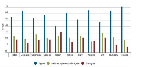
“Public opposition to further migration from Muslim states is especially intense in Austria, Poland, Hungary, France and Belgium, despite these countries having very different sized resident Muslim populations. In each of these countries, at least 38% of the sample ‘strongly agreed’ with the statement. […] across Europe, opposition to Muslim immigration is especially intense among retired, older age cohorts while those aged below 30 are notably less opposed. There is also a clear education divide. Of those with secondary level qualifications, 59% opposed further Muslim immigration. By contrast, less than half of all degree holders supported further migration curbs.”
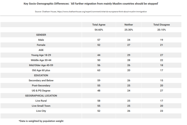
“Of those living in rural, less populated areas, 58% are opposed to further Muslim immigration. […] among those based in cities and metropolitan areas just over half agree with the statement and around a quarter are less supportive of a ban. […] nearly two-thirds of those who feel they don’t have control over their own lives [supported] the statement. Similarly, 65% of those Europeans who are dissatisfied with their life oppose further migration from Muslim countries. […] These results chime with other surveys exploring attitudes to Islam in Europe. In a Pew survey of 10 European countries in 2016, majorities of the public had an unfavorable view of Muslims living in their country in five countries: Hungary (72%), Italy (69%), Poland (66%), Greece (65%), and Spain (50%), although those numbers were lower in the UK (28%), Germany (29%) and France (29%). There was also a widespread perception in many countries that the arrival of refugees would increase the likelihood of terrorism, with a median of 59% across ten European countries holding this view.”
Random stuff
i. Fire works a little differently than people imagine. A great ask-science comment. See also AugustusFink-nottle’s comment in the same thread.
…
ii.
…
iii. I was very conflicted about whether to link to this because I haven’t actually spent any time looking at it myself so I don’t know if it’s any good, but according to somebody (?) who linked to it on SSC the people behind this stuff have academic backgrounds in evolutionary biology, which is something at least (whether you think this is a good thing or not will probably depend greatly on your opinion of evolutionary biologists, but I’ve definitely learned a lot more about human mating patterns, partner interaction patterns, etc. from evolutionary biologists than I have from personal experience, so I’m probably in the ‘they-sometimes-have-interesting-ideas-about-these-topics-and-those-ideas-may-not-be-terrible’-camp). I figure these guys are much more application-oriented than were some of the previous sources I’ve read on related topics, such as e.g. Kappeler et al. I add the link mostly so that if I in five years time have a stroke that obliterates most of my decision-making skills, causing me to decide that entering the dating market might be a good idea, I’ll have some idea where it might make sense to start.
…
iv. Stereotype (In)Accuracy in Perceptions of Groups and Individuals.
“Are stereotypes accurate or inaccurate? We summarize evidence that stereotype accuracy is one of the largest and most replicable findings in social psychology. We address controversies in this literature, including the long-standing and continuing but unjustified emphasis on stereotype inaccuracy, how to define and assess stereotype accuracy, and whether stereotypic (vs. individuating) information can be used rationally in person perception. We conclude with suggestions for building theory and for future directions of stereotype (in)accuracy research.”
A few quotes from the paper:
“Demographic stereotypes are accurate. Research has consistently shown moderate to high levels of correspondence accuracy for demographic (e.g., race/ethnicity, gender) stereotypes […]. Nearly all accuracy correlations for consensual stereotypes about race/ethnicity and gender exceed .50 (compared to only 5% of social psychological findings; Richard, Bond, & Stokes-Zoota, 2003).[…] Rather than being based in cultural myths, the shared component of stereotypes is often highly accurate. This pattern cannot be easily explained by motivational or social-constructionist theories of stereotypes and probably reflects a “wisdom of crowds” effect […] personal stereotypes are also quite accurate, with correspondence accuracy for roughly half exceeding r =.50.”
“We found 34 published studies of racial-, ethnic-, and gender-stereotype accuracy. Although not every study examined discrepancy scores, when they did, a plurality or majority of all consensual stereotype judgments were accurate. […] In these 34 studies, when stereotypes were inaccurate, there was more evidence of underestimating than overestimating actual demographic group differences […] Research assessing the accuracy of miscellaneous other stereotypes (e.g., about occupations, college majors, sororities, etc.) has generally found accuracy levels comparable to those for demographic stereotypes”
“A common claim […] is that even though many stereotypes accurately capture group means, they are still not accurate because group means cannot describe every individual group member. […] If people were rational, they would use stereotypes to judge individual targets when they lack information about targets’ unique personal characteristics (i.e., individuating information), when the stereotype itself is highly diagnostic (i.e., highly informative regarding the judgment), and when available individuating information is ambiguous or incompletely useful. People’s judgments robustly conform to rational predictions. In the rare situations in which a stereotype is highly diagnostic, people rely on it (e.g., Crawford, Jussim, Madon, Cain, & Stevens, 2011). When highly diagnostic individuating information is available, people overwhelmingly rely on it (Kunda & Thagard, 1996; effect size averaging r = .70). Stereotype biases average no higher than r = .10 ( Jussim, 2012) but reach r = .25 in the absence of individuating information (Kunda & Thagard, 1996). The more diagnostic individuating information people have, the less they stereotype (Crawford et al., 2011; Krueger & Rothbart, 1988). Thus, people do not indiscriminately apply their stereotypes to all individual members of stereotyped groups.” (Funder incidentally talked about this stuff as well in his book Personality Judgment).
One thing worth mentioning in the context of stereotypes is that if you look at stuff like crime data – which sadly not many people do – and you stratify based on stuff like country of origin, then the sub-group differences you observe tend to be very large. Some of the differences you observe between subgroups are not in the order of something like 10%, which is probably the sort of difference which could easily be ignored without major consequences; some subgroup differences can easily be in the order of one or two orders of magnitude. The differences are in some contexts so large as to basically make it downright idiotic to assume there are no differences – it doesn’t make sense, it’s frankly a stupid thing to do. To give an example, in Germany the probability that a random person, about whom you know nothing, has been a suspect in a thievery case is 22% if that random person happens to be of Algerian extraction, whereas it’s only 0,27% if you’re dealing with an immigrant from China. Roughly one in 13 of those Algerians have also been involved in a case of ‘body (bodily?) harm’, which is the case for less than one in 400 of the Chinese immigrants.
…
v. Assessing Immigrant Integration in Sweden after the May 2013 Riots. Some data from the article:
“Today, about one-fifth of Sweden’s population has an immigrant background, defined as those who were either born abroad or born in Sweden to two immigrant parents. The foreign born comprised 15.4 percent of the Swedish population in 2012, up from 11.3 percent in 2000 and 9.2 percent in 1990 […] Of the estimated 331,975 asylum applicants registered in EU countries in 2012, 43,865 (or 13 percent) were in Sweden. […] More than half of these applications were from Syrians, Somalis, Afghanis, Serbians, and Eritreans. […] One town of about 80,000 people, Södertälje, since the mid-2000s has taken in more Iraqi refugees than the United States and Canada combined.”
“Coupled with […] macroeconomic changes, the largely humanitarian nature of immigrant arrivals since the 1970s has posed challenges of labor market integration for Sweden, as refugees often arrive with low levels of education and transferable skills […] high unemployment rates have disproportionately affected immigrant communities in Sweden. In 2009-10, Sweden had the highest gap between native and immigrant employment rates among OECD countries. Approximately 63 percent of immigrants were employed compared to 76 percent of the native-born population. This 13 percentage-point gap is significantly greater than the OECD average […] Explanations for the gap include less work experience and domestic formal qualifications such as language skills among immigrants […] Among recent immigrants, defined as those who have been in the country for less than five years, the employment rate differed from that of the native born by more than 27 percentage points. In 2011, the Swedish newspaper Dagens Nyheter reported that 35 percent of the unemployed registered at the Swedish Public Employment Service were foreign born, up from 22 percent in 2005.”
“As immigrant populations have grown, Sweden has experienced a persistent level of segregation — among the highest in Western Europe. In 2008, 60 percent of native Swedes lived in areas where the majority of the population was also Swedish, and 20 percent lived in areas that were virtually 100 percent Swedish. In contrast, 20 percent of Sweden’s foreign born lived in areas where more than 40 percent of the population was also foreign born.”
…
vi. Book recommendations. Or rather, author recommendations. A while back I asked ‘the people of SSC’ if they knew of any fiction authors I hadn’t read yet which were both funny and easy to read. I got a lot of good suggestions, and the roughly 20 Dick Francis novels I’ve read during the fall I’ve read as a consequence of that thread.
…
vii. On the genetic structure of Denmark.
…
“On the basis of an original survey among native Christians and Muslims of Turkish and Moroccan origin in Germany, France, the Netherlands, Belgium, Austria and Sweden, this paper investigates four research questions comparing native Christians to Muslim immigrants: (1) the extent of religious fundamentalism; (2) its socio-economic determinants; (3) whether it can be distinguished from other indicators of religiosity; and (4) its relationship to hostility towards out-groups (homosexuals, Jews, the West, and Muslims). The results indicate that religious fundamentalist attitudes are much more widespread among Sunnite Muslims than among native Christians, even after controlling for the different demographic and socio-economic compositions of these groups. […] Fundamentalist believers […] show very high levels of out-group hostility, especially among Muslims.”
…
ix. Portal: Dinosaurs. It would have been so incredibly awesome to have had access to this kind of stuff back when I was a child. The portal includes links to articles with names like ‘Bone Wars‘ – what’s not to like? Again, awesome!
…
x. “you can’t determine if something is truly random from observations alone. You can only determine if something is not truly random.” (link) An important insight well expressed.
…
xi. Chessprogramming. If you’re interested in having a look at how chess programs work, this is a neat resource. The wiki contains lots of links with information on specific sub-topics of interest. Also chess-related: The World Championship match between Carlsen and Karjakin has started. To the extent that I’ll be following the live coverage, I’ll be following Svidler et al.’s coverage on chess24. Robin van Kampen and Eric Hansen – both 2600+ elo GMs – did quite well yesterday, in my opinion.
…
xii. Justified by More Than Logos Alone (Razib Khan).
“Very few are Roman Catholic because they have read Aquinas’ Five Ways. Rather, they are Roman Catholic, in order of necessity, because God aligns with their deep intuitions, basic cognitive needs in terms of cosmological coherency, and because the church serves as an avenue for socialization and repetitive ritual which binds individuals to the greater whole. People do not believe in Catholicism as often as they are born Catholics, and the Catholic religion is rather well fitted to a range of predispositions to the typical human.”
Some US immigration data
I have had a look at two sources, the Office of Refugee Resettlement’s annual reports to Congress for the financial years 2013 and 2014. I have posted some data from the reports below. In the cases where the page numbers are not included directly in the screen-caps, all page numbers given below are the page numbers of the pdf version of the documents.
I had some trouble with how to deal with the images included in the post; I hope it looks okay now, at least it does on my laptop – but if it doesn’t, I’m not sure I care enough to try to figure out how to resolve the problem. Anyway, to the data!
…
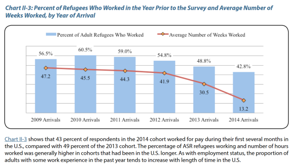
The one above is the only figure/chart from the 2014 report, but I figured it was worth including here. It’s from page 98 of the report. It’s of some note that, despite the recent drop, 42.8% of the 2014 US arrivals worked/had worked during the year they arrived; in comparison, only 494 of Sweden’s roughly 163.000 asylum seekers who arrived during the year 2015 landed a job that year (link).
All further images/charts below are from the 2013 report.
…
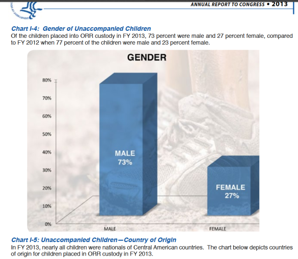
(p. 75)
…
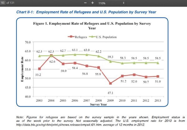
…
It’s noteworthy here how different the US employment gap is to e.g. the employment gap in Denmark. In Denmark the employment rate of refugees with fugitive status who have stayed in the country for 5 years is 34%, and the employment rate of refugees with fugitive status who have stayed in the country for 15 years is 37%, compared to a native employment rate of ~74% (link). But just like in Denmark, in the US it matters a great deal where the refugees are coming from:
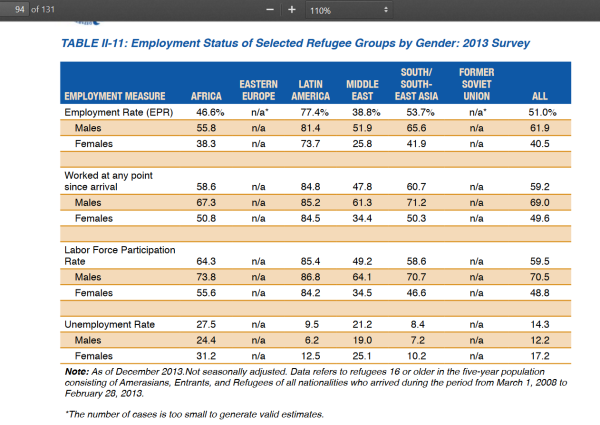
“Since their arrival in the U.S., 59 percent of refugees in the five-year population worked at one point. This rate was highest for refugees from Latin America (85 percent) and lowest for refugees from the Middle East (48 percent), while refugees from South/Southeast Asia (61 percent) and Africa (59 percent) were positioned in between. […] The highest disparity between male and female labor force participation rates was found for respondents from the Middle East (64.1 percent for males vs. 34.5 percent for females, a gap of 30 points). A sizeable gender gap was also found among refugees from South/Southeast Asia (24 percentage points) and Africa (18 percentage points), but there was hardly any gap among Latin American refugees (3 percentage points). Among all refugee groups, 71 percent of males were working or looking for work at the time of the 2013 survey, compared with 49 percent of females.” (p.94)
…
Two tables (both are from page 103 of the 2013 report):
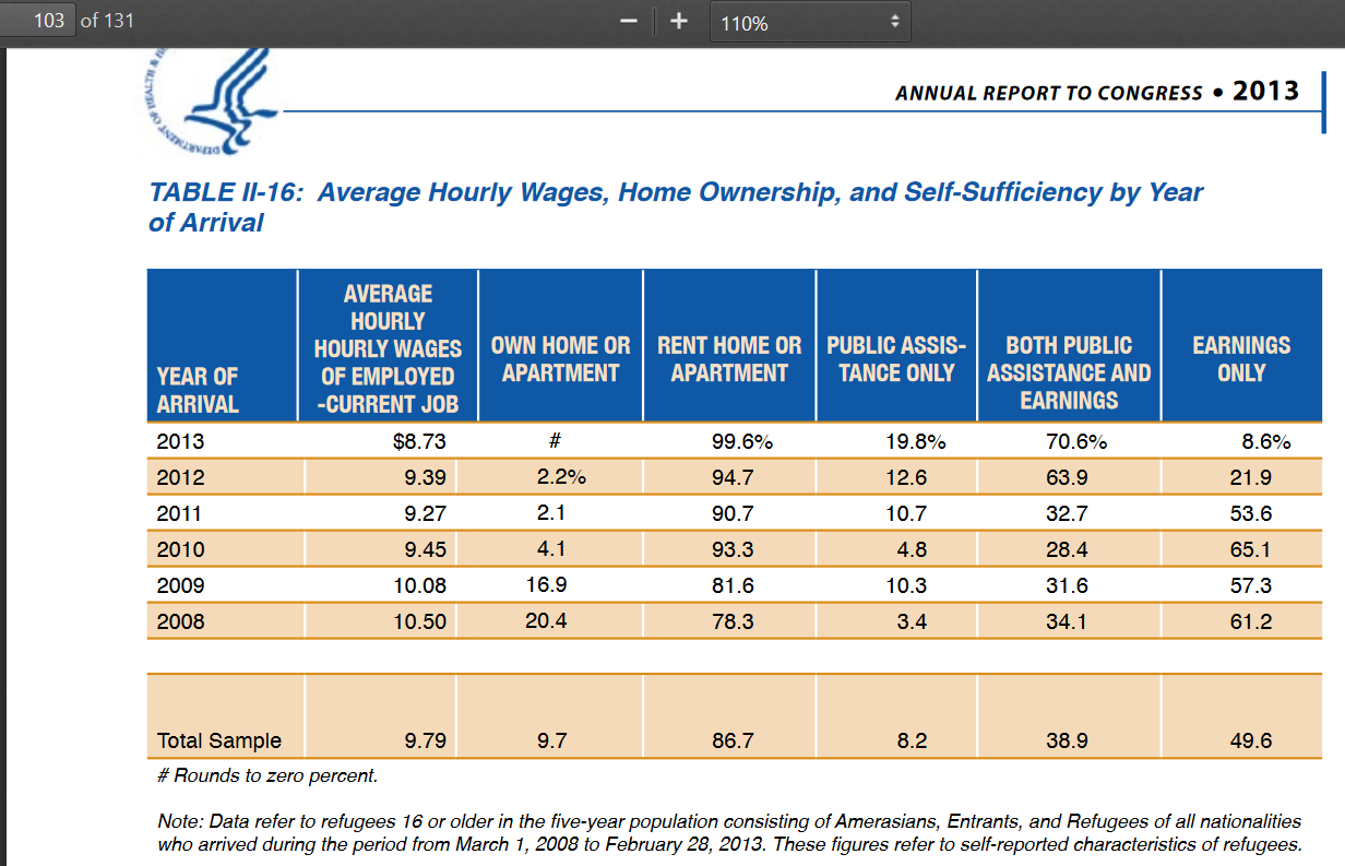
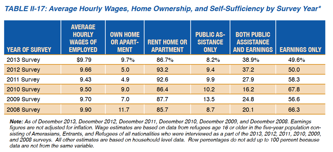
When judged by variables such as home ownership and the proportion of people who survive on public assistance, people who have stayed longer do better (Table II-16). But if you consider table II-17, a much larger proportion of the refugees surveyed in 2013 than in 2008 are partially dependent on public assistance, and it seems that a substantially smaller proportion of the refugees living in the US in the year 2013 was totally self-reliant than was the case 5 years earlier. Fortunately the 2013 report has a bit more data on this stuff (p. 107):
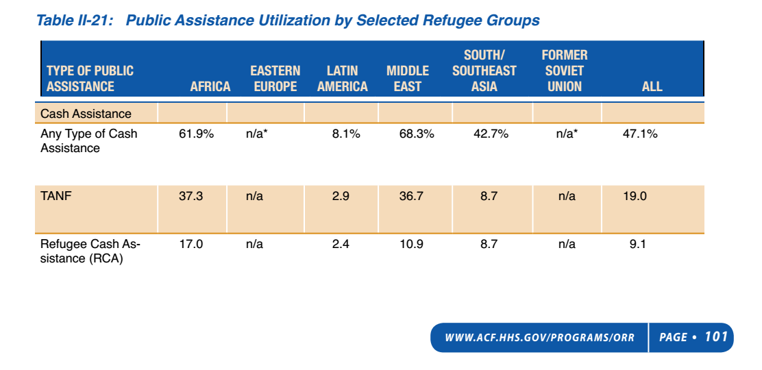
The table has more information on page 108, with more details about specific public assistance programs.Table II-22 includes data on how public assistance utilization has developed over time (it’s clear that utilization rates increased substantially during the half-decade observed):
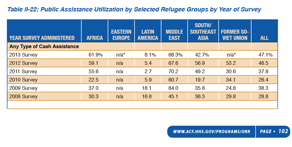
Some related comments from the report:
“Use of non-cash assistance was generally higher than cash assistance. This is probably because Medicaid, the Supplemental Nutrition Assistance Program (SNAP), and housing assistance programs, though available to cash assistance households, also are available more broadly to households without children. SNAP utilization was lowest among Latin Americans (37 percent) but much higher for the other groups, reaching 89 to 91 percent among the refugees from Africa and the Middle East. […] Housing assistance varied by refugee group — as low as 4 percent for Latin American refugees and as high as 32 percent for refugees from South/Southeast Asia in the 2013 survey. In the same period, other refugee groups averaged use of housing assistance between 19 and 31 percent.” (pp. 107-108)
…
The report includes some specific data on Iraqi refugees – here’s one table from that section:
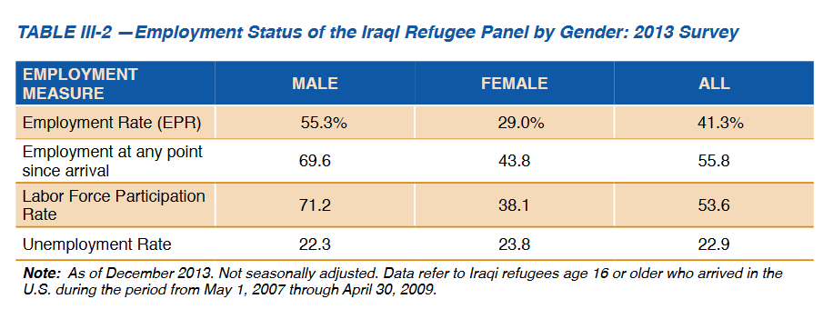
The employment rate of the Iraqis increased from 29.8% in the 2009 survey to 41.3% in 2013. However the US female employment rate is still actually not much different from the female employment rates you observe when you look at European data on these topics – just 29%, up from 18.8% in 2009. As a comparison, in the year 2010 the employment rate of Iraqi females living in Denmark was 28% (n=10163) (data from p.55 of the Statistics Denmark publication Indvandrere i Danmark 2011), almost exactly the same as the employment rate of female Iraqis in the US.
Of note in the context of the US data is perhaps also the fact that despite the employment rate going up for females in the time period observed, the labour market participation rate of this group actually decreased between 2009 and 2013, as it went from 42.2% to 38.1%. So more than 3 out of 5 Iraqi female refugees living in the US are outside the labour market, and almost one in four of those that are not are unemployed. A few observations from the report:
“The survey found that the overall EPR [employment rate, US] for the 2007 to 2009 Iraqi refugee group in the 2013 survey9 was 41 percent (55 percent for males and 29 percent for females), a steady increase in the overall rate from 39 percent in the 2012 survey, 36 percent in the 2011 survey, 31 percent in the 2010 survey, and 30 percent in the 2009 survey. As a point of further reference, the EPR for the general U.S. population was 58.5 percent in 2013, about 17 percentage points higher than that of the 2007 to 2009 Iraqi refugee group (41.3 percent). The U.S. male population EPR was nine percentage points higher than the rate for Iraqi males who arrived in the U.S. in 2007 to 2009 (64 percent versus 55 percent), while the rate for the Iraqi females who arrived in the U.S. in 2007 to 2009 was 24 points higher for all U.S. women (53 percent versus 29 percent). The difference between the male and female EPRs among the same group of Iraqi refugees (26 percentage points) also was much larger than the gap between male and female EPRs in the general U.S. population (11 points) […] The overall unemployment rate for the 2007 to 2009 Iraqi refugee group was 22.9 percent in the 2013 survey, about four times higher than that of the general U.S. population (6.5 percent) in 2013” (pp. 114-115).
Data on Danish diabetics (Dansk Diabetes Database – National årsrapport 2013-2014)
[Warning: Long post].
I’ve blogged data related to the data covered in this post before here on the blog, but when I did that I only provided coverage in Danish. Part of my motivation for providing some coverage in English here (which is a slightly awkward and time consuming thing to do as all the source material is in Danish) is that this is the sort of data you probably won’t ever get to know about if you don’t understand Danish, and it seems like some of it might be worth knowing about also for people who do not live in Denmark. Another reason for posting stuff in English is of course that I dislike writing a blog post which I know beforehand that some of my regular readers will not understand. I should perhaps note that some of the data is at least peripherally related to my academic work at the moment.
The report which I’m covering in this post (here’s a link to it) deals primarily with various metrics collected in order to evaluate whether treatment goals which have been set centrally are being met by the Danish regions, one of the primary political responsibilities of which is to deal with health care service delivery. To take an example from the report, a goal has been set that at least 95 % of patients with known diabetes in the Danish regions should have their Hba1c (an important variable in the treatment context) measured at least once per year. The report of course doesn’t just contain a list of goals etc. – it also presents a lot of data which has been collected throughout the country in order to figure out to which extent the various goals have been met at the local levels. Hba1c is just an example; there are also goals set in relation to the variables hypertension, regular eye screenings, regular kidney function tests, regular foot examinations, and regular tests for hyperlipidemia, among others.
Testing is just one aspect of what’s being measured; other goals relate to treatment delivery. There’s for example a goal that the proportion of (known) type 2 diabetics with an Hba1c above 7.0% who are not receiving anti-diabetic treatment should be at most 5% within regions. A thought that occurred to me while reading the report was that it seemed to me that some interesting incentive problems might pop up here if these numbers were more important than I assume they are in the current decision-making context, because adding this specific variable without also adding a goal for ‘finding diabetics who do not know they are sick’ – and no such goal is included in the report, as far as I’ve been able to ascertain – might lead to problems; in theory a region that would do well in terms of identifying undiagnosed type 2 patients, of which there are many, might get punished for this if their higher patient population in treatment as a result of better identification might lead to binding capacity constraints at various treatment levels; capacity constraints which would not affect regions which are worse at identifying (non-)patients at risk because of the existence of a tradeoff between resources devoted to search/identification and resources devoted to treatment. Without a goal for identifying undiagnosed type 2 diabetics, it seems to me that to the extent that there’s a tradeoff between devoting resources to identifying new cases and devoting resources to the treatment of known cases, the current structure of evaluation, to the extent that it informs decision-making at the regional level, favours treatment over identification – which might or might not be problematic from a cost-benefit point of view. I find it somewhat puzzling that no goals relate to case-finding/diagnostics because a lot of the goals only really make sense if the people who are sick actually get diagnosed so that they can receive treatment in the first place; that, say, 95% of diabetics with a diagnosis receives treatment option X is much less impressive if, say, a third of all people with the disease do not have a diagnosis. Considering the relatively low amount of variation in some of the metrics included you’d expect a variable of this sort to be included here, at least I did.
The report has an appendix with some interesting information about the sex ratios, age distributions, how long people have had diabetes, whether they smoke, what their BMIs and blood pressures are like, how well they’re regulated (in terms of Hba1c), what they’re treated with (insulin, antihypertensive drugs, etc.), their cholesterol levels and triglyceride levels, etc. I’ll talk about these numbers towards the end of the post – if you want to get straight to this coverage and don’t care about the ‘main coverage’, you can just scroll down until you reach the ‘…’ point below.
The report has 182 pages with a lot of data, so I’m not going to talk about all of it. It is based on very large data sets which include more than 37.000 Danish diabetes patients from specialized diabetes units (diabetesambulatorier) (these are usually located in hospitals and provide ambulatory care only) as well as 34.000 diabetics treated by their local GPs – the aim is to eventually include all Danish diabetics in the database, and more are added each year, but even as it is a very big proportion of all patients are ‘accounted for’ in the data. Other sources also provide additional details, for example there’s a database on children and young diabetics collected separately. Most of the diabetics which are not included here are patients treated by their local GPs, and there’s still a substantial amount of uncertainty related to this group; approximately 90% of all patients connected to the diabetes units are assumed at this point to be included in the database, but the report also notes that approximately 80 % of diabetics are assumed to be treated in general practice. Coverage of this patient population is currently improving rapidly and it seems that most diabetics in Denmark will likely be included in the database within the next few years. They speculate in the report that the inclusion of more patients treated in general practice may be part of the explanation why goal achievement seems to have decreased slightly over time; this seems to me like a likely explanation considering the data they present as the diabetes units in general are better at achieving the goals set than are the GPs. The data is up to date – as some of you might have inferred from the presumably partly unintelligible words in the parenthesis in the title, the report deals with data from the time period 2013-2014. I decided early on not to copy tables into this post directly as it’s highly annoying to have to translate terms in such tables; instead I’ve tried to give you the highlights. I may or may not have succeeded in doing that, but you should be aware, especially if you understand Danish, that the report has a lot of details, e.g. in terms of intraregional variation etc., which are excluded from this coverage. Although I far from cover all the data, I do cover most of the main topics dealt with in the publication in at least a little bit of detail.
The report concludes in the introduction that for most treatment indicators no clinically significant differences in the quality of the treatment provided to diabetics are apparent when you compare the different Danish regions – so if you’re looking at the big picture, if you’re a Danish diabetic it doesn’t matter all that much if you live in Jutland or in Copenhagen. However some significant intra-regional differences do exist. In the following I’ll talk in a bit more detail about some of data included in the report.
When looking at the Hba1c goal (95% should be tested at least once per year), they evaluate the groups treated in the diabetes units and the groups treated in general practice separately; so you have one metric for patients treated in diabetes units living in the north of Jutland (North Denmark Region) and you have another group of patients treated in general practice living in the north of Jutland – this breakdown of the data makes it possible to not only compare people across regions but also to investigate whether there are important differences between the care provided by diabetes units and the care provided by general practitioners. When dealing with patients receiving ambulatory care from the diabetes units all regions meet the goal, but in Copenhagen (Capital Region of Denmark, (-CRD)) only 94% of patients treated in general practice had their Hba1c measured within the last year – this was the only region which did not meet the goal for the patient population treated in general practice. I would have thought beforehand that all diabetes units would have 100% coverage here, but that’s actually only the case in the region in which I live (Central Denmark Region) – on the other hand in most other regions, aside from Copenhagen again, the number is 99%, which seems reasonable as I’m assuming a substantial proportion of the remainder is explained by patient noncompliance, which is difficult to avoid completely. I speculate that patient compliance differences between patient populations treated at diabetes units and patient populations treated by their GP might also be part of the explanation for the lower goal achievement of the general practice population; as far as I’m aware diabetes units can deny care in the case of non-compliance whereas GPs cannot, so you’d sort of expect the most ‘difficult’ patients to end up in general practice; this is speculation to some extent and I’m not sure it’s a big effect, but it’s worth keeping in mind when analyzing this data that not all differences you observe necessarily relate to service delivery inputs (whether or not a doctor reminds a patient it’s time to get his eyes checked, for example); the two main groups analyzed are likely to also be different due to patient population compositions. Differences in patient population composition may of course also drive some of the intraregional variation observed. They mention in their discussion of the results for the Hba1c variable that they’re planning on changing the standard here to one which relate to the distributional results of the Hba1c, not just whether the test was done, which seems like a good idea. As it is, the great majority of Danish diabetics have their Hba1c measured at least annually, which is good news because of the importance of this variable in the treatment context.
In the context of hypertension, there’s a goal that at least 95% of diabetics should have their blood pressure measured at least once per year. In the context of patients treated in the diabetes units, all regions achieve the goal and the national average for this patient population is 97% (once again the region in which I live is the only one that achieved 100 % coverage), but in the context of patients treated in general practice only one region (North Denmark Region) managed to get to 95% and the national average is 90%. In most regions, one in ten diabetics treated in general practice do not have their blood pressure measured once per year, and again Copenhagen (CRD) is doing worst with a coverage of only 87%. As mentioned in the general comments above some of the intraregional variation is actually quite substantial, and this may be a good example because not all hospitals are doing great on this variable. Sygehus Sønderjylland, Aabenraa (in southern Jutland), one of the diabetes units, had a coverage of only 67%, and the percentage of patients treated at Hillerød Hospital in Copenhagen (CRD), another diabetes unit, was likewise quite low, with 83% of patients having had their blood pressure measured within the last year. These hospitals are however the exceptions to the rule. Evaluating whether it has been tested if patients do or do not have hypertension is different from evaluating whether hypertension is actually treated after it has been discovered, and here the numbers are less impressive; for the type 1 patients treated in the diabetes units, roughly one third (31%) of patients with a blood pressure higher than 140/90 are not receiving treatment for hypertension (the goal was at most 20%). The picture was much better for type 2 patients (11% at the national level) and patients treated in general practice (13%). They note that the picture has not improved over the last years for the type 1 patients and that this is not in their opinion a satisfactory state of affairs. A note of caution is that the variable only includes patients who have had a blood pressure measured within the last year which was higher than 140/90 and that you can’t use this variable as an indication of how many patients with high blood pressure are not being treated; some patients who are in treatment for high blood pressure have blood pressures lower than 140/90 (achieving this would in many cases be the point of treatment…). Such an estimate will however be added to later versions of the report. In terms of the public health consequences of undertreatment, the two patient populations are of course far from equally important. As noted later in the coverage, the proportion of type 2 patients on antihypertensive agents is much higher than the proportion of type 1 diabetics receiving treatment like this, and despite this difference the blood pressure distributions of the two patient populations are reasonably similar (more on this below).
Screening for albuminuria: The goal here is that at least 95 % of adult diabetics are screened within a two-year period (There are slightly different goals for children and young adults, but I won’t go into those). In the context of patients treated in the diabetes units, the northern Jutland Region and Copenhagen/RH failed to achieve the goal with a coverage slightly below 95% – the other regions achieved the goal, although not much more than that; the national average for this patient population is 96%. In the context of patients treated in general practice none of the regions achieve the goal and the national average for this patient population is 88%. Region Zealand was doing worst with 84%, whereas the region in which I live, Region Midtjylland, was doing best with a 92% coverage. Of the diabetes units, Rigshospitalet, “one of the largest hospitals in Denmark and the most highly specialised hospital in Copenhagen”, seems to also be the worst performing hospital in Denmark in this respect, with only 84 % of patients being screened – which to me seems exceptionally bad considering that for example not a single hospital in the region in which I live is below 95%. Nationally roughly 20% of patients with micro- or macroalbuminuria are not on ACE-inhibitors/Angiotensin II receptor antagonists.
Eye examination: The main process goal here is at least one eye examination every second year for at least 90% of the patients, and a requirement that the treating physician knows the result of the eye examination. This latter requirement is important in the context of the interpretation of the results (see below). For patients treated in diabetes units, four out of five regions achieved the goal, but there were also what to me seemed like large differences across regions. In Southern Denmark, the goal was not met and only 88 % had had an eye examination within the last two years, whereas the number was 98% in Region Zealand. Region Zealand was a clear outlier here and the national average for this patient population was 91%. For patients treated in general practice no regions achieved the goal, and this variable provides a completely different picture from the previous variables in terms of the differences between patients treated in diabetes units and patients treated in general practice: In most regions, the coverage here for patients in general practice is in the single digits and the national average for this patient population is just 5 %. They note in the report that this number has decreased over the years through which this variable has been analyzed, and they don’t know why (but they’re investigating it). It seems to be a big problem that doctors are not told about the results of these examinations, which presumably makes coordination of care difficult.
The report also has numbers on how many patients have had their eyes checked within the last 4 years, rather than within the last two, and this variable makes it clear that more infrequent screening is not explaining anything in terms of the differences between the patient populations; for patients treated in general practice the numbers are still here in the single digits. They mention that data security requirements imposed on health care providers are likely the reason why the numbers are low in general practice as it seems common that the GP is not informed of the results of screenings taking place, so that the only people who gets to know about the results are the ophthalmologists doing them. A new variable recently included in the report is whether newly-diagnosed type 2 diabetics are screened for eye-damage within 12 months of receiving their diagnosis – here they have received the numbers directly from the ophthalmologists so uncertainty about information sharing doesn’t enter the picture (well, it does, but the variable doesn’t care; it just measures whether an eye screen has been performed or not) – and although the standard set is 95% (at most one in twenty should not have their eyes checked within a year of diagnosis) at the national level only half of patients actually do get an eye screen within the first year (95% CI: 46-53%) – uncertainty about the date of diagnosis makes it slightly difficult to interpret some of the specific results, but the chosen standard is not achieved anywhere and this once again underlines how diabetic eye care is one of the areas where things are not going as well as the people setting the goals would like them to. The rationale for screening people within the first year of diagnosis is of course that many type 2 patients have complications at diagnosis – “30–50 per cent of patients with newly diagnosed T2DM will already have tissue complications at diagnosis due to the prolonged period of antecedent moderate and asymptomatic hyperglycaemia.” (link).
The report does include estimates of the number of diabetics who receive eye screenings regardless of whether the treating physician knows the results or not; at the national level, according to this estimate 65% of patients have their eyes screened at least once every second year, leaving more than a third of patients in a situation where they are not screened as often as is desirable. They mention that they have had difficulties with the transfer of data and many of the specific estimates are uncertain, including two of the regional estimates, but the general level – 65% or something like that – is based on close to 10.000 patients and is assumed to be representative. Approximately 1% of Danish diabetics are blind, according to the report.
Foot examinations: Just like most of the other variables: At least 95 % of patients, at least once every second year. For diabetics treated in diabetes units, the national average is here 96% and the goal was not achieved in Copenhagen (CRD) (94%) and northern Jutland (91%). There are again remarkable differences within regions; at Helsingør Hospital only 77% were screened (95% CI: 73-82%) (a drop from 94% the year before), and at Hillerød Hospital the number was even lower, 73% (95% CI: 70-75), again a drop from the previous year where the coverage was 87%. Both these numbers are worse than the regional averages for all patients treated in general practice, even though none of the regions meet the goal. Actually I thought the year-to-year changes in the context of these two hospitals were almost as interesting as the intraregional differences because I have a hard time explaining those; how do you even set up a screening programme such that a coverage drop of more than 10 % from one year to the next is possible? To those who don’t know, diabetic feet are very expensive and do not seem to get the research attention one might from a cost-benefit perspective assume they would (link, point iii). Going back to the patients in general practice on average 81 % of these patients have a foot examination at least once every second year. The regions here vary from 79% to 84%. The worst covered patients are patients treated in general practice in the Vordingborg sygehus catchment area in the Zealand Region, where only roughly two out of three (69%, 95% CI: 62-75%) patients have regularly foot examinations.
Aside from all the specific indicators they’ve collected and reported on, the authors have also constructed a combined indicator, an ‘all-or-none’ indicator, in which they measure the proportion of patients who have not failed to get their Hba1c measured, their feet checked, their blood pressure measured, kidney function tests, etc. … They do not include in this metric the eye screening variable because of the problems associated with this variable, but this is the only process variable not included, and the variable is sort of an indicator of how many of the patients are actually getting all of the care that they’re supposed to get. As patients treated in general practice are generally less well covered than patients treated in the diabetes units at the hospitals I was interested to know how much these differences ‘added up to’ in the end. For the diabetes units, 11 % of patients failed on at least one metric (i.e. did not have their feet checked/Hba1c measured/blood pressure measured/etc.), whereas this was the case for a third of patients in general practice (67%). Summed up like that it seems to me that if you’re a Danish diabetes patient and you want to avoid having some variable neglected in your care, it matters whether you’re treated by your local GP or by the local diabetes unit and that you’re probably going to be better off receiving care from the diabetes unit.
…
Some descriptive statistics from the appendix (p. 95 ->):
Sex ratio: In the case of this variable, they have multiple reports on the same variable based on data derived from different databases. In the first database, including 16.442 people, 56% are male and 44% are female. In the next database (n=20635), including only type 2 diabetics, the sex ratio is more skewed; 60% are males and 40% are females. In a database including only patients in general practice (n=34359), like in the first database 56% of the diabetics are males and 44% are females. For the patient population of children and young adults included (n=2624), the sex ratio is almost equal (51% males and 49% females). The last database, Diabase, based on evaluation of eye screening and including only adults (n=32842), have 55% males and 45% females. It seems to me based on these results that the sex ratio is slightly skewed in most patient populations, with slightly more males than females having diabetes – and it seems not improbable that this is to due to a higher male prevalence of type 2 diabetes (the children/young adult database and type 2 database seem to both point in this direction – the children/young adult group mainly consists of type 1 patients as 98% of this sample is type 1. The fact that the prevalence of autoimmune disorders is in general higher in females than in males also seems to support this interpretation; to the extent that the sex ratio is skewed in favour of males you’d expect lifestyle factors to be behind this.
Next, age distribution. In the first database (n=16.442), the average and the median age is 50, the standard deviation is 16, the youngest individual is 16 and the oldest is 95. It is worth remembering in this part of the reporting that the oldest individual in the sample is not a good estimate of ‘how long a diabetic can expect to live’ – for all we know the 95 year old in the database got diagnosed at the age of 80. You need diabetes duration before you can begin to speculate about that variable. Anyway, in the next database, of type 2 patients (n=20635), the average age is 64 (median=65), the standard deviation is 12 and the oldest individual is 98. In the context of both of the databases mentioned so far some regions do better than others in terms of the oldest individual, but it also seems to me that this may just be a function of the sample size and ‘random stuff’ (95+ year olds are rare events); Northern Jutland doesn’t have a lot of patients so the oldest patient in that group is not as old as the oldest patient from Copenhagen – this is probably but what you’d expect. In the general practice database (n=34359), the average age is 68 (median=69) and the standard deviation is 11; the oldest individual there is 102. In the Diabase database (n=32842), the average age is 62 (median=64), the standard deviation is 15 and the oldest individual is 98. It’s clear from these databases that most diabetics in Denmark are type 2 diabetics (this is no surprise) and that a substantial proportion of them are at or close to retirement age.
The appendix has a bit of data on diabetes type, but I think the main thing to take away from the tables that break this variable down is that type 1 is overrepresented in the databases compared to the true prevalence – in the Diabase database for example almost half of patients are type 1 (46%), despite the fact that type 1 diabetics are estimated to make up only 10% of the total in Denmark (see e.g. this (Danish source)). I’m sure this is to a significant extent due to lack of coverage of type 2 diabetics treated in general practice.
Diabetes duration: In the first data-set including 16.442 individuals the patients have a median diabetes duration of 21,2 years. The 10% cutoff is 5,4 years, the 25% cutoff is 11,3 years, the 75% cutoff is 33,5 years, and the 90% cutoff is 44,2 years. High diabetes durations are more likely to be observed in type 1 patients as they’re in general diagnosed earlier; in the next database involving only type 2 patients (n=20635), the median duration is 12.9 years and the corresponding cutoffs are 3,8 years (10%); 7,4 years (25%); 18,6 years (75%); and 24,7 years (90%). In the database involving patients treated in general practice, the median duration is 6,8 years and the cutoffs reported for the various percentiles are 2,5 years (10%), 4,0 (25%), 11,2 (75%) and 15,6 (90%). One note not directly related to the data but which I thought might be worth adding here is that of one were to try to use these data for the purposes of estimating the risk of complications as a function of diabetes duration, it would be important to have in mind that there’s probably often a substantial amount of uncertainty associated with the diabetes duration variable because many type 2 diabetics are diagnosed after a substantial amount of time with sub-optimal glycemic control; i.e. although diabetes duration is lower in type 2 populations than in type 1 populations, I’d assume that the type 2 estimates of duration are still biased downwards compared to type 1 estimates causing some potential issues in terms of how to interpret associations found here.
Next, smoking. In the first database (n=16.442), 22% of diabetics smoke daily and another 22% are ex-smokers who have not smoked within the last 6 months. According to the resource to which you’re directed when you’re looking for data on that kind of stuff on Statistics Denmark, the percentage of daily smokers was 17% in 2013 in the general population (based on n=158.870 – this is a direct link to the data), which seems to indicate that the trend (this is a graph of the percentage of Danes smoking daily as a function of time, going back to the 70es) I commented upon (Danish link) a few years back has not reversed or slowed down much. If we go back to the appendix and look at the next source, dealing with type 2 diabetics, 19% of them are smoking daily and 35% of them are ex-smokers (again, 6 months). In the general practice database (n=34.359) 17% of patients smoke daily and 37% are ex-smokers.
BMI. Here’s one variable where type 1 and type 2 look very different. The first source deals with type 1 diabetics (n=15.967) and here the median BMI is 25.0, which is comparable to the population median (if anything it’s probably lower than the population median) – see e.g. page 63 here. Relevant percentile cutoffs are 20,8 (10%), 22,7 (25%), 28,1 (75%), and 31,3 (90%). Numbers are quite similar across regions. For the type 2 data, the first source (n=20.035) has a median BMI of 30,7 (almost equal to the 1 in 10 cutoff for type 1 diabetics), with relevant cutoffs of 24,4 (10%), 27,2 (25%), 34,9 (75%), and 39,4 (90%). According to this source, one in four type 2 diabetics in Denmark are ‘severely obese‘ and more diabetics are obese than are not. It’s worth remembering that using these numbers to implicitly estimate the risk of type 2 diabetes associated with overweight is problematic as especially some of the people in the lower end of the distribution are quite likely to have experienced weight loss post-diagnosis. For type 2 patients treated in general practice (n=15.736), the median BMI is 29,3 and cutoffs are 23,7 (10%), 26,1 (25%), 33,1 (75%), and 37,4 (90%).
Distribution of Hba1c. The descriptive statistics included also have data on the distribution of Hba1c values among some of the patients who have had this variable measured. I won’t go into the details here except to note that the differences between type 1 and type 2 patients in terms of the Hba1c values achieved are smaller than I’d perhaps expected; the median Hba1c among type 1s was estimated at 62, based on 16.442 individuals, whereas the corresponding number for type 2s was 59, based on 20.635 individuals. Curiously, a second data source finds a median Hba1c of only 48 for type 2 patients treated in general practice; the difference between this one and the type 1 median is definitely high enough to matter in terms of the risk of complications (it’s more questionable how big the effect of a jump from 59 to 62 is, especially considering measurement error and the fact that the type 1 distribution seems denser than the type 2 distribution so that there aren’t that many more exceptionally high values in the type 1 dataset), but I wonder if this actually quite impressive level of metabolic control in general practice may not be due to biased reporting, with GPs doing well in terms of diabetes management being also more likely to report to the databases; it’s worth remembering that most patients treated in general practice are still not accounted for in these data-sets.
Oral antidiabetics and insulin. In one sample of 20.635 type 2 patients, 69% took oral antidiabetics, and in another sample of 34.359 type 2 patients treated in general practice the number was 75%. 3% of type 1 diabetics in a sample of 16.442 individuals also took oral antidiabetics, which surprised me. In the first-mentioned sample of type 2 patients 69% (but not the same amount of individuals – this was not a reporting error) also took insulin, so there seems to be a substantial number of patients on both treatments. In the general practice sample included the number of patients on insulin was much lower, as only 14% of type 2 patients were on insulin – again concerns about reporting bias may play a role here, but even taking this number at face value and extrapolating out of sample you reach the conclusion that the majority of patients on insulin are probably type 2 diabetics, as only roughly one patient in 10 is type 1.
Antihypertensive treatment and treatment for hyperlipidemia: Although there as mentioned above seems to be less focus on hypertension in type 1 patients than on hypertension in type 2 patients, it’s still the case that roughly half (48%) of all patients in the type 1 sample (n=16.442) was on antihypertensive treatment. In the first type 2 sample (n=20635), 82% of patients were receiving treatment against hypertension, and this number was similar in the general practice sample (81%). The proportions of patients in treatment for hyperlipidemia are roughly similar (46% of type 1, and 79% and 73% in the two type 2 samples, respectively).
Blood pressure. The median level of systolic blood pressure among type 1 diabetics (n=16442) was 130, with the 75% cutoff intersecting the hypertension level (140) and 10% of patients having a systolic blood pressure above 151. These numbers are almost identical to the sample of type 2 patients treated in general practice, however as earlier mentioned this blood pressure level is achieved with a lower proportion of patients in treatment for hypertension. In the second sample of type 2 patients (n=20635), the numbers were slightly higher (median: 133, 75% cutoff: 144, 90% cutoff: 158). The median diastolic blood pressure was 77 in the type 1 sample, with 75 and 90% cutoffs of 82 and 89; the data in the type 2 samples are almost identical.
Civil Wars (II)
Here’s my first post about the book. In this post I’ll continue my coverage where I left off in my first post. A few of the chapters covered below I did not think very highly of, but other parts of the coverage are about as good as you could expect (given problems such as e.g. limited data etc.). Some of the stuff I found quite interesting. As people will note in the coverage below the book does address the religious dimension to some extent, though in my opinion far from to the extent that the variable deserves. An annoying aspect of the chapter on religion was to me that although the author of the chapter includes data which to me cannot but lead to some very obvious conclusions, the author seems to be very careful avoiding drawing those conclusions explicitly. It’s understandable, but still annoying. For related reasons I also got annoyed at him for presumably deliberately completely disregarding which seems in the context of his own coverage to be an actually very important component of Huntington’s thesis, that conflict at the micro level seems to very often be between muslims and ‘the rest’. Here’s a relevant quote from Clash…, p. 255:
“ethnic conflicts and fault line wars have not been evenly distributed among the world’s civilizations. Major fault line fighting has occurred between Serbs and Croats in the former Yugoslavia and between Buddhists and Hindus in Sri Lanka, while less violent conflicts took place between non-Muslim groups in a few other places. The overwhelming majority of fault line conflicts, however, have taken place along the boundary looping across Eurasia and Africa that separates Muslims from non-Muslims. While at the macro or global level of world politics the primary clash of civilizations is between the West and the rest, at the micro or local level it is between Islam and the others.”
This point, that conflict at the local level – which seems to be the type of conflict level you’re particularly interested in if you’re researching civil wars, as also argued in previous chapters in the coverage – according to Huntington seems to be very islam-centric, is completely overlooked (ignored?) in the handbook chapter, and if you haven’t read Huntington and your only exposure to him is through the chapter in question you’ll probably conclude that Huntington was wrong, because that seems to be the conclusion the author draws, arguing that other models are more convincing (I should add here that these other models do seem useful, at least in terms of providing (superficial) explanations; the point is just that I feel the author is misrepresenting Huntington and I dislike this). Although there are parts of the coverage in that chapter where I feel that it’s obvious the author and I do not agree, I should note that the fact that he talks about the data and the empirical research makes up for a lot of other stuff.
Anyway, on to the coverage – it’s perhaps worth noting, in light of the introductory remarks above, that the post has stuff on a lot of things besides religion, e.g. the role of natural resources, regime types, migration, and demographics.
…
“Elites seeking to end conflict must: (1) lead followers to endorse and support peaceful solutions; (2) contain spoilers and extremists and prevent them from derailing the process of peacemaking; and (3) forge coalitions with more moderate members of the rival ethnic group(s) […]. An important part of the two-level nature of the ethnic conflict is that each of the elites supporting the peace process be able to present themselves, and the resulting terms of the peace, as a “win” for their ethnic community. […] A strategy that a state may pursue to resolve ethnic conflict is to co-opt elites from the ethnic communities demanding change […]. By satisfying elites, it reduces the ability of the aggrieved ethnic community to mobilize. Such a process of co-option can also be used to strengthen ethnic moderates in order to undermine ethnic extremists. […] the co-opted elites need to be careful to be seen as still supporting ethnic demands or they may lose all credibility in their respective ethnic community. If this occurs, the likely outcome is that more extreme ethnic elites will be able to capture the ethnic community, possibly leading to greater violence.
It is important to note that “spoilers,” be they an individual or a small sub-group within an ethnic community, can potentially derail any peace process, even if the leaders and masses support peace (Stedman, 2001).”
“Three separate categories of international factors typically play into identity and ethnic conflict. The first is the presence of an ethnic community across state boundaries. Thus, a single community exists in more than one state and its demands become international. […] This division of an ethnic community can occur when a line is drawn geographically through a community […], when a line is drawn and a group moves into the new state […], or when a diaspora moves a large population from one state to another […] or when sub-groups of an ethnic community immigrate to the developed world […] When ethnic communities cross state boundaries, the potential for one state to support an ethnic community in the other state exists. […] There is also the potential for ethnic communities to send support to a conflict […] or to lobby their government to intervene […]. Ethnic groups may also form extra-state militias and cross international borders. Sometimes these rebel groups can be directly or indirectly sponsored by state governments, leading to a very complex situation […] A second set of possible international factors is non-ethnic international intervention. A powerful state may decide to intervene in an ethnic conflict for a variety of reasons, ranging from humanitarian support, to peacekeeping, to outright invasion […] The third and last factor is the commitment of non-governmental organizations (NGOs) or third-party mediators to a conflict. […] The record of international interventions in ethnic civil wars is quite mixed. There are many difficulties associated with international action [and] international groups cannot actually change the underlying root of the ethnic conflict (Lake and Rothchild, 1998; Kaufman, 1996).”
“A relatively simple way to think of conflict onset is to think that for a rebellion to occur two conditions need to be satisfactorily fulfilled: There must be a motivation and there must be an opportunity to rebel.3 First, the rebels need a motive. This can be negative – a grievance against the existing state of affairs – or positive – a desire to capture resource rents. Second, potential rebels need to be able to achieve their goal: The realization of their desires may be blocked by the lack of financial means. […] Work by Collier and Hoeffler (1998, 2004) was crucial in highlighting the economic motivation behind civil conflicts. […] Few conflicts, if any, can be characterized purely as “resource conflicts.” […] It is likely that few groups are solely motivated by resource looting, at least in the lower rank level. What is important is that valuable natural resources create opportunities for conflicts. To feed, clothe, and arm its members, a rebel group needs money. Unless the rebel leaders are able to raise sufficient funds, a conflict is unlikely to start no matter how severe the grievances […] As a consequence, feasibility of conflict – that is, valuable natural resources providing opportunity to engage in violent conflict – has emerged as a key to understanding the relation between valuable resources and conflict.”
“It is likely that some natural resources are more associated with conflict than others. Early studies on armed civil conflict used resource measures that aggregated different types of resources together. […] With regard to financing conflict start-up and warfare the most salient aspect is probably the ease with which a resource can be looted. Lootable resources can be extracted with simple methods by individuals or small groups, are easy to transport, and can be smuggled across borders with limited risks. Examples of this type of resources are alluvial gemstones and gold. By contrast, deep-shaft minerals, oil, and natural gas are less lootable and thus less likely sources of financing. […] Using comprehensive datasets on all armed civil conflicts in the world, natural resource production, and other relevant aspects such as political regime, economic performance, and ethnic composition, researchers have established that at least some high-value natural resources are related to higher risk of conflict onset. Especially salient in this respect seem to be oil and secondary diamonds[7] […] The results regarding timber […] and cultivation of narcotics […] are inconclusive. […] [An] important conclusion is that natural resources should be considered individually and not lumped together. Diamonds provide an illustrative example: the geological form of the diamond deposit is related to its effect on conflict. Secondary diamonds – the more lootable form of two deposit types – makes conflict more likely, longer, and more severe. Primary diamonds on the other hand are generally not related to conflict.”
“Analysis on conflict duration and severity confirm that location is a salient factor: resources matter for duration and severity only when located in the region where the conflict is taking place […] That the location of natural resources matters has a clear and important implication for empirical conflict research: relying on country-level aggregates can lead to wrong conclusions about the role of natural resources in armed civil conflict. As a consequence of this, there has been effort to collect location-specific data on oil, gas, drug cultivation, and gemstones”.
“a number of prominent studies of ethnic conflict have suggested that when ethnic groups grow at different rates, this may lead to fears of an altered political balance, which in turn might cause political instability and violent conflict […]. There is ample anecdotal evidence for such a relationship [but unfortunately little quantitative research…]. The civil war in Lebanon, for example, has largely been attributed to a shift in the delicate ethnic balance in that state […]. Further, in the early 1990s, radical Serb leaders were agitating for the secession of “Serbian” areas in Bosnia-Herzegovina by instigating popular fears that Serbs would soon be outnumbered by a growing Muslim population heading for the establishment of a Shari’a state”.
“[One] part of the demography-conflict literature has explored the role of population movements. Most of this literature […] treats migration and refugee flows as a consequence of conflict rather than a potential cause. Some scholars, however, have noted that migration, and refugee migration in particular, can spur the spread of conflict both between and within states […]. Existing work suggests that environmentally induced migration can lead to conflict in receiving areas due to competition for scarce resources and economic opportunities, ethnic tensions when migrants are from different ethnic groups, and exacerbation of socioeconomic “fault lines” […] Salehyan and Gleditsch (2006) point to spill-over effects, in the sense that mass refugee migration might spur tensions in neighboring or receiving states by imposing an economic burden and causing political stability [sic]. […] Based on a statistical analysis of refugees from neighboring countries and civil war onset during the period 1951–2001, they find that countries that experience an influx of refugees from neighboring states are significantly more likely to experience wars themselves. […] While the youth bulge hypothesis [large groups of young males => higher risk of violence/war/etc.] in general is supported by empirical evidence, indicating that countries and areas with large youth cohorts are generally at a greater risk of low-intensity conflict, the causal pathways relating youth bulges to increased conflict propensity remain largely unexplored quantitatively. When it comes to the demographic factors which have so far received less attention in terms of systematic testing – skewed sex ratios, differential ethnic growth, migration, and urbanization – the evidence is somewhat mixed […] a clear challenge with regard to the study of demography and conflict pertains to data availability and reliability. […] Countries that are undergoing armed conflict are precisely those for which we need data, but also those in which census-taking is hampered by violence.”
“Most research on the duration of civil war find that civil wars in democracies tend to be longer than other civil wars […] Research on conflict severity finds some evidence that democracies tend to see fewer battledeaths and are less likely to target civilians, suggesting that democratic institutions may induce some important forms of restraints in armed conflict […] Many researchers have found that democratization often precedes an increase in the risk of the onset of armed conflict. Hegre et al. (2001), for example, find that the risk of civil war onset is almost twice as high a year after a regime change as before, controlling for the initial level of democracy […] Many argue that democratic reforms come about when actors are unable to rule unilaterally and are forced to make concessions to an opposition […] The actual reforms to the political system we observe as democratization often do not suffice to reestablish an equilibrium between actors and the institutions that regulate their interactions; and in its absence, a violent power struggle can follow. Initial democratic reforms are often only partial, and may fail to satisfy the full demands of civil society and not suffice to reduce the relevant actors’ motivation to resort to violence […] However, there is clear evidence that the sequence matters and that the effect [the increased risk of civil war after democratization, US] is limited to the first election. […] civil wars […] tend to be settled more easily in states with prior experience of democracy […] By our count, […] 75 percent of all annual observations of countries with minor or major armed conflicts occur in non-democracies […] Democracies have an incidence of major armed conflict of only 1 percent, whereas nondemocracies have a frequency of 5.6 percent.”
“Since the Iranian revolution in the late 1970s, religious conflicts and the rise of international terror organizations have made it difficult to ignore the facts that religious factors can contribute to conflict and that religious actors can cause or participate in domestic conflicts. Despite this, comprehensive studies of religion and domestic conflict remain relatively rare. While the reasons for this rarity are complex there are two that stand out. First, for much of the twentieth century the dominant theory in the field was secularization theory, which predicted that religion would become irrelevant and perhaps extinct in modern times. While not everyone agreed with this extreme viewpoint, there was a consensus that religious influences on politics and conflict were a waning concern. […] This theory was dominant in sociology for much of the twentieth century and effectively dominated political science, under the title of modernization theory, for the same period. […] Today supporters of secularization theory are clearly in the minority. However, one of their legacies has been that research on religion and conflict is a relatively new field. […] Second, as recently as 2006, Brian Grim and Roger Finke lamented that “religion receives little attention in international quantitative studies. Including religion in cross-national studies requires data, and high-quality data are in short supply” […] availability of the necessary data to engage in quantitative research on religion and civil wars is a relatively recent development.”
“[Some] studies [have] found that conflicts involving actors making religious demands – such as demanding a religious state or a significant increase in religious legislation – were less likely to be resolved with negotiated settlements; a negotiated settlement is possible if the settlement focused on the non-religious aspects of the conflict […] One study of terrorism found that terror groups which espouse religious ideologies tend to be more violent (Henne, 2012). […] The clear majority of quantitative studies of religious conflict focus solely on inter-religious conflicts. Most of them find religious identity to influence the extent of conflict […] but there are some studies which dissent from this finding”.
“Terror is most often selected by groups that (1) have failed to achieve their goals through peaceful means, (2) are willing to use violence to achieve their goals, and (3) do not have the means for higher levels of violence.”
“the PITF dataset provides an accounting of the number of domestic conflicts that occurred in any given year between 1960 and 2009. […] Between 1960 and 2009 the modified dataset includes 817 years of ethnic war, 266 years of genocides/politicides, and 477 years of revolutionary wars. […] Cases were identified as religious or not religious based on the following categorization:
1 Not Religious.
2 Religious Identity Conflict: The two groups involved in the conflict belong to different religions or different denominations of the same religion.[11]
3 Religious Wars: The two sides of the conflict belong to the same religion but the description of the conflict provided by the PITF project identifies religion as being an issue in the conflict. This typically includes challenges by religious fundamentalists to more secular states. […]
The results show that both numerically and as a proportion of all conflict, religious state failures (which include both religious identity conflicts and religious wars) began increasing in the mid-1970s. […] As a proportion of all conflict, religious state failures continued to increase and became a majority of all state failures in 2002. From 2002 onward, religious state failures were between 55 percent and 62 percent of all state failures in any given year.”
“Between 2002 and 2009, eight of 12 new state failures were religious. All but one of the new religious state failures were ongoing as of 2009. These include:
• 2002: A rebellion in the Muslim north of the Ivory Coast (ended in 2007)
• 2003: The beginning of the Sunni–Shia violent conflict in Iraq (ongoing)
• 2003: The resumption of the ethnic war in the Sudan [97% muslims, US] (ongoing)
• 2004: Muslim militants challenged Pakistan’s government in South and North Waziristan. This has been followed by many similar attacks (ongoing)
• 2004: Outbreak of violence by Muslims in southern Thailand (ongoing)
• 2004: In Yemen [99% muslims, US], followers of dissident cleric Husain Badr al-Din al-Huthi create a stronghold in Saada. Al-Huthi was killed in September 2004, but serious fighting begins again in early 2005 (ongoing)
• 2007: Ethiopia’s invasion of southern Somalia causes a backlash in the Muslim (ethnic- Somali) Ogaden region (ongoing)
• 2008: Islamist militants in the eastern Trans-Caucasus region of Russia bordering on Georgia (Chechnya, Dagestan, and Ingushetia) reignited their violent conflict against Russia[12] (ongoing)” [my bold]
“There are few additional studies which engage in this type of longitudinal analysis. Perhaps the most comprehensive of such studies is presented in Toft et al.’s (2011) book God’s Century based on data collected by Toft. They found that religious conflicts – defined as conflicts with a religious content – rose from 19 percent of all civil wars in the 1940s to about half of civil wars during the first decade of the twenty-first century. Of these religious conflicts, 82 percent involved Muslims. This analysis includes only 135 civil wars during this period. The lower number is due to a more restrictive definition of civil war which includes at least 1,000 battle deaths. This demonstrates that the findings presented above also hold when looking at the most violent of civil wars.” [my bold]
Civil Wars (I)
“This comprehensive new Handbook explores the significance and nature of armed intrastate conflict and civil war in the modern world.
Civil wars and intrastate conflict represent the principal form of organised violence since the end of World War II, and certainly in the contemporary era. These conflicts have a huge impact and drive major political change within the societies in which they occur, as well as on an international scale. The global importance of recent intrastate and regional conflicts in Afghanistan, Pakistan, Iraq, Somalia, Nepal, Côte d’Ivoire, Syria and Libya – amongst others – has served to refocus academic and policy interest upon civil war. […] This volume will be of much interest to students of civil wars and intrastate conflict, ethnic conflict, political violence, peace and conflict studies, security studies and IR in general.”
…
I’m currently reading this handbook. One observation I’ll make here before moving on to the main coverage is that although I’ve read more than 100 pages and although every single one of the conflicts argued in the introduction above to be motivating study into these topics aside from one (the exception being Nepal) involve muslims, the word ‘islam’ has been mentioned exactly once in the coverage so far (an updated list would arguably include yet another muslim country, Yemen, as well). I noted while doing the text search that they seem to take up the topic of religion and religious motivation later on, so I sort of want to withhold judgment for now, but if they don’t deal more seriously with this topic later on than they have so far, I’ll have great difficulties giving this book a high rating, despite the coverage being in general actually quite interesting, detailed and well written so far – chapter 7, on so-called ‘critical perspectives’ is in my opinion a load of crap [a few illustrative quotes/words/concepts from that chapter: “Frankfurt School-inspired Critical Theory”, “approaches such as critical constructivism, post-structuralism, feminism, post-colonialism”, “an openly ethical–normative commitment to human rights, progressive politics”, “labelling”, “dialectical”, “power–knowledge structures”, “conflict discourses”, “Foucault”, “an abiding commitment to being aware of, and trying to overcome, the Eurocentric, Orientalist and patriarchal forms of knowledge often prevalent within civil war studies”, “questioning both morally and intellectually the dominant paradigm”… I read the chapter very fast, to the point of almost only skimming it, and I have not quoted from that chapter in my coverage below, for reasons which should be obvious – I was reminded of Poe’s Corollary while reading the chapter as I briefly started wondering along the way if the chapter was an elaborate joke which had somehow made it into the publication, and I also briefly was reminded of the Sokal affair, mostly because of the unbelievable amount of meaningless buzzwords], but that’s just one chapter and most of the others so far have been quite okay. A few of the points in the problematic chapter are actually arguably worth having in mind, but there’s so much bullshit included as well that you’re having a really hard time taking any of it seriously.
Some observations from the first 100 pages:
…
“There are wide differences of opinion across the broad field of scholars who work on civil war regarding the basis of legitimate and scientific knowledge in this area, on whether cross-national studies can generate reliable findings, and on whether objective, value-free analysis of armed conflict is possible. All too often – and perhaps increasingly so, with the rise in interest in econometric approaches – scholars interested in civil war from different methodological traditions are isolated from each other. […] even within the more narrowly defined empirical approaches to civil war studies there are major disagreements regarding the most fundamental questions relating to contemporary civil wars, such as the trends in numbers of armed conflicts, whether civil wars are changing in nature, whether and how international actors can have a role in preventing, containing and ending civil wars, and the significance of [various] factors”.
“In simplest terms civil war is a violent conflict between a government and an organized rebel group, although some scholars also include armed conflicts primarily between non-state actors within their study. The definition of a civil war, and the analytical means of differentiating a civil war from other forms of large-scale violence, has been controversial […] The Uppsala Conflict Data Program (UCDP) uses 25 battle-related deaths per year as the threshold to be classified as armed conflict, and – in common with other datasets such as the Correlates of War (COW) – a threshold of 1,000 battle-related deaths for a civil war. While this is now widely endorsed, debate remains regarding the rigor of this definition […] differences between two of the main quantitative conflict datasets – the UCDP and the COW – in terms of the measurement of armed conflict result in significant differences in interpreting patterns of conflict. This has led to conflicting findings not only about absolute numbers of civil wars, but also regarding trends in the numbers of such conflicts. […] According to the UCDP/PRIO data, from 1946 to 2011 a total of 102 countries experienced civil wars. Africa witnessed the most with 40 countries experiencing civil wars between 1946 and 2011. During this period 20 countries in the Americas experienced civil war, 18 in Asia, 13 in Europe, and 11 in the Middle East […]. There were 367 episodes (episodes in this case being separated by at least one year without at least 25 battle-related deaths) of civil wars from 1946 to 2009 […]. The number of active civil wars generally increased from the end of the Cold War to around 1992 […]. Since then the number has been in decline, although whether this is likely to be sustained is debatable. In terms of onset of first episode by region from 1946 to 2011, Africa leads the way with 75, followed by Asia with 67, the Western Hemisphere with 33, the Middle East with 29, and Europe with 25 […]. As Walter (2011) has observed, armed conflicts are increasingly concentrated in poor countries. […] UCDP reports 137 armed conflicts for the period 1989–2011. For the overlapping period 1946–2007, COW reports 179 wars, while UCDP records 244 armed conflicts. As most of these conflicts have been fought over disagreements relating to conditions within a state, it means that civil war has been the most common experience of war throughout this period.”
“There were 3 million deaths from civil wars with no international intervention between 1946 and 2008. There were 1.5 million deaths in wars where intervention occurred. […] In terms of region, there were approximately 350,000 civil war-related deaths in both Europe and the Middle East from the years 1946 to 2008. There were 467,000 deaths in the Western Hemisphere, 1.2 million in Africa, and 3.1 million in Asia for the same period […] In terms of historical patterns of civil wars and intrastate armed conflict more broadly, the most conspicuous trend in recent decades is an apparent decline in absolute numbers, magnitude, and impact of armed conflicts, including civil wars. While there is wide – but not total – agreement regarding this, the explanations for this downward trend are contested. […] the decline seems mainly due not to a dramatic decline of civil war onsets, but rather because armed conflicts are becoming shorter in duration and they are less likely to recur. While this is undoubtedly welcome – and so is the tendency of civil wars to be generally smaller in magnitude – it should not obscure the fact that civil wars are still breaking out at a rate that has been fairly static in recent decades.”
“there is growing consensus on a number of findings. For example, intrastate armed conflict is more likely to occur in poor, developing countries with weak state structures. In situations of weak states the presence of lootable natural resources and oil increase the likelihood of experiencing armed conflict. Dependency upon the export of primary commodities is also a vulnerability factor, especially in conjunction with drastic fluctuations in international market prices which can result in economic shocks and social dislocation. State weakness is relevant to this – and to most of the theories regarding armed conflict proneness – because such states are less able to cushion the impact of economic shocks. […] Authoritarian regimes as well as entrenched democracies are less likely to experience civil war than societies in-between […] Situations of partial or weak democracy (anocracy) and political transition, particularly a movement towards democracy in volatile or divided societies, are also strongly correlated to conflict onset. The location of a society – especially if it has other vulnerability factors – in a region which has contiguous neighbors which are experiencing or have experienced armed conflict is also an armed conflict risk.”
“Military intervention aimed at supporting a protagonist or influencing the outcome of a conflict tends to increase the intensity of civil wars and increase their duration […] It is commonly argued that wars ending with military victory are less likely to recur […]. In these terminations one side no longer exists as a fighting force. Negotiated settlements, on the other hand, are often unstable […] The World Development Report 2011 notes that 90 percent of the countries with armed conflicts taking place in the first decade of the 2000s also had a major armed conflict in the preceding 30 years […] of the 137 armed conflicts that were fought after 1989 100 had ended by 2011, while 37 were still ongoing”
“Cross-national, aggregated, analysis has played a leading role in strengthening the academic and policy impact of conflict research through the production of rigorous research findings. However, the […] aggregation of complex variables has resulted in parsimonious findings which arguably neglect the complexity of armed conflict; simultaneously, differences in the codification and definition of key concepts result in contradictory findings. The growing popularity of micro-studies is therefore an important development in the field of civil war studies, and one that responds to the demand for more nuanced analysis of the dynamics of conflict at the local level.”
“Jason Quinn, University of Notre Dame, has calculated that the number of scholarly articles on the onset of civil wars published in the first decade of the twenty-first century is larger than the previous five decades combined”.
“One of the most challenging aspects of quantitative analysis is transforming social concepts into numerical values. This difficulty means that many of the variables used to capture theoretical constructs represent crude indicators of the real concept […] econometric studies of civil war must account for the endogenising effect of civil war on other variables. Civil war commonly lowers institutional capacity and reduces economic growth, two of the primary conditions that are consistently shown to motivate civil violence. Scholars have grown more capable of modelling this process […], but still too frequently fail to capture the endogenising effect of civil conflict on other variables […] the problems associated with the rare nature of civil conflict can [also] cause serious problems in a number of econometric models […] Case-based analysis commonly suffers from two fundamental problems: non-generalisability and selection bias. […] Combining research methods can help to enhance the validity of both quantitative and qualitative research. […] the combination of methods can help quantitative researchers address measurement issues, assess outliers, discuss variables omitted from the large-N analysis, and examine cases incorrectly predicted by econometric models […] The benefits of mixed methods research designs have been clearly illustrated in a number of prominent studies of civil war […] Yet unfortunately the bifurcation of conflict studies into qualitative and quantitative branches makes this practice less common than is desirable.”
“Ethnography has elicited a lively critique from within and without anthropology. […] Ethnographers stand accused of argument by ostension (pointing at particular instances as indicative of a general trend). The instances may not even be true. This is one of the reasons that the economist Paul Collier rejected ethnographic data as a source of insight into the causes of civil wars (Collier 2000b). According to Collier, the ethnographer builds on anecdotal evidence offered by people with good reasons to fabricate their accounts. […] The story fits the fact. But so might other stories. […] [It might be categorized as] a discipline that still combines a mix of painstaking ethnographic documentation with brilliant flights of fancy, and largely leaves numbers on one side.”
“While macro-historical accounts convincingly argue for the centrality of the state to the incidence and intensity of civil war, there is a radical spatial unevenness to violence in civil wars that defies explanation at the national level. Villages only a few miles apart can have sharply contrasting experiences of conflict and in most civil wars large swathes of territory remain largely unaffected by violence. This unevenness presents a challenge to explanations of conflict that treat states or societies as the primary unit of analysis. […] A range of databases of disaggregated data on incidences of violence have recently been established and a lively publication programme has begun to explore sub-national patterns of distribution and diffusion of violence […] All of these developments testify to a growing recognition across the social sciences that spatial variation, territorial boundaries and bounding processes are properly located at the heart of any understanding of the causes of civil war. It suggests too that sub-national boundaries in their various forms – whether regional or local boundaries, lines of control established by rebels or no-go areas for state security forces – need to be analysed alongside national borders and in a geopolitical context. […] In both violent and non-violent contention local ‘safe territories’ of one kind or another are crucial to the exercise of power by challengers […] the generation of violence by insurgents is critically affected by logistics (e.g. roads), but also shelter (e.g. forests) […] Schutte and Weidmann (2011) offer a […] dynamic perspective on the diffusion of insurgent violence. Two types of diffusion are discussed; relocation diffusion occurs when the conflict zone is shifted to new locations, whereas escalation diffusion corresponds to an expansion of the conflict zone. They argue that the former should be a feature of conventional civil wars with clear frontlines, whereas the latter should be observed in irregular wars, an expectation that is borne out by the data.”
“Research on the motivation of armed militants in social movement scholarship emphasises the importance of affective ties, of friendship and kin networks and of emotion […] Sageman’s (2004, 2008) meticulous work on Salafist-inspired militants emphasises that mobilisation is a collective rather than individual process and highlights the importance of inter-personal ties, networks of friendship, family and neighbours. That said, it is clear that there is a variety of pathways to armed action on the part of individuals rather than one single dominant motivation”.
“While it is often difficult to conduct real experiments in the study of civil war, the micro study of violence has seen a strong adoption of quasi-experimental designs and in general, a more careful thinking about causal identification”.
“Condra and Shapiro (2012) present one of the first studies to examine the effects of civilian targeting in a micro-level study. […] they show that insurgent violence increases as a result of civilian casualties caused by counterinsurgent forces. Similarly, casualties inflicted by the insurgents have a dampening effect on insurgent effectiveness. […] The conventional wisdom in the civil war literature has it that indiscriminate violence by counterinsurgent forces plays into the hands of the insurgents. After being targeted collectively, the aggrieved population will support the insurgency even more, which should result in increased insurgent effectiveness. Lyall (2009) conducts a test of this relationship by examining the random shelling of villages from Russian bases in Chechnya. He matches shelled villages with those that have similar histories of violence, and examines the difference in insurgent violence between treatment and control villages after an artillery strike. The results clearly disprove conventional wisdom and show that shelling reduces subsequent insurgent violence. […] Other research in this area has looked at alternative counterinsurgency techniques, such as aerial bombings. In an analysis that uses micro-level data on airstrikes and insurgent violence, Kocher et al. (2011) show that, counter to Lyall’s (2009) findings, indiscriminate violence in the form of airstrikes against villages in the Vietnam war was counterproductive […] Data availability […] partly dictates what micro-level questions we can answer about civil war. […] not many conflicts have datasets on bombing sorties, such as the one used by Kocher et al. (2011) for the Vietnam war.”
A Systematic Review… (II)
Yesterday I gave some of the reasons I had for disliking the book; in this post I’ll provide some of the reasons why I kept reading. The book had a lot of interesting data. I know I’ve covered some of these topics and numbers before (e.g. here), but I don’t mind repeating myself every now and then; some things are worth saying more than once, and as for the those that are not I must admit I don’t really care enough about not repeating myself here to spend time perusing the archives in order to make sure I don’t repeat myself here. Anyway, here are some number from the coverage:
…
“Twenty-two high-burden countries account for over 80 % of the world’s TB cases […] data referring to 2011 revealed 8.7 million new cases of TB [worldwide] (13 % coinfected with HIV) and 1.4 million people deaths due to such disease […] Around 80 % of TB cases among people living with HIV were located in Africa. In 2011, in the WHO European Region, 6 % of TB patients were coinfected with HIV […] In 2011, the global prevalence of HIV accounted for 34 million people; 69 % of them lived in Sub-Saharan Africa. Around five million people are living with HIV in South, South-East and East Asia combined. Other high-prevalence regions include the Caribbean, Eastern Europe and Central Asia [11]. Worldwide, HIV incidence is in downturn. In 2011, 2.5 million people acquired HIV infection; this number was 20 % lower than in 2001. […] Sub-Saharan Africa still accounts for 70 % of all AIDS-related deaths […] Worldwide, an estimated 499 million new cases of curable STIs (as gonorrhoea, chlamydia and syphilis) occurred in 2008; these findings suggested no improvement compared to the 448 million cases occurring in 2005. However, wide variations in the incidence of STIs are reported among different regions; the burden of STIs mainly occurs in low-income countries”.
“It is estimated that in 2010 alone, malaria caused 216 million clinical episodes and 655,000 deaths. An estimated 91 % of deaths in 2010 were in the African Region […]. A total of 3.3 billion people (half the world’s population) live in areas at risk of malaria transmission in 106 countries and territories”.
“Diarrhoeal diseases amount to an estimated 4.1 % of the total disability-adjusted life years (DALY) global burden of disease, and are responsible for 1.8 million deaths every year. An estimated 88 % of that burden is attributable to unsafe supply of water, sanitation and hygiene […] It is estimated that diarrhoeal diseases account for one in nine child deaths worldwide, making diarrhoea the second leading cause of death among children under the age of 5 after pneumonia”
“NCDs [Non-Communicable Diseases] are the leading global cause of death worldwide, being responsible for more
deaths than all other causes combined. […] more than 60 % of all deaths worldwide currently stem from NCDs [3].
In 2008, the leading causes of all NCD deaths (36 million) were:
• CVD [cardiovascular disease] (17 million, or 48 % of NCD deaths) [nearly 30 % of all deaths];
• Cancer (7.6 million, or 21 % of NCD deaths) [about 13 % of all deaths]
• Respiratory diseases (4.2 million, or 12 % of NCD deaths) [7 % of all deaths]
• Diabetes (1.3 million, 4 % of NCD deaths) [4].” [Elsewhere in the publication they report that: “In 2010, diabetes was responsible for 3.4 million deaths globally and 3.6 % of DALYs” – obviously there’s a lot of uncertainty here. How to avoid ‘double-counting’ is one of the major issues, because we have a pretty good idea what they die of: “CVD is by far the most frequent cause of death in both men and women with diabetes, accounting for about 60 % of all mortality”].
“Behavioural risk factors such as physical inactivity, tobacco use and unhealthy diet explain nearly 80 % of the CVD burden”
“nearly 80 % of NCD deaths occur in low- and middle-income countries [4], up sharply from just under 40 % in 1990 […] Low- and lower-middle-income countries have the highest proportion of deaths from NCDs under 60 years. Premature deaths under 60 years for high-income countries were 13 and 25 % for upper-middle-income countries. […] In low-income countries, the proportion of premature NCD deaths under 60 years is 41 %, three times the proportion in high-income countries [7]. […] Overall, NCDs account for more than 50 % of DALYs [disability-adjusted life years] in most counties. This percentage rises to over 80 % in Australia, Japan and the richest countries of Western Europe and North America […] In Europe, CVD causes over four million deaths per year (52 % of deaths in women and 42 % of deaths in men), and they are the main cause of death in women in all European countries.”
“Overall, age-adjusted CVD death rates are higher in most low- and middle-income countries than in developed countries […]. CHD [coronary heart disease] and stroke together are the first and third leading causes of death in developed and developing countries, respectively. […] excluding deaths from cancer, these two conditions were responsible for more deaths in 2008 than all remaining causes among the ten leading causes of death combined (including chronic diseases of the lungs, accidents, diabetes, influenza, and pneumonia)”.
“The global prevalence of diabetes was estimated to be 10 % in adults aged 25 + years […] more than half of all nontraumatic lower limb amputations are due to diabetes [and] diabetes is one of the leading causes of visual impairment and blindness in developed countries [14].”
“Almost six million people die from tobacco each year […] Smoking is estimated to cause nearly 10 % of CVD […] Approximately 2.3 million die each year from the harmful use of alcohol. […] Alcohol abuse is responsible for 3.8 % of all deaths (half of which are due to CVD, cancer, and liver cirrhosis) and 4.5 % of the global burden of disease […] Heavy alcohol consumption (i.e. ≥ 4 drinks/day) is significantly associated with an about fivefold increased risk of oral and pharyngeal cancer and oesophageal squamous cell carcinoma (SqCC), 2.5-fold for laryngeal cancer, 50 % for colorectal and breast cancers and 30 % for pancreatic cancer [37]. These estimates are based on a large number of epidemiological studies, and are generally consistent across strata of several covariates. […] The global burden of cancer attributable to alcohol drinking has been estimated at 3.6 and 3.5 % of cancer deaths [39], although this figure is higher in high-income countries (e.g. the figure of 6 % has been proposed for UK [9] and 9 % in Central and Eastern Europe).”
“At least two million cancer cases per year (18 % of the global cancer burden) are attributable to chronic infections by human papillomavirus, hepatitis B virus, hepatitis C virus and Helicobacter pylori. These infections are largely preventable or treatable […] The estimate of the attributable fraction is higher in low- and middle-income countries than in high-income countries (22.9 % of total cancer vs. 7.4 %).”
“Information on the magnitude of CVD in high-income countries is available from three large longitudinal studies that collect multidisciplinary data from a representative sample of European and American individuals aged 50 and older […] according to the Health Retirement Survey (HRS) in the USA, almost one in three adults have one or more types of CVD [11, 12]. By contrast, the data of Survey of Health, Ageing and Retirement in Europe (SHARE), obtained from 11 European countries, and English Longitudinal Study of Aging (ELSA) show that disease rates (specifically heart disease, diabetes, and stroke) across these populations are lower (almost one in five)”
“In 1990, the major fraction of morbidity worldwide was due to communicable, maternal, neonatal, and nutritional disorders (47 %), while 43 % of disability adjusted life years (DALYs) lost were attributable to NCDs. Within two decades, these estimates had undergone a drastic change, shifting to 35 % and 54 %, respectively”
“Estimates of the direct health care and nonhealth care costs attributable to CVD in many countries, especially in low- and middle-income countries, are unclear and fragmentary. In high-income countries (e.g., USA and Europe), CVD is the most costly disease both in terms of economic costs and human costs. Over half (54 %) of the total cost is due to direct health care costs, while one fourth (24 %) is attributable to productivity losses and 22 % to the informal care of people with CVD. Overall, CVD is estimated to cost the EU economy, in terms of health care, almost €196 billion per year, i.e., 9 % of the total health care expenditure across the EU”
“In the WHO European Region, the Eastern Mediterranean Region, and the Region of the Americas, over 50 % of women are overweight. The highest prevalence of overweight among infants and young children is in upper-to-middle-income populations, while the fastest rise in overweight is in the lower-to-middle-income group [19]. Globally, in 2008, 9.8 % of men and 13.8 % of women were obese compared to 4.8 % of men and 7.9 % of women in 1980 [27].”
“In low-income countries, around 25 % of adults have raised total cholesterol, while in high-income countries, over 50 % of adults have raised total cholesterol […]. Overall, one third of CHD disease is attributable to high cholesterol levels” (These numbers seem very high to me, but I’m reporting them anyway).
“interventions based on tobacco taxation have a proportionally greater effect on smokers of lower SES and younger smokers, who might otherwise be difficult to influence. Several studies suggest that the application of a 10 % rise in price could lead to as much as a 2.5–10 % decline in smoking [20, 45, 50, 56].”
“The decision to allocate resources for implementing a particular health intervention depends not only on the strength of the evidence (effectiveness of intervention) but also on the cost of achieving the expected health gain. Cost-effectiveness analysis is the primary tool for evaluating health interventions on the basis of the magnitude of their incremental net benefits in comparison with others, which allows the economic attractiveness of one program over another to be determined [More about this kind of stuff here]. If an intervention is both more effective and less costly than the existing one, there are compelling reasons to implement it. However, the majority of health interventions do not meet these criteria, being either more effective but more costly, or less costly but less effective, than the existing interventions [see also this]. Therefore, in most cases, there is no “best” or absolute level of cost-effectiveness, and this level varies mainly on the basis of health care system expenditure and needs [102].”
“The number of new cases of cancer worldwide in 2008 has been estimated at about 12,700,000 [3]. Of these, 6,600,000 occurred in men and 6,000,000 in women. About 5,600,000 cases occurred in high-resource countries […] and 7,100,000 in low- and middle-income countries. Among men, lung, stomach, colorectal, prostate and liver cancers are the most common […], while breast, colorectal, cervical, lung and stomach are the most common neoplasms among women […]. The number of deaths from cancer was estimated at about 7,600,000 in 2008 […] No global estimates of survival from cancer are available: Data from selected cancer registries suggest wide disparities between high- and low-income countries for neoplasms with effective but expensive treatment, such as leukaemia, while the gap is narrow for neoplasms without an effective therapy, such as lung cancer […]. The overall 5-year survival of cases diagnosed during 1995– 1999 in 23 European countries was 49.6 % […] Tobacco smoking is the main single cause of human cancer worldwide […] In high-income countries, tobacco smoking causes approximately 30 % of all human cancers [9].”
“Systematic reviews have concluded that nutritional factors may be responsible for about one fourth of human cancers in high-income countries, although, because of the limitations of the current understanding of the precise role of diet in human cancer, the proportion of cancers known to be avoidable in practicable ways is much smaller [9]. The only justified dietary recommendation for cancer prevention is to reduce the total caloric intake, which would contribute to a decrease in overweight and obesity, an established risk factor for human cancer. […] The magnitude of the excess risk [associated with obesity] is not very high (for most cancers, the relative risk (RR) ranges between 1.5 and 2 for body weight higher than 35 % above the ideal weight). Estimates of the proportion of cancers attributable to overweight and obesity in Europe range from 2 % [9] to 5 % [34]. However, this figure is likely to be larger in North America, where the prevalence of overweight and obesity is higher.”
“Estimates of the global burden of cancer attributable to occupation in high-income countries result in the order of 1–5 % [9, 42]. In the past, almost 50 % of these were due to asbestos alone […] The available evidence suggests, in most populations, a small role of air, water and soil pollutants. Global estimates are in the order of 1 % or less of total cancers [9, 42]. This is in striking contrast with public perception, which often identifies pollution as a major cause of human cancer.”
“Avoidance of sun exposure, in particular during the middle of the day, is the primary preventive measure to reduce the incidence of skin cancer. There is no adequate evidence of a protective effect of sunscreens, possibly because use of sunscreens is associated with increased exposure to the sun. The possible benefit in reducing skin cancer risk by reduction of sun exposure, however, should be balanced against possible favourable effects of UV radiation in promoting vitamin D metabolism.”
Sexually Transmitted Diseases (4th edition) (III)
I read the first nine chapters of this very long book a while back, and I decided to have another go at it. I have now read chapters 10-18, the first seven of which deal with ‘Profiles of Vulnerable Populations’ (including chapters about: Gender and Sexually Transmitted Diseases (10), Adolescents and STDs Including HIV Infection (11), Female Sex Workers and Their Clients in the Epidemiology and Control of Sexually Transmitted Diseases (12), Homosexual and Bisexual Behavior in Men in Relation to STDs and HIV Infection (13), Lesbian Sexual Behavior in Relation to STDs and HIV Infection (14) (some surprising stuff in that chapter, but I won’t cover that here), HIV and Other Sexually Transmitted Infections in Injection Drug Users and Crack Cocaine Smokers (15), and STDs, HIV/AIDS, and Migrant Populations (16)), and the last two of which deal with ‘Host Immunity and Molecular Pathogenesis and STD’ (Chapters about: ‘Genitourinary Immune Defense’ (17) and ‘Normal Genital Flora’ (19 as well as ‘Pathogenesis of Sexually Transmitted Viral and Bacterial Infections’ (19) – I have only read the first two chapters in that section so far, and so I won’t cover the last chapter here. I also won’t cover the content of the first of these chapters, but for different reasons). The book has 108 chapters and more than 2000 pages, so although I’ve started reading the book again I’m sure I won’t finish the book this time either. My interest in the things covered in this book is purely academical in the first place.
You can read my first two posts about the book here and here.
Some observations and comments below…
…
“A major problem when assessing the risk of men and women of contracting an STI [sexually transmitted infection], is the differential reporting of sexual behavior between men and women. It is believed that women tend to underreport sexual activity, whereas men tend to over-report. This has been highlighted by studies assessing changes in reported age at first sexual intercourse between successive birth cohorts15 and by studies that compared the numbers of sex partners reported by men and by women.10,13,16, 17, 18 […] There is widespread agreement that women are more frequently and severely affected by STIs than men. […] In the studies in the general population that have assessed the prevalence of gonorrhea, chlamydial infection, and active syphilis, the prevalence was generally higher in women than in men […], with differences in prevalence being more marked in the younger age groups. […] HIV infection is also strikingly more prevalent in women than in men in most populations where the predominant mode of transmission is heterosexual intercourse and where the HIV epidemic is mature […] It is generally accepted that the male-to-female transmission of STI pathogens is more efficient than female-to-male transmission. […] The high vulnerability to STIs of young women compared to young men is [however] the result of an interplay between psychological, sociocultural, and biological factors.33”
“Complications of curable STIs, i.e., STIs caused by bacteria or protozoa, can be avoided if infected persons promptly seek care and are managed appropriately. However, a prerequisite to seeking care is that infected persons are aware that they are infected and that they seek treatment. A high proportion of men and of women infected with N. gonorrhoeae, C. trachomatis, or T. vaginalis, however, never experience symptoms. Women are asymptomatic more often than men. It has been estimated that 55% of episodes of gonorrhea in men and 86% of episodes in women remain asymptomatic; 89% of men with chlamydial infection remain asymptomatic and 94% of women.66 For chlamydial infection, it has been well documented that serious complications, including infertility due to tubal occlusion, can occur in the absence of a history of symptoms of pelvic inflammatory disease.65”
“Most population-based STD rates underestimate risk for sexually active adolescents because the rate is inappropriately expressed as cases of disease divided by the number of individuals in this age group. Yet only those who have had intercourse are truly at risk for STDs. For rates to reflect risk among those who are sexually experienced, appropriate denominators should include only the number of individuals in the demographic group who have had sexual intercourse. […] In general, when rates are corrected for those who are sexually active, the youngest adolescents have the highest STD rates of any age group.5”
“Although risk of HPV acquisition increases with number of partners,67,74,75 prevalence of infection is substantial even with limited sexual exposure. Numerous clinic-based studies,76,77 supported by population-based data, indicate that HPV prevalence typically exceeds 10% among young women with only one or two partners.71”
“while 100 years ago young men in the United States spent approximately 7 years between [sexual] maturation and marriage, more recently the interval was 13 years, and increasing; for young women, the interval between menarche and marriage has increased from 8 years to 14. […] In 1970, only 5% of women in United States had had premarital intercourse by age 15, whereas in 1988, 26% had engaged in intercourse by this age. However, in 1988, 37% of never married 15-17-year-olds had engaged in intercourse but in 2002, only 30% had. Comparable data from males demonstrated even greater declines — 50% of never married 15-17-year-olds reported having had intercourse in 1988, compared with only 31% in 200299”
“Infection with herpes simplex type 2 (HSV-2) is extremely common among FSWs [female sex workers], and because HSV-2 infection increases the likelihood of both HIV acquisition in HIV-uninfected individuals, and HIV transmission in HIV-infected individuals, HSV-2 infection plays a key role in HIV transmission dynamics.100 Studies of FSWs in Kenya,67 South Africa,101 Tanzania,36 and Mexico72 have found HSV-2 prevalences ranging from 70% to over 80%. In a prospective study of HIV seronegative FSWs in Nairobi, Kenya, 72.7% were HSV-2 seropositive at baseline.67 Over the course of over two years of observation […] HSV-2 seropositive FSWs were over six times more likely to acquire HIV infection than women who were HSV-2 seronegative.”
“Surveys in the UK133 and New Zealand134 found that approximately 7% of men reported ever paying for sex. A more recent telephone survey in Australia found that almost 16% of men reported having ever paid for sex, with 1.9% reporting that they had paid for sex in the past 12 months.135 Two national surveys in Britain found that the proportion of men who reported paying women for sex in the previous 5 years increased from 2.0% in 1990 to 4.2% in 2000.14 A recent review article summarizing the findings of various surveys in different global regions found that the median proportion of men who reported “exchanging gifts or money for sex” in the past 12 months was approximately 9-10%, whereas the proportion of men reporting who engaged in “paid sex” or sex with a sex worker was 2-3%.136”
“There are currently around 175-200 million people documented as living outside their countries of birth.3 This number includes both voluntary migrants, people who have chosen to leave their country of origin, and forced migrants, including refugees, trafficked people, and internally displaced people.4 […] Each year about 700 million people travel internationally with an estimated 50 million originating in developed countries traveling to developing ones.98 […] Throughout history, infectious diseases of humans have followed population movements. The great drivers of population mobility including migration, economic changes, social change, war, and travel have been associated with disease acquisition and spread at individual and population levels. There have been particularly strong associations of these key modes of population mobility and mixing for sexually transmitted diseases (STDs), including HIV/AIDS. […] Epidemiologists elucidated early in the HIV/AIDS epidemic that there was substantial geographic variability in incidence, as well as different risk factors for disease spread. As researchers better understood the characteristics of HIV transmission, its long incubation time, relatively low infectivity, and chronic disease course, it became clear that mobility of infected persons was a key determinant for further spread to new populations.6 […] mobile populations are more likely to exhibit high-risk behaviors”
“Studies conducted over the past decade have relied on molecular techniques to identify previously noncultivable organisms in the vagina of women with “normal” and “abnormal” flora. […] These studies have confirmed that the microflora of some women is predominated by species belonging to the genus Lactobacillus, while women having BV [bacterial vaginosis] have a broad range of aerobic and anaerobic microorganisms. It has become increasingly clear that even with these more advanced tools to characterize the microbial ecology of the vagina the full range of microorganisms present has yet to be fully described. […] the frequency and concentration of many facultative organisms depends upon whether the woman has BV or Lactobacillus-predominant microflora.36 However, even if “normal” vaginal microflora is restricted to those women having a Lactobacillus-dominant flora as defined by Gram stain, 46% of women are colonized by G. vaginalis, 78% are colonized by Ureaplasma urealyticum, and 31% are colonized by Candida albicans.36 […] Nearly all women are vaginally colonized by obligately anaerobic gram-negative rods and cocci,36 and several species of anaerobic bacteria, which are not yet named, are also present. While some species of anaerobes are present at higher frequencies or concentrations among women with BV, it is clear that the microbial flora is complex and cannot be defined simply by the presence or absence of lactobacilli, Gardnerella, mycoplasmas, and anaerobes. This observation has been confirmed with molecular characterization of the microflora.26, 27, 28, 29, 30, 31, 32, 33, 34, 35”
…
Vaginal pH, which is in some sense an indicator of vaginal health, varies over the lifespan (I did not know this..): In premenarchal girls vaginal pH is around 7, whereas it drops to 4.0-4.5 in healthy women of reproductive age. It increases again in post-menopausal women, but postmenopausal women receiving hormone replacement therapy have lower average vaginal pH and higher numbers of lactobacilli in their vaginal floras than do postmenopausal women not receiving hormone replacement therapy, one of several findings indicating that vaginal pH is under hormonal control (estrogen is important). Lactobacilli play an important role because those things produce lactic acid which lowers pH, and women with a reduced number of lactobacilli in their vaginal floras have higher vaginal pH. Stuff like sexual intercourse, menses, and breastfeeding all affect vaginal pH and -microflora, as does antibiotic usage, and such things may play a role in disease susceptibility. Aside from lowering pH some species of Lactobacilli also play other helpful roles which are likely to be important in terms of disease susceptibility, such as producing hydrogen peroxide in their microenvironments, which is the kind of stuff a lot of (other) bacteria really don’t like to be around: “Several clinical studies conducted in populations of pregnant and nonpregnant women in the United States and Japan have shown that the prevalence of BV is low (4%) among women colonized with H2O2-producing strains of lactobacilli. By comparison, approximately one third of women who are vaginally colonized by Lactobacillus that do not produce H2O2 have BV.45, 46, 47“.
My interest in the things covered in this book is as mentioned purely academical, but I’m well aware that some of the stuff may not be as ‘irrelevant’ to other people reading along here as it is to me. One particularly relevant observation I came across which I thought I should include here is this:
“The lack of reliable plenotypic methods for identification of lactobacilli have led to a broad misunderstanding of the species of lactobacilli present in the vagina, and the common misperception that dairy and food derived lactobacilli are similar to those found in the vagina. […] Acidophilus in various forms have been used to treat yeast vaginitis.144 Some investigators have gone so far as to suggest that ingestion of yogurt containing acidophilus prevents recurrent Candida vaginitis.145 Nevertheless, clinical studies of women with acute recurrent vulvovaginitis have demonstrated that women who have recurrent yeast vaginitis have the same frequency and concentration of Lactobacillus as women without recurrent infections.146 […] many women who seek medical care for chronic vaginal symptoms report using Lactobacillus-containing products orally or vaginally to restore the vaginal microflora in the mistaken belief that this will prevent recurrent vaginitis.147 Well-controlled trials have failed to document any decrease in vaginal candidiasis whether orally or vaginally applied preparations of lactobacilli are used by women.148 Microbial interactions in the vagina probably are much more complex than have been appreciated in the past.”
As illustrated above, there seems to be some things ‘we’ know which ‘people’ (including some doctors..) don’t know. But there are also some really quite relevant things ‘we’ don’t know a lot about yet. One example would be whether/how hygiene products mediate the impact of menses on vaginal flora: “It is unknown whether the use of tampons, which might absorb red blood cells during menses, may minimize the impact of menses on colonization by lactobacilli. However, some observational data suggests that women who routinely use tampons for catamenial protection are more likely to maintain colonization by lactobacilli compared to women who use pads for catamenial protection”. Just to remind you, colonization by lactobacilli is desirable. On a related and more general note: “Many young women use vaginal products including lubricants, contraceptives, antifungals, and douches. Each of these products can alter the vaginal ecosystem by changing vaginal pH, altering the vaginal fluid by direct dilution, or by altering the capacity of organisms to bind to the vaginal epithelium.” There are a lot of variables at play here and my reading of the results indicate that it’s not always obvious what is actually the best advice. For example an in this context large (n=235) prospective study about the effect of N-9, a compound widely used in contraceptives, on vaginal flora “demonstrated that N-9 did have a dose-dependent impact on the prevalence of anaerobic gram-negative rods, and was associated with a twofold increase in BV (OR 2.3, 95% CI 1.1-4.7).” Using spermicides like those may on the one hand perhaps decrease the likelihood of getting pregnant and perhaps lower the risk of contracting a sexually transmitted disease during intercourse, but on the other hand usage of such preparations may also affect the vaginal flora in a way which may make users more vulnerable to sexually transmitted diseases by promoting E. coli colonization of the vaginal flora. On a more general note, “The impact of contraceptives on the vaginal ecosystem, including their impact on susceptibility to infection, has not been adequately investigated to date.” The book does cover various studies on different types of contraceptives, but most of the studies are small and probably underpowered, so I decided not to go into this stuff in more detail. An important point to take away here is however that there’s no doubt that the vaginal flora is important for disease susceptibility: “longitudinal studies [have] showed a consistent link between increased incidence of HIV, HSV-2 and HPV and altered vaginal microflora […] there is a strong interaction between the health of the vaginal ecosystem and susceptibility to viral STIs.” Unfortunately, “use of probiotic products for treatment of BV has met with limited success.”
I should note that although multiple variables and interactions are involved in ‘this part of the equation’, it is of course only part of the bigger picture. One way in which it’s only part of the bigger picture is that the vaginal flora plays other roles besides the one which relates to susceptibility to sexually transmitted disease – one example: “Studies have established that some organisms considered to be part of the normal vaginal microflora are associated with an increased risk of preterm and/or low birth weight delivery when they are present at high-density concentrations in the vaginal fluid”. (And once again the lactobacilli in particular may play a role: “high-density vaginal colonization by Lactobacillus species has been linked with a decreased risk of most adverse outcomes of pregnancy”). Another major way in which this stuff is only part of the equation is that human females have a lot of other ways to defend themselves as well besides relying on bacterial colonists. If you don’t like immunology there are some chapters in here which you’d be well-advised to skip.
The Cambridge Economic History of Modern Europe: Volume 1, 1700-1870 (2)
Here’s my first post about the book. I have now finished it, and I ended up giving it three stars on goodreads. It has a lot of good stuff – I’m much closer to four stars than two.
Back when I read Kenwood and Lougheed, the first economic history text I’ve read devoted to such topics, the realization of how much the world and the conditions of the humans inhabiting it had changed during the last 200 years really hit me. Reading this book was a different experience because I knew some stuff already, but it added quite a bit to the narrative and I’m glad I did read it. If you haven’t read an economic history book which tells the story of how we got from the low-growth state to the high-income situation in which we find ourselves today, I think you should seriously consider doing so. It’s a bit like reading a book like Scarre et al., it has the potential to seriously alter the way you view the world – and not just the past, but the present as well. Particularly interesting is the way information in books like these tend to ‘replace’ ‘information’/mental models you used to have; when people know nothing about a topic they’ll often still have ‘an idea’ about what they think about it, and most of the time that idea is wrong – people usually make assumptions based on what they know about, and when things about which they make assumptions are radically different from anything they know, they will make wrong assumptions and get a lot of things seriously wrong. To take an example, in recent times human capital has been argued to play a very important role in determining economic growth differentials, and so an economist who’s not read economic history might think human capital played a very important role in the Industrial Revolution as well. Some economic historians thought along similar lines, but it turns out that what they found did not really support such ideas:
“Although human capital has been seen as crucial to economic growth in recent times, it has rarely featured as a major factor in accounts of the Industrial Revolution. One problem is that the machinery of the Industrial Revolution is usually characterized as de-skilling, substituting relatively unskilled labor for skilled artisans, and leading to a decline in apprenticeship […] A second problem is that the widespread use of child labor raised the opportunity cost of schooling (Mitch, 1993, p. 276).”
I mentioned in the previous post how literacy rates didn’t change much during this period, which is also a serious problem with human-capital driven Industrial Revolution growth models. Here’s some stuff on how industrialization affected the health of the population:
“A large body of evidence indicates that average heights of males born in different parts of western and northern Europe began to decline, beginning with those born after 1760 for a period lasting until 1800. After a recovery, average heights resumed their decline for males born after 1830, the decline lasting this time until about 1860. The total reduction in average heights of English soldiers, for example, reached 2 cm during this period. Similar declines were found elsewhere […] in the case of England, it is clear that the decline in the average height of males born after 1830 occurred at a time when real wages were rising […] in the period 1820–70, the greatest improvement in life expectancy at birth occurred not in Great Britain but in other western and northwest European countries, such as France, Germany, the Netherlands, and especially Sweden […] Even in industrializing northern England [infant mortality] only began to register progress after the middle of the nineteenth century – before the 1850s, infant mortality still went up […] It is clear that economic growth accelerated during the 1700–1870 period – in northwestern Europe earlier and more strongly than in the rest of the continent; that real wages tended to lag behind (and again, were higher in the northwest than elsewhere); and that real improvements in other indicators of the standard of living – height, infant mortality, literacy – were often (and in particular for the British case) even more delayed. The fruits of the Industrial Revolution were spread very unevenly over the continent”
A marginally related observation which I could not help myself from adding here is this one: “three out of ten babies died before age 1 in Germany in the 1860s”. The world used to be a very different place.
Most people probably have some idea that physical things such as roads, railways, canals, steam engines, etc. made a big difference, but how they made that difference may not be completely clear. As a person who can without problems go down to the local grocery store and buy bananas for a small fraction of the hourly average wage rate, it may be difficult to understand how much things have changed. The idea that spoilage during transport was a problem to such an extent that many goods were simply not available to people at all may be foreign to many people, and I doubt many people living today have given it a lot of thought how they would deal with the problems associated with transporting stuff upstream on rivers before canals took off. Here’s a relevant quote:
“The difficulties of going upstream always presented problems in the narrow confines of rivers. Using poles and oars for propulsion meant large crews and undermined the advantages of moving goods by water. Canals solved the problem with vessels pulled by draught animals walking along towpaths alongside the waterways.”
Roads were very important as well:
“Roads and bridges, long neglected, got new attention from governments and private investors in the first half of the eighteenth century. […] Over long hauls – distances of about 300 km – improved roads could lead to at least a doubling of productivity in land transport by the 1760s and a tripling by the 1830s. There were significant gains from a shift to using wagons in place of pack animals, something made possible by better roads. […] Pavement was created or improved, increasing speed, especially in poor weather. In the Austrian Netherlands, for example, new brick or stone roads replaced mud tracks, the Habsburg monarchs increasing the road network from 200 km in 1700 to nearly 2,850 km by 1793”
As were railroads:
“As early as 1801 an English engineer took a steam carriage from his home in Cornwall to London. […] In 1825 in northern England a railroad more than 38 km long went into operation. By 1829 engines capable of speeds of almost 60 kilometers an hour could serve as effective people carriers, in addition to their typical original function as vehicles for moving coal. In England in 1830 about 100km of railways were open to traffic; by 1846 the distance was over 1,500 km. The following year construction soared, and by 1860 there were more than 15,000 km of tracks.”
How did growth numbers look like in the past? The numbers used to be very low:
“Economic historians agree that increases in per capita GDP remained limited across Europe during the eighteenth century and even during the early decades of the nineteenth century. In the period before 1820, the highest rates of economic growth were experienced in Great Britain. Recent estimates suggest that per capita GDP increased at an annual rate of 0.3 percent per annum in England or by a total of 45 percent during the period 1700–1820 […] In other countries and regions of Europe, increases in per capita GDP were much more limited – at or below 0.1 percent per annum or less than 20 percent for 1700–1820 as a whole. As a result, at some time in the second half of the eighteenth century per capita incomes in England (but not the United Kingdom) began to exceed those in the Netherlands, the country with the highest per capita incomes until that date. The gap between the Netherlands and Great Britain on the one hand, and the rest of the continent on the other, was already significant around 1820. Italian, Spanish, Polish, Turkish, or southeastern European levels of income per capita were less than half of those occurring around the North Sea […] From the 1830s and especially the 1840s onwards, the pace of economic growth accelerated significantly. Whereas in the eighteenth century England, with a growth rate of 0.3 percent per annum, had been the most dynamic, from the 1830s onwards all European countries realized growth rates that were unheard of during the preceding century. Between 1830 and 1870 the growth of GDP per capita in the United Kingdom accelerated to more than 1.5 percent per year; the Belgian economy was even more successful, with 1.7 percent per year, but countries on the periphery, such as Poland, Turkey, and Russia, also registered annual rates of growth of 0.5 percent or more […] Parts of the continent then tended to catch up, with rates of growth exceeding 1 percent per annum after 1870. Catch-up or convergence applied especially to France, Germany, Austria, and the Scandinavian countries. […] in 1870 all Europeans enjoyed an average income that was 50 to 200 percent higher than in the eighteenth century”
To have growth you need food:
“In 1700, all economies were based very largely on agricultural production. The agricultural sector employed most of the workforce, consumed most of the capital inputs and provided most of the outputs in the economy […] at the onset of the Industrial Revolution in England , around 1770, food accounted for approximately 60 percent of the household budget, compared with just 10 percent in 2001 (Feinstein, 1998). But it is important to realise that agriculture additionally provided most of the raw materials for industrial production: fibres for cloth, animal skins for leather, and wood for building houses and ships and making the charcoal used in metal smelting. There was scarcely an economic activity that was not ultimately dependent on agricultural production – even down to the quill pens and ink used by clerks in the service industries. […] substantial food imports were unavailable to any country in the eighteenth century because no country was producing a sufficient agricultural surplus to be able to supply the food demanded by another. Therefore any transfer of labor resources from agriculture to industry required high output per worker in domestic agriculture, because each agricultural worker had to produce enough to feed both himself and some fraction of an industrial worker. This is crucial, because the transfer of labor resources out of agriculture and into industry has come to be seen as the defining feature of early industrialization. Alternative paradigms of industrial revolution – such as significant increases in the rate of productivity growth, or a marked superiority of industrial productivity over that of agriculture – have not been supported by the empirical evidence.”
“Much, though not all, of the increase in [agricultural] output between 1700 and 1870 is attributable to an increase in the intensity of rotations and the switch to new crops […] Many of the fertilization techniques (such as liming and marling) that came into fashion in the eighteenth century in England and the Netherlands had been known for many years (even in Roman times), and farmers had merely chosen to reintroduce them because relative prices had shifted in such a way as to make it profitable once again. The same may also be true of some aspects of crop rotation, such as the increasing use of clover in England. […] O’Brien and Keyder […] have suggested that English farmers had perhaps two-thirds more animal power than their French counterparts in 1800, helping to explain the differences in labor productivity.[2] The role of horsepower was crucial to increasing output both on and off the farm […] [Also] by 1871 an estimated 25 percent of wheat in England and Wales was harvested by mechanical reapers, considerably more than in Germany (3.6 percent in 1882) or France (6.9 percent in 1882)”
“It is no coincidence that those places where agricultural productivity improved first were also the first to industrialize. For industrialization to occur, it had to be possible to produce more food with fewer people. England was able to do this because markets tended to be more efficient, and incentives for farmers to increase output were strong […] When new techniques, crop rotations, or the reorganization of land ownership were rejected, it was not necessarily because economic agents were averse to change, but because the traditional systems were considered more profitable by those with vested interests. Agricultural productivity in southern and eastern Europe may have been low, but the large landowners were often exceedingly rich, and were successful in maintaining policies which favored the current production systems.”
I think I talked about urbanization in the previous post as well, but I had to include these numbers because it’s yet another way to think about the changes that took place during the Industrial Revolution:
“On the whole, European urban patterns [in the mid-eighteenth century] were not very different from those of the late Middle Ages (i.e. between the tenth and the fourteenth centuries). The only difference was the rise of urbanization north of Flanders, especially in the Netherlands and England. […] In Europe, in the early modern age, fewer than 10 percent of the population lived in urban centers with more than 10,000 inhabitants. At the end of the twentieth century, this had increased to about 70 percent.[7] In 1800 the population of the world was 900 million, of which about 50 million (5.5 percent) lived in urban centers of more than 10,000 inhabitants: the number of such centers was between 1,500 and 1,700, and the number of cities with more than 5,000 inhabitants was more than 4,000.[8] At this time Europe was one of the most urbanized areas in the world […], with about one third of the world’s cities being located in Europe […] In the nineteenth century urban populations rose in Europe by 27 million […] (by 22.5 million in 1800–70) and the number of cities with over 5,000 inhabitants grew from 1,600 in 1800 to 3,419 in 1870. On the whole, in today’s developed regions, urbanization rates tripled in the nineteenth century, from 10 to 30 percent […] With regard to [European] centers with over 5,000 inhabitants, their number was 86 percent higher in 1800 than in 1700, and this figure increased fourfold by 1870. […] Between 1700 and 1800 centers with more than 10,000 inhabitants doubled. […] On the world scale, urbanization was about 5 percent in 1800, 15–20 percent in 1900, and 40 percent in 2000”
There’s a lot more interesting stuff in the book, but I had to draw a line somewhere. As I pointed out in the beginning, if you haven’t read a book dealing with this topic you might want to consider doing it at some point.
The Cambridge Economic History of Modern Europe – Volume 1, 1700-1870 (1)
I’m currently reading this book.
This is not the first economic history text I read on ‘this’ topic; a while back I read the Kenwood and Lougheed text. However as that book ‘only’ covers the time period from 1820-2000 and does not limit the coverage to Europe I’ve felt that I’ve had some gaps in my knowledge base, and reading this book was one way for me to try to fill the gaps. The book also partly bridges the gap between Whittock (coverage ends around 1550) and K&L. K&L is a good text, and although this book is also okay so far I’m far from certain I’ll read the second volume as it seems unnecessary – part of the justification for reading this book was precisely that the time period covered does not perfectly overlap with K&L. Interestingly, without really having had any intention to do so I have actually over the last few years covered a very large chunk of British history (Britain was the biggest player in the game during the Industrial Revolution, so naturally the book spends quite a few pages on her in this book); I’ve also in the past dealt with the Roman invasion of Britain, Harding had relevant stuff about Bronze Age developments, Heather had stuff about both the period under Roman rule and about later Viking Age developments, and of course then there’s Whittock. Include WW1 and WW2 book reading and offbeat books like Bryson’s At Home as well as stuff like Wikipedia’s great (featured) portal about the British Empire, which I’ve also been browsing from time to time, and it starts to add up – thinking about it, I’m probably at the point where I’ve read more (/much more?) British history than I have Danish history…
Anyway, back to the book. It has a lot of data, and I love that. Unfortunately it also spends some pages talking about macro models which have been used to try to make sense of that data (or was that actually what they were meant to do? Sometimes you wonder…), and I don’t like that very much. Most models assume things about the world which are blatantly false (which makes it easy for me to dismiss them and hard for me to take them seriously), a fact which the authors fortunately mention during the coverage (“the “Industrial Revolution in most growth models shares few similarities with the economic events unfolding in England in the 18th century””) – and I consider many of these and similar models to be, well, to a great extent a load of crap. An especially infuriating combination is the one where economic theorists have combined the macro modelling approach and historicism and have tried to identify ‘historical laws’. Mokyr and Voth argue in the first chapter that:
“A closer collaboration between those who want to discern general laws and those who have studied the historical facts and data closely may have a high payoff.”
To which I say: The facts/data guys should stay the hell away from those ‘other people’ (this was where I ended up – I called them different things in earlier drafts of this post). The views of people who’re working on trying to identify general Historical Laws should be disregarded altogether – they’re wasting their time and the time of the people who read their stuff. The people who do should read Popper instead.
The data which is included in the book is nice, and the book has quite a few tables and figures which I had to omit from the coverage. I’d say most people should be able to read the book and get a lot out of it, but people who’re considering reading it should keep in mind that it’s an economic history textbook and not ‘just’ a history text – “The approach is quantitative and makes explicit use of economic analysis, but in a manner that is accessible to undergraduates” – so if you’ve never heard about, say, the Heckscher–Ohlin model for example, there’ll be some stuff which you’ll not understand without looking up some stuff along the way. But I think most people should be able to take a lot away from the book even so. I may be biased/wrong.
Below some observations from the first three chapters, I’ve tried to emphasize key points for the readers who don’t want to read it all:
…
“the transition to modern economic growth was a long-drawn-out process. Even in the lead country, the United Kingdom, the annual growth rate of per capita income remained less than 0.5 percent until well into the nineteenth century. Only after 1820 were rates of growth above 1 percent per annum seen, and then only in a handful of countries.” [a ‘growth argument’ was incidentally, if I remember correctly, part of the reason why K&L decided to limit their coverage to 1820 and later.]
“The population–idea nexus [the idea that larger populations -> more ideas -> higher growth] is key in many unified growth models. How does this square with the historical record? As Crafts (1995) has pointed out, the implications for the cross-section of growth in Europe and around the world are simply not borne out by the facts – bigger countries did not grow faster.[2] Modern data reinforce this conclusion: country size is either negatively related to GDP per capita, or has no effect at all. The negative finding seems plausible, as one of the most reliable correlates of economic growth, the rule of law (Hansson and Olsson, 2006), declines with country size. […] the European experience after 1700 [also] does not suggest that the absolute size of economies is a good predictor of the timing of industrialization.”
“Most “constraints on the executive” took the form of rent-seeking groups ensuring that their share of the pie remained constant. Unsurprisingly, large parts of Europe’s early modern history read like one long tale of gridlock, with interest groups from local lords and merchant lobbies to the Church and the guilds squabbling over the distribution of output. […] None of the groups that offered resistance to the centralizing agendas of rulers in France, Spain, Russia, Sweden, and elsewhere were interested in growth. Where they won, they did not push through sensible, longterm policies. They often replaced arbitrary taxation by the ruler with arbitrary exactions by local monopolies.[18] […] Economically successful but compact units were frequently destroyed by superior military forces or by the costs of having to maintain an army disproportionate to their tax base.[19] The only two areas that escaped this fate enjoyed unusual geographical advantages for repelling foreign invasions – Britain and the northern Netherlands. Even these economies were burdened by high taxation […] A fundamental trade-off [existed]: a powerful central government was more effective in protecting an economy from foreign marauders, but at the same time the least amenable to internal checks and balances.”
“In many models of long-run growth, the transition to self-sustaining growth is almost synonymous with rising returns to education, and a rapid acceleration in skill formation. […] Developments during the Industrial Revolution in Britain appear largely at variance with these predictions. Most evidence is still based on the ability to sign one’s name, arguably a low standard of literacy (Schofield, 1973). British literacy rates during the Industrial Revolution were relatively low and largely stagnant […] School enrollment rates did not increase much before the 1870s […] A recent literature survey, focusing on the ability to sign one’s name in and around 1800, rates this proportion at about 60 percent for British males and 40 percent for females, more or less at a par with Belgium, slightly better than France, but worse than the Netherlands and Germany […] The main conclusion appears to be that, while human-capital-based approaches hold some attractions for the period after 1850, few growth models have much to say about the first escape from low growth.”
“The average population growth rate in Europe in 1700–50 was 3.1 percent, ranging between 0.3 percent in the Netherlands and 8.9 percent in Russia […] Figure 2.1 […] shows two measures of fertility for England, 1540–2000. The first is the gross reproduction rate (GRR), the average number of daughters born per woman who lived through the full reproductive span, by decade. Such a woman would have given birth to nearly five children (daughters plus sons), all the way from the 1540s to the 1890s. Since in England 10–15 percent of each female cohort remained celibate, for married women the average number of births was nearly six. The demographic transition to modern fertility rates began only in the 1870s in England, as in most of Europe, but then progressed rapidly. […] population growth [after 1750] occurred everywhere in Europe. Annual rates of growth were between 0.4 percent and 1.3 percent, except for France and Ireland. Europe’s population more than doubled in 1800–1900, compared with increases of 32 percent in 1500–1600, 13 percent in 1600–1700, and 56 percent in 1700–1800 […] population growth was, at best, weakly associated with economic development […] [From] 1800–1900, France grew by 65 percent, from 29 million to 41 million. In the same period England and Wales grew from under 9 million to over 30 million, and Germany grew from about 25 million to 56 million.”
“Mortality, especially for infants, remained extremely high in eastern Europe. Blum and Troitskaja (1996) estimate that life expectancy at birth in the Moscow region at mid-century [~1850] was about twenty-four years, compared with life expectancies of around forty years in western Europe. Birth rates in eastern Europe were also much higher than in the west.”
“The population of Europe in 1815 was 223 million. By 1913, 40 million people had emigrated to the New World. […] By 1900, more than a million people a year were emigrating to the United States, the primary destination for most Europeans. […] More than half of some nationalities returned to Europe from the United States […] Internally there was substantial migration of population from country to city as incomes rose. From 1815 to 1913 the rural population [in Europe] grew from 197 to 319 million. But the urban population expanded from 26 million in 1815 to about 162 million in 1913 (Bairoch, 1997).” [26 million out of 223 million is roughly 10 percent of Europe’s population living in urban areas at that time; 10 percent is a very small number – it corresponds to the proportion of the English population living in towns around the year 1000 AD… (link).]
“This positive correlation of fertility and income [they talk a little about that stuff in the text but I won’t cover it here – see Bobbi Low’s coverage here if you’re interested, the Swedish pattern is also observed elsewhere] became negative in Europe in the period of the demographic transition after 1870, and there seems to be no association between income and fertility in high-income–low-fertility societies today. The numbers of children present in the households of married women aged 30–42 in both 1980 and 2000 were largely uncorrelated with income in Canada, Finland, Germany, Sweden, the United Kingdom, and the United States […] This suggests that the income–fertility relationship within societies changed dramatically over time.”
“Between 1665 and 1800 total revenue in England rose from 3.4 percent of GDP to at least 12.9 percent. In France, meanwhile, taxes slipped from 9.4 percent in the early eighteenth century to only 6.8 percent in 1788 […] In 1870 central government typically raised only between 20 and 40 percent of their revenue through taxes on wealth or income. The remainder came from customs and, especially after the liberalization of trade in the 1850s and 1860s, excise duties […] In most countries the tax burden was often no higher in 1870 than it had been a century earlier. Most central governments’ taxes still amounted to less than 10 percent of GDP.”
“by 1870 institutions were more different across Europe than they had been in 1700. Suffrage where it existed in 1700 was generally quite restricted. By 1870 there were democracies with universal male suffrage, while other polities had no representation whatsoever. In 1700 public finance was an arcane art and taxation an opaque process nearly everywhere. By 1870 the western half of Europe had adopted many modern principles of taxation, while in the east reforms were very slow.”
Recent Comments
Sabra Zaraa on Cost-effectiveness analysis in… adityaguharoy on Combinatorics (I) therookswinger on Magnus Carlsen playing bullet… Stefan on Quotes US on Quotes Goodreads Quotes
Usfromdk’s quotes
"Happiness and its anticipation are […] proximate mechanisms that lead us to perform and repeat acts that in the environments of history, at least, would have led to greater reproductive success." (Richard D. Alexander)Statcounter
